React Native Refreshable FlatList
A pull-down-to-refresh and pull-up-to-load-more component based on FlatList.
The component is compeletly written in js and is highly customizable.
Inspired by react-native-refreshable-listview and react-native-pull
iOS

Android

Usage
npm install react-native-refreshable-flatlist
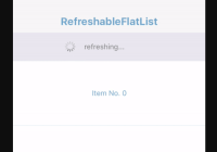
RefreshableFlatList
RefreshableFlatList Accepts the same props as FlatList, plus a few extras (see the props definitions below).
`import React, { PureComponent } from 'react'; import { View, Text, StyleSheet, Dimensions } from 'react-native'; import RefreshableFlatList from 'react-native-refreshable-flatlist'; const { width } = Dimensions.get('window'); const styles = StyleSheet.create({ container: { flex: 1 }, topBar: { backgroundColor: '#F7F7F8', height: 64, zIndex: 10, }, row: { padding: 10, height: 125, width, backgroundColor: '#ffffff', borderTopWidth: 1, marginBottom: -1, borderBottomColor: '#E5EDF5', borderTopColor: '#E5EDF5', borderBottomWidth: 1, justifyContent: 'center' }, text: { textAlign: 'center', color: '#6da3d0' }, navText: { color: '#6da3d0', fontSize: 20, fontWeight: '700', textAlign: 'center', paddingTop: 30 } }); export default class Example extends PureComponent { state = { data: new Array(3).fill(1).map((x, i) => ({ id: i, text: `Item No. ${i}` })), } render() { return ( <View style={styles.container}> <View style={styles.topBar}><Text style={styles.navText}>RefreshableFlatList</Text></View> <RefreshableFlatList data={this.state.data} renderItem={({ item }) => ( <View key={item.id} style={styles.row}> <Text style={styles.text}>{item.text}</Text> </View> )} ref={(ref) => { this.flatList = ref; }} onRefreshing={() => new Promise((r) => { setTimeout(() => { r(); }, 3000); })} onLoadMore={() => new Promise((r) => { setTimeout(() => { const no = this.state.data.length; const newArr = new Array(4).fill(1).map((x, i) => ({ id: i + no, text: `Item No. ${i + no}` })); this.setState({ data: this.state.data.concat(newArr) }); r(); }, 2500); })} keyExtractor={item => item.id} styles={{ prompt: { color: 'gray' } }} /> </View> ); } } `
Props
-
onRefreshing: funcA function returning a Promise or taking a callback, called when user pulls flatlist down to refresh.The top loading indicator will show until the Promise resolves or the callback is called.
-
onLoadMore: funcA function returning a Promise or taking a callback, called when user pulls flatlist up to load more data.The bottom loading indicator will show until the Promise resolves or the callback is called.
-
showTopIndicator: boolWhether to show top indicator. Defaults to true.
-
showBottomIndicator: boolWhether to show top indicator. Defaults to true.
-
topIndicatorComponent: oneOfType([func, element])Component shows in list header when pulling down. -
bottomIndicatorComponent: oneOfType([func, element])Component shows in list footer when pulling up. -
minDisplayTime: numberThe minimum amount of time for showing the loading indicator while is refreshing. Default 300ms.
-
minPullDownDistance: numberMinimum distance (in px) which the list has to be scrolled off the top to trigger a refresh. -
minPullUpDistance: numberMinimum distance (in px) which the list has to be scrolled off the bottom to trigger a data loading.
topIndicatorComponent
topIndicatorComponent shows in list header when pulling and refreshing.
Props
-
topPullingIndicator: oneOfType([string, element])Text/element shows in list header when user pulls flatlist down. Could be image or icon. -
topHoldingIndicator: oneOfType([string, element])Text/element shows in list header when user pulls flatlist down and the pull-down distance exceedsminPullDownDistance. -
topRefreshingIndicator: oneOfType([string, element])Text/element shows in list header when refreshing. -
topPullingPrompt: oneOfType([func, element])Text/element to show alongside indicator when user pulls down.
-
topHoldingPrompt: oneOfType([string, element])Text/element to show alongside indicator when user pulls flatlist down and the pull-down distance exceedsminPullDownDistance. -
topRefreshingPrompt: oneOfType([string, element])Text/element to show alongside indicator when refreshing.
bottomIndicatorComponent
bottomIndicatorComponent shows in list footer when pulling and data loading.
Props
-
bottomPullingIndicator: oneOfType([string, element])Text/element shows in list footer when user pulls flatlist up. Could be image or icon. -
bottomHoldingIndicator: oneOfType([string, element])Text/element shows in list footer when user pulls flatlist up and the pull-up distance exceedsminPullUpDistance. -
bottomRefreshingIndicator: oneOfType([string, element])Text/element shows in list header when data loading. -
bottomPullingPrompt: oneOfType([func, element])Text/element to show alongside indicator when user pulls up.
-
bottomHoldingPrompt: oneOfType([string, element])Text/element to show alongside indicator when user pulls flatlist up and the pull-up distance exceedsminPullDownDistance. -
bottomRefreshingPrompt: oneOfType([string, element])Text/element to show alongside indicator when data loading.
Style the IndicatorComponent
Just past the styles prop to RefreshableFlatList, it will pass the prop to both topIndicatorComponent and bottomIndicatorComponent. The styles prop must has structure like below:
const styles = StyleSheet.create({ indicatorContainer: { justifyContent: 'center', alignItems: 'center', flexDirection: 'row', height: 54, }, indicator: { width: 24, height: 24, marginRight: 15, resizeMode: 'cover', }, prompt: { color: '#6e6e6e', fontSize: 14 } });


