react-native-panel
A Customizable React Native Panel for Android and iOS
- note: It's lag due to gif recorder app, actually it works more smooth.
Installation
npm install --save react-native-panel
Usage
- Just import
Panelfrom the package and use your own component to render Header or Content. - Don't forget to wrap your
Panelcomponent insideScrollVieworListView. - To render a content, you must wrap your component inside
Panel(as a children). - See Example below for more details.
Example
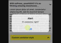
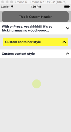
import React, { Component } from 'react'; import { StyleSheet, Text, View, ScrollView, } from 'react-native'; import Panel from 'react-native-panel'; class MyExample extends Component { renderFirstHeader() { return ( <View style={styles.firstHeader}> <Text>This is Custom Header</Text> </View> ); } render() { return ( <ScrollView style={styles.container} contentContainerStyle={styles.contentContainerStyle} > <Panel style={styles.firstHeaderContainer} header={this.renderFirstHeader} > <Text style={styles.myDescription}> Lorem ipsum dolor sit amet, consectetur adipiscing elit. </Text> </Panel> <Panel header="With onPress, yeaahhhh!!! It's so f#cking amazing wooohoooo..." onPress={() => alert("It's awesome, right?")} > <Text style={styles.myDescription}> Lorem ipsum dolor sit amet, consectetur adipiscing elit, sed do eiusmod tempor incididunt ut labore et dolore magna aliqua. Ut enim ad minim veniam, quis nostrud exercitation ullamco laboris nisi ut aliquip ex ea commodo consequat. Duis aute irure dolor in reprehenderit in voluptate velit esse cillum dolore eu fugiat nulla pariatur. Excepteur sint occaecat cupidatat non proident, sunt in culpa qui officia deserunt mollit anim id est laborum. </Text> </Panel> <Panel style={styles.thirdHeaderContainer} header="Custom container style" > <Text style={styles.myDescription}> Lorem ipsum dolor sit amet, consectetur adipiscing elit, sed do eiusmod tempor incididunt ut labore et dolore magna aliqua. Ut enim ad minim veniam, quis nostrud exercitation ullamco laboris nisi ut aliquip ex ea commodo consequat. Duis aute irure dolor in reprehenderit in voluptate velit esse cillum dolore eu fugiat nulla pariatur. Excepteur sint occaecat cupidatat non proident. </Text> </Panel> <Panel header="Custom content style"> <View style={styles.customContent}> <View style={styles.square} /> <View style={styles.circle} /> <View style={styles.square} /> </View> </Panel> </ScrollView> ); } } const styles = StyleSheet.create({ contentContainerStyle: { paddingTop: 30, paddingBottom: 20, }, container: { flex: 1, backgroundColor: '#eee', }, firstHeaderContainer: { backgroundColor: '#ccc', }, firstHeader: { marginHorizontal: 10, backgroundColor: 'gray', alignItems: 'center', justifyContent: 'center', borderRadius: 15, height: 50, }, thirdHeaderContainer: { margin: 15, backgroundColor: 'yellow', }, myDescription: { padding: 10, paddingTop: 0, }, customContent: { backgroundColor: '#bada55', flexDirection: 'row', justifyContent: 'space-around', alignItems: 'center', paddingVertical: 10, }, square: { backgroundColor: 'yellow', width: 50, height: 50, }, circle: { backgroundColor: 'blue', width: 50, height: 50, borderRadius: 25, }, }); export default MyExample;Properties
| props | type | description |
|---|---|---|
| header | String / Function | Use String or Function that render a React Element |
| onPress | Function | Invoke a function when the Panel header is pressed |
| style | Object | Custom wrapper style for Panel |
License
MIT


