react-native-custom-segmented-control
Native UI component for Segmented Control with custom style
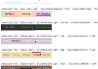
animationType: 'middle-line' selectedLineAlign: 'text' selectedLineMode: 'full' 
animationType: 'open-and-close' selectedLineAlign: 'text' selectedLineMode: 'text' 
animationType: 'middle-line' selectedLineAlign: 'bottom' selectedLineMode: 'text' 
animationType: 'middle-line' selectedLineAlign: 'top' selectedLineMode: 'full' 
animationType: 'middle-line' selectedLineAlign: 'top' selectedLineMode: 'full' 
animationType: 'middle-line' selectedLineAlign: 'text' selectedLineMode: 'text' 
Installation
-
Install using
npm:npm install react-native-custom-segmented-control --save -
Locate the module lib folder in your node modules:
PROJECT_DIR/node_modules/react-native-custom-segmented-control/lib. -
Drag the
CustomSegmentedControl.xcodeprojproject file into your project -
Add
libCustomSegmentedControl.ato your target's Linked Frameworks and Libraries.
How To Use
Require the native component:
import {CustomSegmentedControl} from 'react-native-custom-segmented-control'Now use it in your jsx inside your View:
<CustomSegmentedControl style={{ flex:1, backgroundColor: 'white', marginVertical: 8 }} textValues={['ORDERS','PRODUCTS' ]} selected={0} segmentedStyle={{ selectedLineHeight: 2, fontSize:17, fontWeight: 'bold', // bold, italic, regular (default) segmentBackgroundColor: 'transparent', segmentTextColor: '#7a92a5', segmentHighlightTextColor: '#7a92a599', selectedLineColor: '#00adf5', selectedLineAlign: 'bottom', // top/bottom/text selectedLineMode: 'text', // full/text selectedTextColor: 'black', selectedLinePaddingWidth: 30, segmentFontFamily: 'system-font-bold' }} animation={{ duration: 0.7, damping: 0.5, animationType: 'middle-line', initialDampingVelocity: 0.4 }} onSelectedWillChange={(event)=> { }} onSelectedDidChange={(event)=> { }} />##Properties
| Attribute | Description |
|---|---|
| textValues | [Array] Array of strings which will be presented on the segmented control |
| selected | [int] The selected segment |
| onSelectedWillChange | [function] callback function will be called before the selected animation will take place |
| onSelectedDidChange | [function] callback function will be called after the selected animation will take place |
| animation | [Object] see Animation Properties |
| segmentedStyle | [Object] see Segmented Style Properties |
##Segmented Style Properties Attribute | Description --------- | ----------- selectedLineHeight | [float] The selected line height. Default is 2 fontSize | [float] The segmented control text font size. Default is 14 segmentBackgroundColor | [Color] The segmented control background color. Default is 'black' segmentTextColor | [Color] The segmented control text color. Default is system default (blue) selectedTextColor | [Color] The selected segment color segmentHighlightTextColor | [Color] The segmnet highlight color. Default is black with alpha 0.5 segmentFontFamily | [Font/'system-font-bold'/'system-font'] The segmented control font. Default is system-font default selectedLineColor | [Color] The selected line color. Default is 'black' selectedLineAlign | ['top'/'bottom'/'text'] The selected line vertical alignment. Defualt is 'text' selectedLineMode | ['full'/'text'] The selected line mode. For determine if the line will be text width of full button width. Default is 'text' selectedLinePaddingWidth | [float] The selected line width padding. Default is 2
##Animation Properties
| Attribute | Description |
|---|---|
| duration | [float] The animation duration. Default is 0.2 sec |
| damping | [float] The damping ratio for the spring animation. Default is 0 (no damping) |
| animationType | ['default', 'middle-line', 'close-and-open'] The transition animation type. Default is 'default' |
| initialDampingVelocity | (float) The initial damping velocity. Default is 0 |


