React Native Android TabLayout native component
A React-Native (0.19+) wrapper for the standalone Android TabLayout component. It's fully native and similar in use like the TabBarIOS component.
Example Project
You can find an example project in a separate repo.
Installation
Install module with NPM:
npm install --save react-native-android-tablayoutIf you haven't installed RNPM, run:
npm install -g rnpmAfter RNPM is installed:
rnpm link react-native-android-tablayoutIf you want to setup the project manually, see the manual install guide.
After setting up your project, run react-native run-android from the root to see if there are no compilation failures.
Usage
Make sure to import the Tab and TabLayout component in your script:
import { Tab, TabLayout } from 'react-native-android-tablayout';Then, create a tab layout as follows:
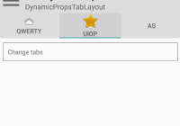
export default class MyComponent extends Component { render() { return ( <View> <TabLayout> <Tab name="Tab 1"/> <Tab name="Tab 2"/> <Tab name="Tab 3"/> </TabLayout> </View> ); } }The TabLayout and Tab accept the following properties:
TabLayout
| Prop | Type | Explanation |
|---|---|---|
| selectedTab | number | Use for selecting the initial tab and/or connecting to state. See the StatefulTabLayout example. |
| selectedTabIndicatorColor | string | Color of indicator line. Specify in CSS color format. |
| tabGravity | string | Set tab gravity. Default 'fill', use 'center' when tabstrip needs to be centered. |
| tabMode | string | Set tab mode. Default 'fixed', use 'scrollable' when tabstrip needs to scroll. |
| onTabSelected | func | Provide callback function with e:Event as argument. When called, the selected tab position is found in e.nativeEvent.position (0-based). See the StatefulTabLayout example. |
Tab
| Prop | Type | Explanation |
|---|---|---|
| name | string | Tab name. |
| iconResId | string | Icon resource ID. Points to a drawable, see the IconsOnTopTabLayout example. |
| iconPackage | string | Icon resource package. If not provided, defaults to current package. Use 'android' for built-in icons. See the IconsOnTopTabLayout example. |
| iconUri | string | Icon URI. Only allows file:// URIs. See how to combine with react-native-vector-icons in the IconsOnTopTabLayout example. |
| iconSize | number | Icon size. |
| textColor | string | Text color. Specify in CSS color format. |
| onTabSelected | func | Provide callback function with e:Event as argument. Called on the tab that was selected. When called, the selected tab position is found in e.nativeEvent.position (0-based). See the StatefulTabLayout example. |
| accessibilityLabel | string | Accessibility label for tab. Tabs are already set as accessible. |
Usage of these properties can be seen by example in the example repo.
Custom views
Since v0.2, you can define a custom view for a tab by adding child components to a Tab element:
export default class MyComponent extends Component { render() { return ( <View> <TabLayout> <Tab style={{width: 110, height: 48}}> <Text>Tab 1</Text> <Text>Hey, multiline!</Text> </Tab> <Tab style={{width: 110, height: 48}}> <Image source={require('./image/tabImage.png')}/> </Tab> <Tab style={{width: 110, height: 48}}> <Icon name="user"/> </Tab> </TabLayout> </View> ); } }You need to specify the width and height of the tab contents, else no contents will show up. This might be improved in the future.
See the CustomViewTabLayout example for a working example.
Todo
- add/remove tabs not implemented
- custom views need a width and height to work
PRs are welcome!


