rmc-tabs
React Mobile Tabs Component (web & react-native), inspired by react-native-scrollable-tab-view


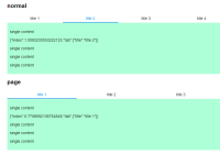
Screenshots
Development
npm i npm start Example
http://localhost:8000/examples/
online example: http://react-component.github.io/m-tabs/
install
docs
Usage
// normal <Tabs tabs={[ { key: 't1', title: 't1' }, { key: 't2', title: 't2' }, { key: 't3', title: 't3' }, { key: 't4', title: 't4' }, { key: 't5', title: 't5' }, ]} initalPage={'t2'} > <div key="t1"><p>content1</p></div> <div key="t2"><p>content2</p></div> <div key="t3"><p>content3</p></div> <div key="t4"><p>content4</p></div> <div key="t5"><p>content5</p></div> </Tabs> // single content <Tabs tabs={[ { title: 't1' }, { title: 't2' }, { title: 't3' }, { title: 't4' }, { title: 't5' }, ]} onChange={(tab, index) => { this.setState({ scData: JSON.stringify({ index: index + Math.random(), tab }) }); }} > <div> <p>single content</p> <p>{this.state.scData}</p> </div> </Tabs> // single content function <Tabs tabs={[ { title: 't1' }, { title: 't2' }, { title: 't3' }, { title: 't4' }, { title: 't5' }, ]} > { (index, tab) => <div> <p>single content</p> <p>{JSON.stringify({ index: index + Math.random(), tab })}</p> </div> } </Tabs> // renderTabBar e.g: Sticky, react-sticky ./examples/sticky.tsxreact-native
npm run rn-init npm run watch-tsc react-native start react-native run-ios API
Tabs:
| 属性 | 说明 | 类型 | 默认值 | 必选 |
|---|---|---|---|---|
| tabs | tabs data | Models.TabData[] | true | |
| tabBarPosition | TabBar's position | 'top' | 'bottom' | 'left' | 'right' | top | false |
| renderTabBar | render for TabBar | ((props: TabBarPropsType) => React.ReactNode) | false | false | |
| initialPage | initial Tab, index or key | number | string | false | |
| page | current tab, index or key | number | string | false | |
| swipeable | whether to switch tabs with swipe gestrue in the content | boolean | true | false |
useOnPan (web only) | use scroll follow pan | boolean | true | false |
| prerenderingSiblingsNumber | pre-render nearby # sibling, Infinity: render all the siblings, 0: render current page | number | 1 | false |
| animated | whether to change tabs with animation | boolean | true | false |
| onChange | callback when tab is switched | (tab: Models.TabData, index: number) => void | false | |
| onTabClick | on tab click | (tab: Models.TabData, index: number) => void | false | |
| destroyInactiveTab | destroy inactive tab | boolean | false | false |
| distanceToChangeTab | distance to change tab, width ratio | number | 0.3 | false |
| usePaged | use paged | boolean | true | false |
| tabDirection | tab paging direction | 'horizontal' | 'vertical' | horizontal | false |
| tabBarUnderlineStyle | tabBar underline style | React.CSSProperties | any | false | |
| tabBarBackgroundColor | tabBar background color | string | false | |
| tabBarActiveTextColor | tabBar active text color | string | false | |
| tabBarInactiveTextColor | tabBar inactive text color | string | false | |
| tabBarTextStyle | tabBar text style | React.CSSProperties | any | false |
TabBarPropsType (Common):
| 属性 | 说明 | 类型 | 默认值 | 必选 |
|---|---|---|---|---|
| goToTab | call this function to switch tab | (index: number) => void | true | |
| tabs | tabs data | Models.TabData[] | true | |
| activeTab | current active tab | number | true | |
| animated | use animate | boolean | true | true |
| renderTab | render the tab of tabbar | (tab: Models.TabData) => React.ReactNode | false | |
| page | page size of tabbar's tab | number | 5 | false |
| onTabClick | on tab click | (tab: Models.TabData, index: number) => void | false | |
| tabBarPosition | tabBar's position defualt: top | 'top' | 'bottom' | 'left' | 'right' | false | |
| tabBarUnderlineStyle | tabBar underline style | React.CSSProperties | any | false | |
| tabBarBackgroundColor | tabBar background color | string | false | |
| tabBarActiveTextColor | tabBar active text color | string | false | |
| tabBarInactiveTextColor | tabBar inactive text color | string | false | |
| tabBarTextStyle | tabBar text style | React.CSSProperties | any | false |
Test Case
npm test npm run chrome-test Coverage
npm run coverage open coverage/ dir
License
rmc-tabs is released under the MIT license.


