react-font-picker
ATTENTION: Looking for maintainers! This module needs a good rewrite to work with latest React
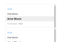
This is a ReactJS font picker component with Material Design styling as default styling. It exports the <FontPicker> component that works as standalone with local component state or with app state / store (like Redux).
Demo & Examples
Live demo: nardeas.github.io/react-font-picker
To build the examples locally, run:
npm install npm start Then open localhost:8000 in a browser.
Installation
The easiest way to use react-font-picker is to install it from NPM and include it in your own React build process (using Browserify, Webpack, etc).
You can also use the standalone build by including dist/react-font-picker.js in your page. If you use this, make sure you have already included React, and it is available as a global variable.
npm install react-font-picker --save Usage
Just require the 'react-font-picker' package which exports the <FontPicker> component.
var React = require('react'); var FontPicker = require('react-font-picker'); var App = React.createClass({ render() { return ( <FontPicker label="Choose Font" fonts={["Arial", "Times New Roman", "Verdana"]} previews={true} activeColor="#64B5F6" value="" onChange={this.handleChange} /> ); }, handleChange(selectedFont) { console.log(selectedFont); // Will log font name (string) when being selected } }); Properties
All properties are optional. The component works as standalone even if you don't supply it with any properties.
| name | type | default | required? | description |
|---|---|---|---|---|
| fonts | array | A basic list of common fonts | no | List of fonts to use with the component. The list indices should be strings e.g "Arial" |
| label | string | no | A label e.g "Select font" | |
| previews | boolean | true | no | See previews of each font in the font option list when selecting fonts |
| activeColor | string | #64B5F6 | no | When a font is selected and the option list is opened again, the selected font text will display this color. |
| value | string | no | Value from store | |
| onChange | function | no | A function that's called when a font is selected. It should take one argument which is the selected font's name as string. |
Styling
You can supply your own stylesheet if the default material design-style doesn't fit for you.
The default one is injected dynamically if the .ReactFontPicker rule is not found in the DOM. Here are the component CSS classnames for quick reference:
/* Component wrapper */ .ReactFontPicker /* The component UI wrapper */ .ReactFontPicker_Wrapper .ReactFontPicker_Wrapper:hover /* Label when no font is selected */ .ReactFontPicker_Label /* Label when a font is selected (floating above the selected option) */ .ReactFontPicker_LabelFloat /* The option that is displayed in the main field */ .ReactFontPicker_SelectedOption /* Small dropdown arrow */ .ReactFontPicker_Button .ReactFontPicker_Button:hover /* Option list (list of fonts) */ .ReactFontPicker_Options /* ...when hidden */ .ReactFontPicker_OptionsHidden /* Option (font) in the dropdown option list */ .ReactFontPicker_Option .ReactFontPicker_Option:hover /* MATERIAL DESIGN: */ /* Elements that have the Material design click ripple effect */ div.ReactFontPicker_Wrapper .ripple /* The Material design ripple effect itself */ div.ReactFontPicker_Wrapper .ripple-effect /* ...keyframes for ripple animation */ @keyframes ripple-animation To override styles in your own stylesheet you should use a more precise selector e.g div.ReactFontPicker
Development (src, lib and the build process)
NOTE: The source code for the component is in src. A transpiled CommonJS version (generated with Babel) is available in lib for use with node.js, browserify and webpack. A UMD bundle is also built to dist, which can be included without the need for any build system.
To build, watch and serve the examples (which will also watch the component source), run npm start. If you just want to watch changes to src and rebuild lib, run npm run watch (this is useful if you are working with npm link).
License
The MIT license (MIT)
Copyright (c) 2016 Andreas Urbanski.
Permission is hereby granted, free of charge, to any person obtaining a copy of this software and associated documentation files (the "Software"), to deal in the Software without restriction, including without limitation the rights to use, copy, modify, merge, publish, distribute, sublicense, and/or sell copies of the Software, and to permit persons to whom the Software is furnished to do so, subject to the following conditions:
The above copyright notice and this permission notice shall be included in all copies or substantial portions of the Software.
THE SOFTWARE IS PROVIDED "AS IS", WITHOUT WARRANTY OF ANY KIND, EXPRESS OR IMPLIED, INCLUDING BUT NOT LIMITED TO THE WARRANTIES OF MERCHANTABILITY, FITNESS FOR A PARTICULAR PURPOSE AND NONINFRINGEMENT. IN NO EVENT SHALL THE AUTHORS OR COPYRIGHT HOLDERS BE LIABLE FOR ANY CLAIM, DAMAGES OR OTHER LIABILITY, WHETHER IN AN ACTION OF CONTRACT, TORT OR OTHERWISE, ARISING FROM, OUT OF OR IN CONNECTION WITH THE SOFTWARE OR THE USE OR OTHER DEALINGS IN THE SOFTWARE.


