

Comparison with other React FLIP libraries
| Feature | react-flip-move | react-overdrive | react-flip-toolkit |
|---|---|---|---|
| Animate position | |||
| Animate scale | |||
| Animate opacity | |||
| Animate parent's size without warping children | |||
| Use real FLIP instead of cloning & crossfading | |||
| Use springs for animations | |||
| Support spring-based stagger effects | |||
| Usable with frameworks other than React |
Table of Contents
- Quick start
- Demos
- The Components
- Intermediate Tutorial
- Practical scale transitions
- Usage with Vanilla JS or Other Frameworks Like Vue.js
- Library details
- Troubleshooting
- Performance
Quick start
npm install react-flip-toolkit or yarn add react-flip-toolkit
-
Wrap your animations with a single
Flippercomponent that has aflipKeyprop that changes every time animations should happen. -
Wrap elements that should be animated with
Flippedcomponents that have aflipIdprop matching them across renders.
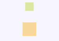
Example 1: Expanding Div (Fork on Code Sandbox)
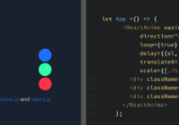
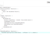
import React, { useState } from 'react' import { Flipper, Flipped } from 'react-flip-toolkit' const AnimatedSquare = () => { const [fullScreen, setFullScreen] = useState(false) const toggleFullScreen = () => setFullScreen(prevState => !prevState) return ( <Flipper flipKey={fullScreen}> <Flipped flipId="square"> <div className={fullScreen ? 'full-screen-square' : 'square'} onClick={toggleFullScreen} /> </Flipped> </Flipper> ) }Example 2: Two Divs (Fork on Code Sandbox)
import React, { useState } from 'react' import { Flipper, Flipped } from 'react-flip-toolkit' const Square = ({ toggleFullScreen }) => ( <Flipped flipId="square"> <div className="square" onClick={toggleFullScreen} /> </Flipped> ) const FullScreenSquare = ({ toggleFullScreen }) => ( <Flipped flipId="square"> <div className="full-screen-square" onClick={toggleFullScreen} /> </Flipped> ) const AnimatedSquare = () => { const [fullScreen, setFullScreen] = useState(false) const toggleFullScreen = () => setFullScreen(prevState => !prevState) return ( <Flipper flipKey={fullScreen}> {fullScreen ? ( <FullScreenSquare toggleFullScreen={toggleFullScreen} /> ) : ( <Square toggleFullScreen={toggleFullScreen} /> )} </Flipper> ) }Example 3: List Shuffle (Fork on Code Sandbox)
import React, { useState } from 'react' import { Flipper, Flipped } from 'react-flip-toolkit' import shuffle from 'lodash.shuffle' const ListShuffler = () => { const [data, setData] = useState([1, 2, 3, 4, 5, 6, 7, 8, 9, 10]) const shuffleList = () => setData(shuffle(data)) return ( <Flipper flipKey={data.join('')}> <button onClick={shuffleList}> shuffle</button> <ul className="list"> {data.map(d => ( <Flipped key={d} flipId={d}> <li>{d}</li> </Flipped> ))} </ul> </Flipper> ) }Demos
Image Transitions

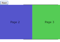
Usage with React Router

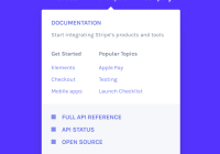
Stripe-Inspired Menu

Control the sequence of entering, updating, and exiting elements

List Transition

Spring Options Explorer

- Animated List (
react-flip-moveclone) - Guitar shop
- Overly complex, nested cards example
- React-flip-toolkit logo
- Using Portals
The Components
1. Flipper
The parent wrapper component that contains all the elements to be animated. You'll most typically need only one of these per page.
<Flipper flipKey={someKeyThatChanges}>{/* children */}</Flipper>Basic Props
| prop | default | type | details |
|---|---|---|---|
| flipKey (required) | - | string, number, bool | Changing this tells react-flip-toolkit to transition child elements wrapped in Flipped components. |
| children (required) | - | node | One or more element children |
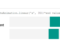
| spring | noWobble | string or object | Provide a string referencing one of the spring presets — noWobble (default), veryGentle, gentle, wobbly, or stiff, OR provide an object with stiffness and damping parameters. Explore the spring setting options here. The prop provided here will be the spring default that can be overrided on a per-element basis on the Flipped component. |
| applyTransformOrigin | true | bool | Whether or not react-flip-toolkit should apply a transform-origin of "0 0" to animating children (this is generally, but not always, desirable for FLIP animations) |
| element | div | string | If you'd like the wrapper element created by the Flipped container to be something other than a div, you can specify that here. |
| className | - | string | A class applied to the wrapper element, helpful for styling. |
| staggerConfig | - | object | Provide configuration for staggered Flipped children. The config object might look something like the code snippet below: |
staggerConfig={{ // the "default" config will apply to staggered elements without explicit keys default: { // default direction is forwards reverse: true, // default is .1, 0 < n < 1 speed: .5 }, // this will apply to Flipped elements with the prop stagger='namedStagger' namedStagger : { speed: .2 } }}Advanced Props
| prop | default | type | details |
|---|---|---|---|
| decisionData | - | any | Sometimes, you'll want the animated children of Flipper to behave differently depending on the state transition — maybe only certain Flipped elements should animate in response to a particular change. By providing the decisionData prop to the Flipper component, you'll make that data available to the shouldFlip and shouldInvert methods of each child Flipped component, so they can decided for themselves whether to animate or not. |
| debug | false | boolean | This experimental prop will pause your animation right at the initial application of FLIP-ped styles. That will allow you to inspect the state of the animation at the very beginning, when it should look similar or identical to the UI before the animation began. |
| portalKey | - | string | In general, the Flipper component will only apply transitions to its descendents. This allows multiple Flipper elements to coexist on the same page, but it will prevent animations from working if you use portals. You can provide a unique portalKey prop to Flipper to tell it to scope element selections to the entire document, not just to its children, so that elements in portals can be transitioned. |
| retainTransform | false | boolean | This performance enhancement can be set to true to retain an imperceptible rotateZ transform on all Flipped elements after they animate. This persistent transform will prevent the "pixel-snapping" effect sometimes seem in Chrome when a scale transform is fully removed from an element. |
| onComplete | - | function | This callback prop will be called when all individual FLIP animations have completed. Its single argument is a list of flipIds for the Flipped components that were activated during the animation. If an animation is interrupted, onComplete will be still called right before the in-progress animation is terminated. |
| handleEnterUpdateDelete | - | function | By default, react-flip-toolkit finishes animating out exiting elements before animating in new elements, with updating elements transforming immediately. You might want to have more control over the sequence of transitions — say, if you wanted to hide elements, pause, update elements, pause again, and finally animate in new elements. Or you might want transitions to happen simultaneously. If so, provide the function handleEnterUpdateDelete as a prop. The best way to understand how this works is to check out this interactive example. handleEnterUpdateDelete receives the following arguments every time a transition occurs: |
handleEnterUpdateDelete({ // this func applies an opacity of 0 to entering elements so // they can be faded in - it should be called immediately hideEnteringElements, // calls `onAppear` for all entering elements animateEnteringElements, //calls `onExit` for all exiting elements // returns a promise that resolves when all elements have exited animateExitingElements, // the main event: `FLIP` animations for updating elements // this also returns a promise that resolves when // animations have completed animateFlippedElements })2. Flipped
Wraps an element that should be animated.
E.g. in one component you can have
<Flipped flipId="coolDiv"> <div className="small" /> </Flipped>and in another component somewhere else you can have
<Flipped flipId="coolDiv"> <div className="big" /> </Flipped>and they will be tweened by react-flip-toolkit.
The Flipped component produces no markup, it simply passes some props down to its wrapped child.
Wrapping a React Component
If you want to wrap a React component rather than a JSX element like a div, you can provide a render prop and then apply the flippedProps directly to the wrapped element in your component:
;<Flipped> {flippedProps => <MyCoolComponent flippedProps={flippedProps} />} </Flipped> const MyCoolComponent = ({ flippedProps }) => <div {...flippedProps} />You can also simply provide a regular React component as long as that component spreads unrecognized props directly onto the wrapped element (this technique works well for wrapping styled components):
;<Flipped> <MyCoolComponent /> </Flipped> const MyCoolComponent = ({ knownProp, ...rest }) => <div {...rest} />Basic props
| prop | default | type | details |
|---|---|---|---|
| children (required) | - | node or function | Wrap a single element, React component, or render prop child with the Flipped component |
| flipId (required unless inverseFlipId is provided) | - | string | Use this to tell react-flip-toolkit how elements should be matched across renders so they can be animated. |
| inverseFlipId | - | string | Refer to the id of the parent Flipped container whose transform you want to cancel out. If this prop is provided, the Flipped component will become a limited version of itself that is only responsible for cancelling out its parent transform. It will read from any provided transform props and will ignore all other props (besides inverseFlipId.) Read more about canceling out parent transforms here. |
| transformOrigin | "0 0" | string | This is a convenience method to apply the proper CSS transform-origin to the element being FLIP-ped. This will override react-flip-toolkit's default application of transform-origin: 0 0; if it is provided as a prop. |
| spring | noWobble | string or object | Provide a string referencing one of the spring presets — (default), veryGentle, gentle, wobbly, or stiff, OR provide an object with stiffness and damping parameters. Explore the spring setting options here. |
| stagger | false | boolean or string | Provide a natural, spring-based staggering effect in which the spring easing of each item is pinned to the previous one's movement. Provide true to stagger the element with all other staggered elements. If you want to get more granular, you can provide a string key and the element will be staggered with other elements with the same key. |
Callback props
The above animation uses onAppear and onExit callbacks for fade-in and fade-out animations.
| prop | arguments | details |
|---|---|---|
| onAppear | element, index | Called when the element first appears in the DOM. It is provided a reference to the DOM element being transitioned as the first argument, and the index of the element relative to all appearing elements as the second. Note: If you provide an onAppear prop, the default opacity of the element will be set to 0 to allow you to animate it in without any initial flicker. If you don't want any opacity animation, just set the element's opacity to 1 immediately in your onAppear function. |
| onStart | element | Called when the FLIP animation for the element starts. It is provided a reference to the DOM element being transitioned as the first argument. |
| onStartImmediate | element | Similar to onStart, but guaranteed to run for all FLIP-ped elements on the initial tick of the FLIP animation, before the next frame has rendered, even if the element in question has a stagger delay. It is provided a reference to the DOM element being transitioned as the first argument. |
| onSpringUpdate | springValue | Called with the current spring value (normally between 0 - 1 but might briefly go over or under that range depending on the level of "bounciness" of the spring). Useful if you'd like to tween other, non-FLIP animations in concert with a FLIP transition. |
| onComplete | element | Called when the FLIP animation completes. It is provided a reference to the DOM element being transitioned as the first argument. (If transitions are interruped by new ones, onComplete will still be called.) |
| onExit | element, index, removeElement | Called when the element is removed from the DOM. It must call the removeElement function when the exit transition has completed. |
Transform props
By default the FLIP-ped elements' translate, scale, and opacity properties are all transformed. However, certain effects require more control so if you specify any of these props, only the specified attribute(s) will be tweened:
| prop | type | details |
|---|---|---|
| translate | bool | Tween translateX and translateY |
| scale | bool | Tween scaleX and scaleY |
| opacity | bool |
Advanced props
Functions to control when FLIP happens
| prop | arguments | details |
|---|---|---|
| shouldFlip | prevDecisionData, currentDecisionData | A function provided with the current and previous decisionData props passed down by the Flipper component. Returns a boolean to indicate whether a Flipped component should animate at that particular moment or not. |
| shouldInvert | prevDecisionData, currentDecisionData | A function provided with the current and previous decisionData props passed down by the Flipper component. Returns a boolean indicating whether to apply inverted transforms to all Flipped children that request it via an inverseFlipId. |
Intermediate Tutorial
Learn how to easily set up an elegant animation with this step-by-step tutorial.
Practical scale transitions
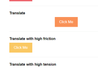
Some other FLIP libraries just allow you to animate position changes, but things get more interesting once you can animate scale changes as well.

The problem with scale animations has to do with children — if you scale a div up 2x, you will warp any children it has by scaling them up too, creating a weird-looking animation. That's why this library allows you to wrap the child with a Flipped component that has an inverseFlipId to counteract the transforms of the parent:
<Flipped flipId={id}> <div> <Flipped inverseFlipId={id} scale> <div>some text that will not be warped</div> </Flipped> </div> </Flipped>By default, both the scale and the translation transforms of the parent will be counteracted (this allows children components to make their own FLIP animations without being affected by the parent). But for many use cases, you'll want to additionally specify the scale prop to limit the adjustment to the scale and allow the positioning to move with the parent.
The DOM element with the inverse transform should lie flush against its parent container for the most seamless animation.
That means any layout styles — padding, flexbox, etc—should be applied to the inverted container (the element wrapped with a Flipped component with an inverseFlipId) rather than the parent Flipped container.
Usage with Vanilla JS or Other Frameworks Like Vue.js
React-Flip-Toolkit exports a special file, core, that allows you to use the methods from the library imperatively, without requiring React. You could use this with vanilla JavaScript or any UI library. (For usage with Vue.js, try Vue-Flip-Toolkit).
You can refer to the React documentation below to see what options can be passed to the Flipper class constructor as well as the addFlipped function exposed by the Flipper instance (which takes options corresponding to the Flipped component's props).
Expanding Div (Fork on Code Sandbox)
import Flipper from 'react-flip-toolkit/core' const container = document.querySelector('.container') const square = document.querySelector('.square') const innerSquare = document.querySelector('.inner-square') // the config options for the Flipper class are the same // as the allowed props for the Flipper component const flipper = new Flipper({ element: container }) // add flipped children to the parent // options are the same as the props // for the Flipped component flipper.addFlipped({ element: square, flipId: 'square', onStart: () => console.log('animation started!'), onSpringUpdate: springValue => console.log(`current spring value: ${springValue}`), onComplete: () => console.log('animation completed!') }) // to add an inverted child, use this method with // a reference to the parent element flipper.addInverted({ element: innerSquare, parent: square }) square.addEventListener('click', () => { // record positions before they change flipper.recordBeforeUpdate() square.classList.toggle('big-square') // record new positions and begin animations flipper.onUpdate() })Library details

- Tested in latest Chrome, Firefox, Safari, Edge, and IE 11 with Browserstack.
- For IE11 compatability, make sure you're polyfilling the
window.Promiseobject. - Requires React 16+
- Uses Rematrix for matrix calculations and a simplified fork of Rebound for spring animations
Troubleshooting
Problem #1: Nothing is happening
- Make sure you're updating the
flipKeyattribute in theFlippercomponent whenever an animation should happen. - If one of your
Flippedcomponents is wrapping another React component rather than a DOM element, use a render prop to get the Flipped props and pass down to the necessary DOM element. - Is the element that's receiving props from
Flippedvisible in the DOM?react-flip-toolkitattempts to optimize performance by not animating elements that are off-screen or elements that have no width or height.
Problem #2: Things look weird / animations aren't behaving
- Check to make sure all
flipIds are unique. At any point, there can only be one element with a specifiedflipIdon the page. If there are multipleFlippedelements on the page with the same id, the animation will break. - Make sure you are animating the element you want to animate and not, for instance, a wrapper div. If you are animating an inline element like some text, but have wrapped it in a
div, you're actually animating the div, which might have a much wider width that you'd expect at certain points, which will throw off the animation. Check to see if you need to add aninline-blockstyle to the animated element. - Make sure you don't have any competing CSS transitions on the element in question.
- If you are animating an image, try giving the image hard-coded dimensions and seeing if that fixes the problem. (If you are relying on the innate dimensions of the image, it might not have been fully rendered by the browser in time for the new image dimensions to be measured.)
Problem #3: It's still not working
- Try out the
debugprop. If you still can't figure out what's going wrong, you can add the thedebugprop directly on yourFlippercomponent to pause transitions at the beginning. - If you think something might actually be broken, or are completely stuck, feel free to make an issue.
Performance
React-flip-toolkit does a lot of work under the hood to try to maximize the performance of your animations — for instance, off-screen elements won't be animated, and style updates are batched to prevent layout thrashing. However, if you are building particularly complex animations—ones that involve dozens of elements or large images— there are some additional strategies you can use to ensure performant animations.
1. PureComponent
When you trigger a complex FLIP animation with react-flip-toolkit, React could be spending vital milliseconds doing unnecessary reconciliation work before allowing the animation to start. If you notice a slight delay between when the animation is triggered, and when it begins, this is probably the culprit. To short-circuit this possibly unnecessary work, try using PureComponent for your animated elements, and seeing if you can refactor your code to minimize prop updates to animated children when an animation is about to occur.
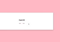
For example, in a hypothetical UI where you are animating the positions of several cards at once, you might want to update a Card component that looks like this:
import React, { Component } from 'react' class Card extends Component { render() { return ( <Flipped flipId={this.props.id}> <div>{/* card content goes here */}</div> </Flipped> ) } }to this:
import React, { PureComponent } from 'react' class Card extends PureComponent { // everything else is the same }Remember to always provide key props as appropriate to your elements, and check the React docs for some caveats on when to not use PureComponent. But if you have complex animations with noticeable lag, think about giving PureComponent a try.
2. will-change:transform
.image { will-change: transform; }This somewhat mysterious CSS property tells the browser to anticipate changes to an element. It should be used with caution, because it can increase browser resource usage. If you are animating images (svg, jpg, etc), I would recommend trying it out and seeing if it increases the performance of the animation. In my tests, when animating one or two large images, will-change:transform increased animation frame rate. However, trying to apply it to too many components at once (20+) actually decreased performance considerably.


