
React Fuzzy Picker
A React component that implements a fuzzy picker (similar to Sublime Text's command palette or Slack's channel switcher). In a nutshell, it provides a quick way for user's to pick from a long list of items.

Installing
npm install --save react-fuzzy-picker # Within your code: import FuzzyPicker from 'react-fuzzy-picker'; # Within your scss: @import "node_modules/react-fuzzy-picker/styles/fuzzy-picker" # Or, for plain css, take a look in node_modules/react-fuzzy-picker/styles/index.css Demo and Examples
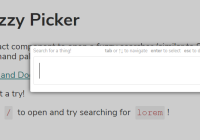
A live demo is available here: https://1egoman.github.io/fuzzy-picker
A super basic example of the component:
import FuzzyPicker from 'react-fuzzy-picker'; ReactDOM.render(<FuzzyPicker isOpen={true} onClose={() => console.log('You closed the fuzzy-picker')} onChange={choice => console.log('You picked', choice)} items={["foo", "bar", "baz"]} />, element);Uncontrolled
The above renders, however, the component is "stuck" open. This is because the component is written to be controlled, ie, ties in a parent component's state to keep track of whether is is open or closed. Don't want that, or would rather an uncontrolled variant? Wrap it in a FuzzyWrapper:
import FuzzyPicker, {FuzzyWrapper} from 'react-fuzzy-picker'; // This is the code from above, just wrapped in a factory function. function renderFuzzyPicker(isOpen, onClose) { return <FuzzyPicker isOpen={isOpen} onClose={onClose} onChange={choice => console.log('You picked', choice)} items={["foo", "bar", "baz"]} />; } // Here, we check what key must be pressed to open the fuzzy picker // We'll use the '/' key for this example. function isCorrectKeyPressed(event) { return event.key === '/'; } ReactDOM.render(<FuzzyWrapper isKeyPressed={isCorrectKeyPressed} popup={renderFuzzyPicker} />, element);With the above, pressing / will open the fuzzy picker (and you don't have to worry about managing that state.)
The fuzzy picker is automatically dismissed (closed) when the user presses escape.
Automatic close on enter
By default FuzzyPicker doesn't close when the user presses the enter key. To make it behave this way you can close it in response to the onChange event.
You can also enable automatically close on enter by setting the autoCloseOnEnter property to true. This enables the behaviour to automatically close FuzzyPicker when the user presses enter to choose an item
import FuzzyPicker from 'react-fuzzy-picker'; ReactDOM.render(<FuzzyPicker isOpen={true} onClose={() => console.log('You closed the fuzzy-picker')} onChange={choice => console.log('You picked', choice)} autoCloseOnEnter={true} // Automatically close FuzzyPicker when the user presses enter. items={["foo", "bar", "baz"]} />, element);Showing all items
By default FuzzyPicker doesn't show any items until you start to type and matching items are found. You can enable showing of all items before any text is entered by enabling the showAllItems property as follows:
import FuzzyPicker from 'react-fuzzy-picker'; ReactDOM.render(<FuzzyPicker isOpen={true} onClose={() => console.log('You closed the fuzzy-picker')} onChange={choice => console.log('You picked', choice)} showAllItems={true} // Automatically show all items by default. items={["foo", "bar", "baz"]} />, element);Asynchronous Items
Sometimes, you want to fetch items asynchronously. Here's how you'd do that here.
import {AsyncFuzzyPicker} from 'react-fuzzy-picker'; ReactDOM.render(<AsyncFuzzyPicker isOpen={true} onClose={() => console.log('You closed the fuzzy-picker')} onChange={choice => console.log('You picked', choice)} // Here's where it gets interesting. This prop takes a function, and expects a promise to be // returned with a list of values that should be specified. fetchItems={value => { // "value" is what the user typed into the box. if (value === "foo") { // Pretend to be async! return Promise.resolve(["foo", "bar", "baz"]); } else { return Promise.resolve(["hello", "world"]); } }} />, element);Documentation
FuzzyPicker
A component for fuzzy searching through a collection of items.
<FuzzyPicker isOpen={true} onClose={() => console.log('You closed the fuzzy-picker')} onChange={choice => console.log('You picked', choice)} items={[{value: "foo"}, {value: "bar"}, {value: "baz"}]} renderItem={item => <span>{item.value}</span>} itemValue={item => item.value} />Props:
label: A string, a label to print above the fuzzy-picker textbox.items: An array of strings. These are a "haystack" of all items. This is searched against to find a match.showAllItems: Set totrueto shows all items when nothing is typed in the fuzzy picker. Defaults tofalsemeaning no items are shown until you start typing.displayCount: An integer, how many matches to show at maximum.cycleAtEndsOfList: A boolean, when a user arrows past the end of the list, should the highlight wrap?onChangeHighlightedItem: a callback that is fired when the highlight changes within the fuzzyfinder. Passed one argument, the newly highlighted item.onChange: When the user selects a final item, this callback is fired with that item. Passed one argument, the chosen item.onClose: When the user closes the fuzzy-finder by either pressing escape of clicking on the background, this callback is fired. Passed zero arguments.autoCloseOnEnter: Set totrueto automatically close fuzzy picker when the selects an item with the enter key. Defaults tofalsemeaning that pressing enter does not close the fuzzy picker.renderItem: An optional function that allows a user to map each function to its displayed component on the page. This is presentational only. IfitemValueis specified, this prop must also be specified.itemValue: An optional function that maps each item to its string value to be searched against. This function must always return a string. If omitted, the "default" is to map the item directly to the output (ie, your data is a flat array of strings.) IfrenderItemis specified, this prop must also be specified.
AsyncFuzzyPicker
An asynchronous version of the FuzzyPicker component.
<AsyncFuzzyPicker isOpen={true} onClose={() => console.log('You closed the fuzzy-picker')} onChange={choice => console.log('You picked', choice)} label="Fuzzy Picker Label" // Here's where it gets interesting. This prop takes a function, and expects a promise to be returned with a list of values that should be specified. fetchItems={value => { // "value" is what the user typed into the box. if (value === "foo") { // Pretend to be async! return Promise.resolve(["foo", "bar", "baz"]); } else { return Promise.resolve(["hello", "world"]); } }} />Props:
- All props that can be passed to the above
FuzzyPickercomponent, plus... fetchItems: A function called to asynchronously fetch new items for a given search phrase. Must return a promise with an array of strings. For example,value => Promise.resolve(["foo", "bar", "baz"])
FuzzyWrapper
A wrapper component that controls a FuzzyFinder and will bind its opening to a keyboard event.
// This is the code from above, just wrapped in a factory function. function renderFuzzyPicker(isOpen, onClose) { return <FuzzyPicker isOpen={true} onClose={() => console.log('You closed the fuzzy-picker')} onChange={choice => console.log('You picked', choice)} items={["foo", "bar", "baz"]} />; } // Here, we check what key must be pressed to open the fuzzy picker // We'll use the '/' key for this example. function isCorrectKeyPressed(event) { return e.key === '/'; } <FuzzyWrapper isKeyPressed={isCorrectKeyPressed} popup={renderFuzzyPicker} />Props:
isKeyPressed: A callback, fired when a key is pressed. Expected to return a boolean indicating whether the given keypress should open the fuzzy-finder.popup: A callback that is passed two arguments, the first being whether the contained fuzzy-finder shoule be open (isOpen), and the second being a callback that the fuzzy-finder can use to close itself (onClose). See the above examples for usage.


