react-native-pin-code
A simple pin code component
Installation
npm install react-native-pin-code --save
Example
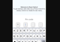
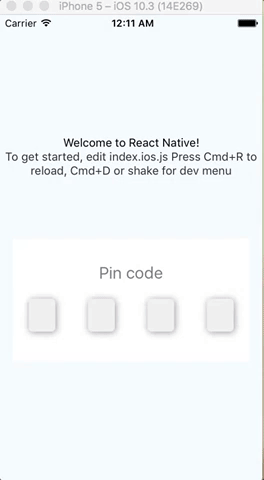
<CodePin code="2018" // code.length is used if you not pass number prop success={() => console.log('hurray!')} // If user fill '2018', success is called text="A simple Pin code component" // My title error="You fail" // If user fail (fill '2017' for instance) autoFocusFirst={false} // disabling auto-focus />or
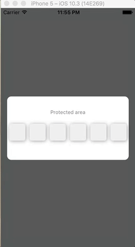
<CodePin number={4} // You must pass number prop, it will be used to display 4 (here) inputs checkPinCode={(code, callback) => callback(code === '1234')} // Check manually code (ask server for instance) // and call callback function with // true (code pin is correct) // or false (code pin is false) success={() => console.log('hurray!')} // If user fill '2018', success is called text="A simple Pin code component" // My title error="You fail" // If user fail (fill '2017' for instance) autoFocusFirst={false} // disabling auto-focus />Code prop is not needed if checkPinCode is used
props
| prop | type | description | isRequired | default value |
|---|---|---|---|---|
| code | number | pin code | not required | '' |
| success | function | call on success | required | |
| checkPinCode | function | this function is called to check pin code. The parameters are : code (the code filled by user) and a callback function. callback must be called with true (code pin is correct) or false (code pin is wrong) | not required | null |
| obfuscation | boolean | If true, obfuscate code with '*' | false | |
| text | string | text to display as title | 'Pin code.' | |
| error | string | text to display on error | 'Bad pin code.' | |
| number | number | number of input to display | 4 | |
| autoFocusFirst | boolean | auto focus first input | true | |
| containerStyle | object, StyleSheet object | container style | { height: 150, width: width - 30, backgroundColor : '#FFF' } | |
| containerPinStyle | object, StyleSheet object | inputs container style | { width: width - 30, height: 40, flexDirection: 'row', justifyContent: 'space-around', alignItems: 'center', marginTop: 20 } | |
| pinStyle | object, StyleSheet object | input style | { backgroundColor : '#F0F0F0', textAlign: 'center', flex: 1, marginLeft: 20, marginRight: 20, borderRadius: 5, shadowColor: '#000000', shadowOffset: {width: 1,height : 1}, shadowRadius: 5, shadowOpacity : 0.4 } | |
| textStyle | object, StyleSheet object | text style | { textAlign: 'center', color: 'gray', fontSize: 20, marginTop: 30 } | |
| errorStyle | object, StyleSheet object | error text style | { textAlign: 'center', color: 'red', paddingTop: 10 } |
All other props are pass down to TextInput component.
For instance you can customize keyboardtype :
<CodePin //... keyboardType="numeric" />Functions
To use pin code component function, use ref :
<CodePin ref={ref => this.ref = ref} ... />clean
clean inputs and focus first input.
this.ref.clean();focus
focus input at specified index
this.ref.focus(1);Examples
To test examples (use expo) :
git clone https://github.com/gkueny/react-native-pin-code-examples cd blurExample npm install npm run ios or
git clone https://github.com/gkueny/react-native-pin-code-examples cd simpleExample npm install npm run ios 


