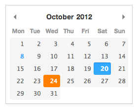
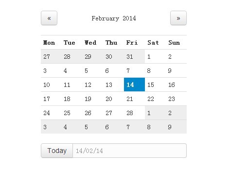
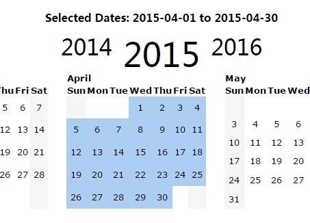
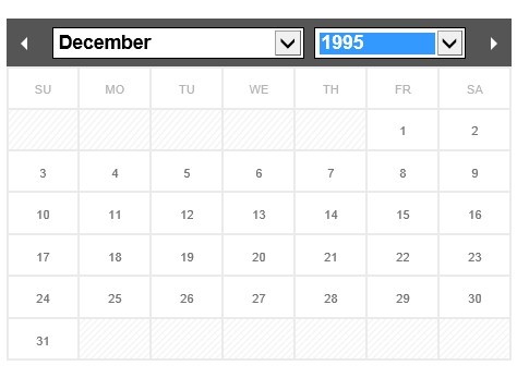
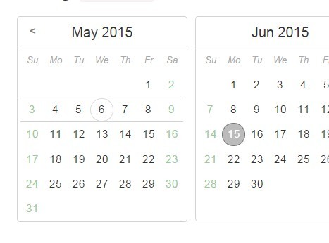
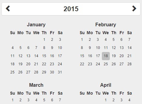
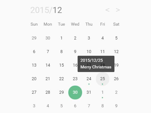
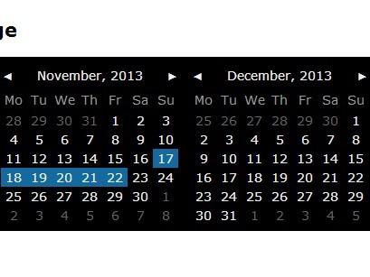
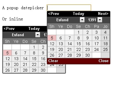
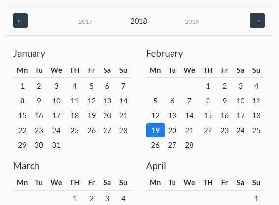
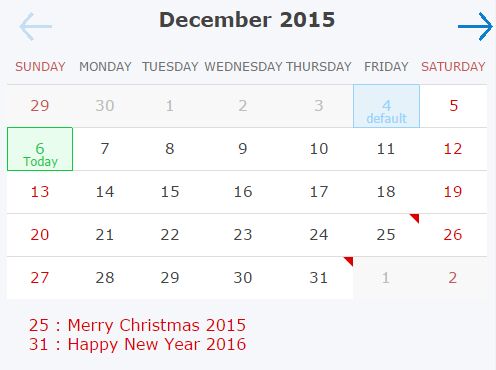
Pikaday
A refreshing JavaScript Datepicker
- Lightweight (less than 5kb minified and gzipped)
- No dependencies (but plays well with Moment.js)
- Modular CSS classes for easy styling
Production ready? Since version 1.0.0 Pikaday is stable and used in production. If you do however find bugs or have feature requests please submit them to the GitHub issue tracker. Also see the changelog
Installation
You can install Pikaday as an NPM package:
npm install pikadayOr link directly to the CDN:
<script src="https://cdn.jsdelivr.net/npm/pikaday/pikaday.js"></script>Styles
You will also need to include Pikaday CSS file. This step depends on how Pikaday was installed. Either import from NPM:
@import './node_modules/pikaday/css/pikaday.css';Or link to the CDN:
<link rel="stylesheet" type="text/css" href="https://cdn.jsdelivr.net/npm/pikaday/css/pikaday.css">Usage
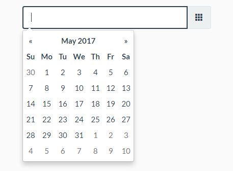
Pikaday can be bound to an input field:
<input type="text" id="datepicker">Add the JavaScript to the end of your document:
<script src="pikaday.js"></script> <script> var picker = new Pikaday({ field: document.getElementById('datepicker') }); </script>If you're using jQuery make sure to pass only the first element:
var picker = new Pikaday({ field: $('#datepicker')[0] });If the Pikaday instance is not bound to a field you can append the element anywhere:
var field = document.getElementById('datepicker'); var picker = new Pikaday({ onSelect: function(date) { field.value = picker.toString(); } }); field.parentNode.insertBefore(picker.el, field.nextSibling);Formatting
By default, dates are formatted and parsed using standard JavaScript Date object. If Moment.js is available in scope, it will be used to format and parse input values. You can pass an additional format option to the configuration which will be passed to the moment constructor. See the moment.js example for a full version.
<input type="text" id="datepicker" value="9 Oct 2014"> <script src="moment.js"></script> <script src="pikaday.js"></script> <script> var picker = new Pikaday({ field: document.getElementById('datepicker'), format: 'D MMM YYYY', onSelect: function() { console.log(this.getMoment().format('Do MMMM YYYY')); } }); </script>For more advanced and flexible formatting you can pass your own toString function to the configuration which will be used to format the date object. This function has the following signature:
toString(date, format = 'YYYY-MM-DD')
You should return a string from it.
Be careful, though. If the formatted string that you return cannot be correctly parsed by the Date.parse method (or by moment if it is available), then you must provide your own parse function in the config. This function will be passed the formatted string and the format:
parse(dateString, format = 'YYYY-MM-DD')
var picker = new Pikaday({ field: document.getElementById('datepicker'), format: 'D/M/YYYY', toString(date, format) { // you should do formatting based on the passed format, // but we will just return 'D/M/YYYY' for simplicity const day = date.getDate(); const month = date.getMonth() + 1; const year = date.getFullYear(); return `${day}/${month}/${year}`; }, parse(dateString, format) { // dateString is the result of `toString` method const parts = dateString.split('/'); const day = parseInt(parts[0], 10); const month = parseInt(parts[1], 10) - 1; const year = parseInt(parts[2], 10); return new Date(year, month, day); } });Configuration
As the examples demonstrate above Pikaday has many useful options:
fieldbind the datepicker to a form fieldtriggeruse a different element to trigger opening the datepicker, see trigger example (default tofield)boundautomatically show/hide the datepicker onfieldfocus (defaulttrueiffieldis set)ariaLabeldata-attribute on the input field with an aria assistance tekst (only applied whenboundis set)positionpreferred position of the datepicker relative to the form field, e.g.:top right,bottom rightNote: automatic adjustment may occur to avoid datepicker from being displayed outside the viewport, see positions example (default to 'bottom left')repositioncan be set to false to not reposition datepicker within the viewport, forcing it to take the configuredposition(default: true)containerDOM node to render calendar into, see container example (default: undefined)formatthe default output format for.toString()andfieldvalue (requires Moment.js for custom formatting)formatStrictthe default flag for moment's strict date parsing (requires Moment.js for custom formatting)toString(date, format)function which will be used for custom formatting. This function will take precedence overmoment.parse(dateString, format)function which will be used for parsing input string and getting a date object from it. This function will take precedence overmoment.defaultDatethe initial date to view when first openedsetDefaultDateBoolean (true/false). make thedefaultDatethe initial selected valuefirstDayfirst day of the week (0: Sunday, 1: Monday, etc)minDatethe minimum/earliest date that can be selected (this should be a native Date object - e.g.new Date()ormoment().toDate())maxDatethe maximum/latest date that can be selected (this should be a native Date object - e.g.new Date()ormoment().toDate())disableWeekendsdisallow selection of Saturdays or SundaysdisableDayFncallback function that gets passed a Date object for each day in view. Should return true to disable selection of that day.yearRangenumber of years either side (e.g.10) or array of upper/lower range (e.g.[1900,2015])showWeekNumbershow the ISO week number at the head of the row (defaultfalse)pickWholeWeekselect a whole week instead of a day (defaultfalse)isRTLreverse the calendar for right-to-left languagesi18nlanguage defaults for month and weekday names (see internationalization below)yearSuffixadditional text to append to the year in the titleshowMonthAfterYearrender the month after year in the title (defaultfalse)showDaysInNextAndPreviousMonthsrender days of the calendar grid that fall in the next or previous months (default: false)enableSelectionDaysInNextAndPreviousMonthsallows user to select date that is in the next or previous months (default: false)numberOfMonthsnumber of visible calendarsmainCalendarwhennumberOfMonthsis used, this will help you to choose where the main calendar will be (defaultleft, can be set toright). Only used for the first display or when a selected date is not already visibleeventsarray of dates that you would like to differentiate from regular days (e.g.['Sat Jun 28 2017', 'Sun Jun 29 2017', 'Tue Jul 01 2017',])themedefine a classname that can be used as a hook for styling different themes, see theme example (defaultnull)blurFieldOnSelectdefines if the field is blurred when a date is selected (defaulttrue)onSelectcallback function for when a date is selectedonOpencallback function for when the picker becomes visibleonClosecallback function for when the picker is hiddenonDrawcallback function for when the picker draws a new monthkeyboardInputenable keyboard input support (defaulttrue)
Styling
If the reposition configuration-option is enabled (default), Pikaday will apply CSS-classes to the datepicker according to how it is positioned:
top-alignedleft-alignedright-alignedbottom-aligned
Note that the DOM element at any time will typically have 2 CSS-classes (eg. top-aligned right-aligned etc).
jQuery Plugin
The normal version of Pikaday does not require jQuery, however there is a jQuery plugin if that floats your boat (see plugins/pikaday.jquery.js in the repository). This version requires jQuery, naturally, and can be used like other plugins: See the jQuery example for a full version.
<script src="//ajax.googleapis.com/ajax/libs/jquery/1.9.1/jquery.min.js"></script> <script src="pikaday.js"></script> <script src="plugins/pikaday.jquery.js"></script> <script> // activate datepickers for all elements with a class of `datepicker` $('.datepicker').pikaday({ firstDay: 1 }); // chain a few methods for the first datepicker, jQuery style! $('.datepicker').eq(0).pikaday('show').pikaday('gotoYear', 2042); </script>AMD support
If you use a modular script loader, Pikaday is not bound to the global object and will fit nicely in your build process. You can require Pikaday just like any other module. See the AMD example for a full version.
require(['pikaday'], function(Pikaday) { var picker = new Pikaday({ field: document.getElementById('datepicker') }); });The same applies for the jQuery plugin mentioned above. See the jQuery AMD example for a full version.
require(['jquery', 'pikaday.jquery'], function($) { $('#datepicker').pikaday(); });CommonJS module support
If you use a CommonJS compatible environment you can use the require function to import Pikaday.
var pikaday = require('pikaday');When you bundle all your required modules with Browserify and you don't use Moment.js specify the ignore option:
browserify main.js -o bundle.js -i moment
Ruby on Rails
If you're using Ruby on Rails, make sure to check out the Pikaday gem.
Methods
You can control the date picker after creation:
var picker = new Pikaday({ field: document.getElementById('datepicker') });Get and set date
picker.toString('YYYY-MM-DD')
Returns the selected date in a string format. If Moment.js exists (recommended) then Pikaday can return any format that Moment understands. You can also provide your own toString function and do the formatting yourself. Read more in the formatting section.
If neither moment object exists nor toString function is provided, JavaScript's default .toDateString() method will be used.
picker.getDate()
Returns a basic JavaScript Date object of the selected day, or null if no selection.
picker.setDate('2015-01-01')
Set the current selection. This will be restricted within the bounds of minDate and maxDate options if they're specified. You can optionally pass a boolean as the second parameter to prevent triggering of the onSelect callback (true), allowing the date to be set silently.
picker.getMoment()
Returns a Moment.js object for the selected date (Moment must be loaded before Pikaday).
picker.setMoment(moment('14th February 2014', 'DDo MMMM YYYY'))
Set the current selection with a Moment.js object (see setDate for details).
Clear and reset date
picker.clear()
Will clear and reset the input where picker is bound to.
Change current view
picker.gotoDate(new Date(2014, 1))
Change the current view to see a specific date. This example will jump to February 2014 (month is a zero-based index).
picker.gotoToday()
Shortcut for picker.gotoDate(new Date())
picker.gotoMonth(2)
Change the current view by month (0: January, 1: Februrary, etc).
picker.nextMonth() picker.prevMonth()
Go to the next or previous month (this will change year if necessary).
picker.gotoYear()
Change the year being viewed.
picker.setMinDate()
Update the minimum/earliest date that can be selected.
picker.setMaxDate()
Update the maximum/latest date that can be selected.
picker.setStartRange()
Update the range start date. For using two Pikaday instances to select a date range.
picker.setEndRange()
Update the range end date. For using two Pikaday instances to select a date range.
Show and hide datepicker
picker.isVisible()
Returns true or false.
picker.show()
Make the picker visible.
picker.adjustPosition()
Recalculate and change the position of the picker.
picker.hide()
Hide the picker making it invisible.
picker.destroy()
Hide the picker and remove all event listeners — no going back!
Internationalization
The default i18n configuration format looks like this:
i18n: { previousMonth : 'Previous Month', nextMonth : 'Next Month', months : ['January','February','March','April','May','June','July','August','September','October','November','December'], weekdays : ['Sunday','Monday','Tuesday','Wednesday','Thursday','Friday','Saturday'], weekdaysShort : ['Sun','Mon','Tue','Wed','Thu','Fri','Sat'] }You must provide 12 months and 7 weekdays (with abbreviations). Always specify weekdays in this order with Sunday first. You can change the firstDay option to reorder if necessary (0: Sunday, 1: Monday, etc). You can also set isRTL to true for languages that are read right-to-left.
Extensions
Timepicker
Pikaday is a pure datepicker. It will not support picking a time of day. However, there have been efforts to add time support to Pikaday. See #1 and #18. These reside in their own fork.
You can use the work @owenmead did most recently at owenmead/Pikaday A more simple time selection approach done by @xeeali at xeeali/Pikaday is based on version 1.2.0. Also @stas has a fork stas/Pikaday, but is now quite old
Browser Compatibility
- IE 7+
- Chrome 8+
- Firefox 3.5+
- Safari 3+
- Opera 10.6+
Authors
- David Bushell https://dbushell.com @dbushell
- Ramiro Rikkert GitHub @RamRik
Thanks to @shoogledesigns for the name.
Copyright © 2014 David Bushell | BSD & MIT license


