bDialog
A multi-layer nested, highly customizable powerful dialog plugin,
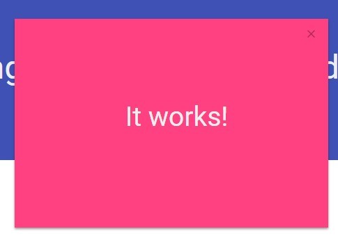
dialog type including modal dialog, alert dialog, mask layer, toast dialog


Guide, Demos and Documents
Explorer on
The Vuejs version: v-dialogs
If you think this project is helpful, please star it.
Features
- jQuery plugin, on Bootstrap Modal plugin basis to extend
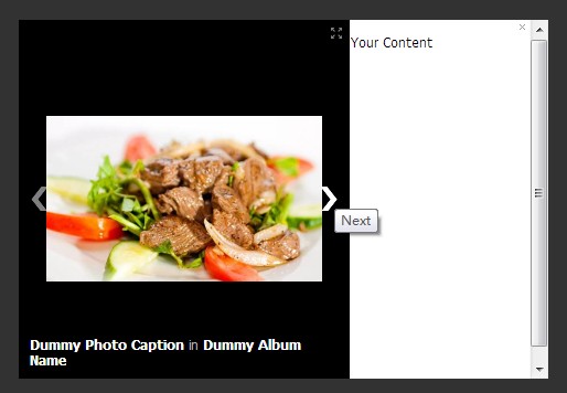
- multi-layer Nested modal dialog
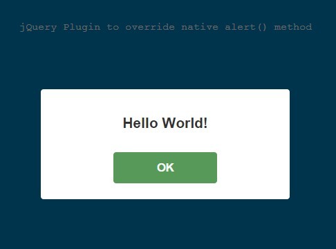
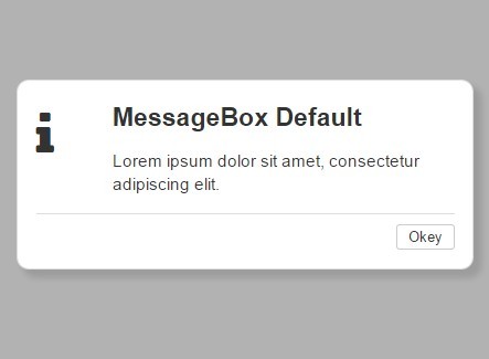
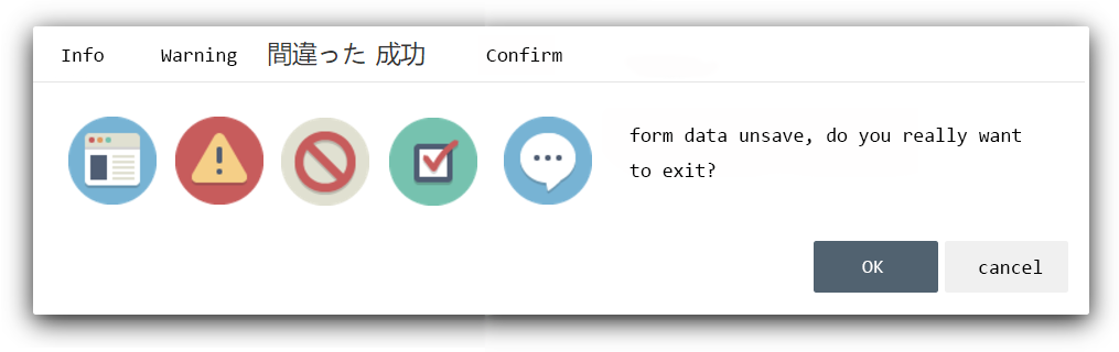
- alert mode dialog provide
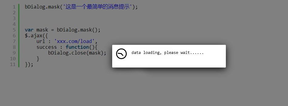
info、warning、error、success、confirmtypes - mask layer block all element when data loading
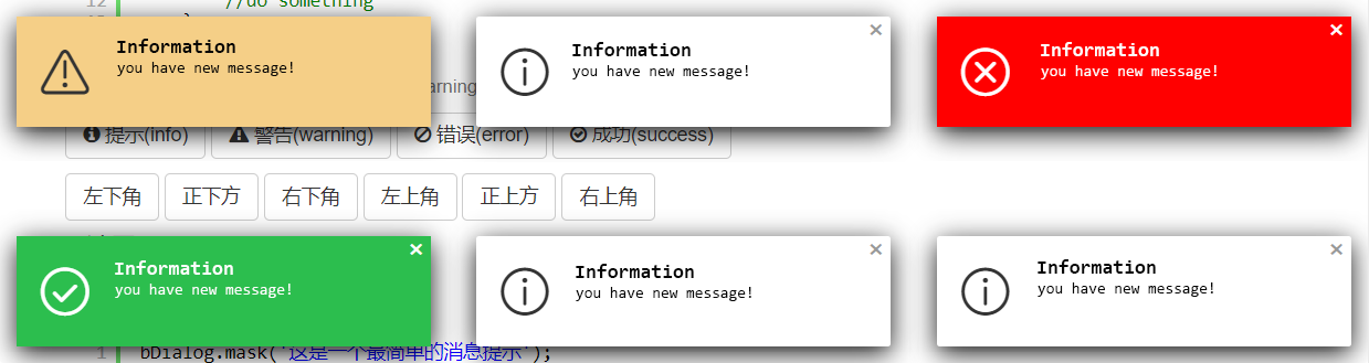
- toast dialog, provide
info、warning、error、successtypes and 6 corner position - flexible style setting
- when browser size changes, the dialog will automatically repositioned to the center of the browser
- dialog area outside the click, the window automatically positioning and other scenes have a corresponding reminder animation
The Alert Dialog Icon
the icons in alert dialog used are made by Elegant Themes and control icon, toast icon used are come from IconFont
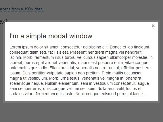
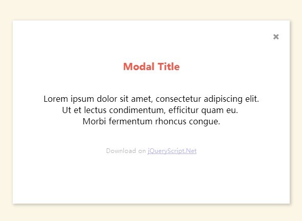
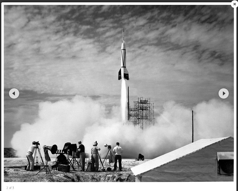
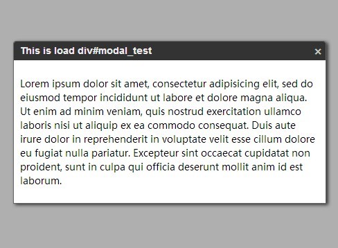
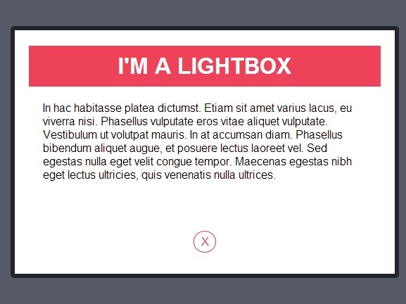
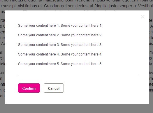
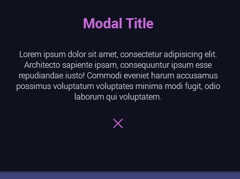
Plugin Preview
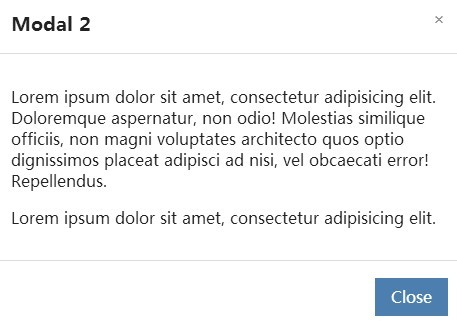
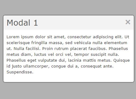
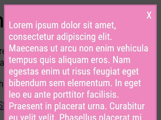
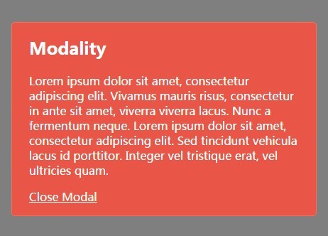
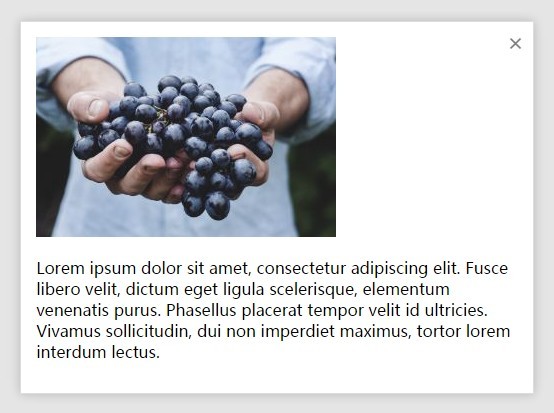
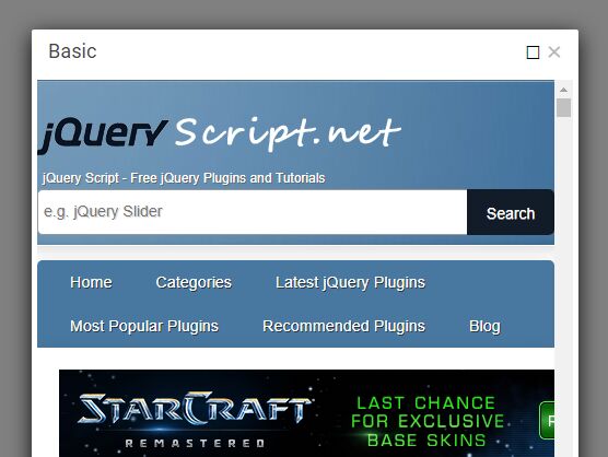
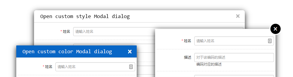
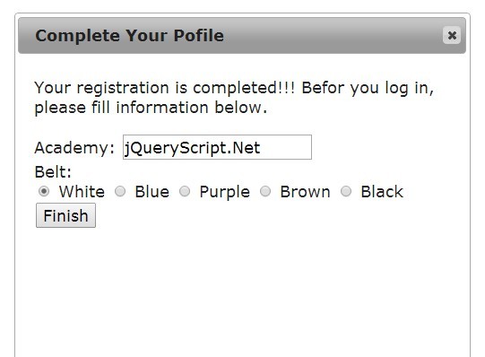
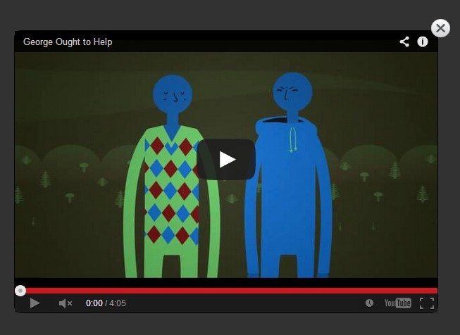
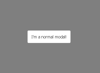
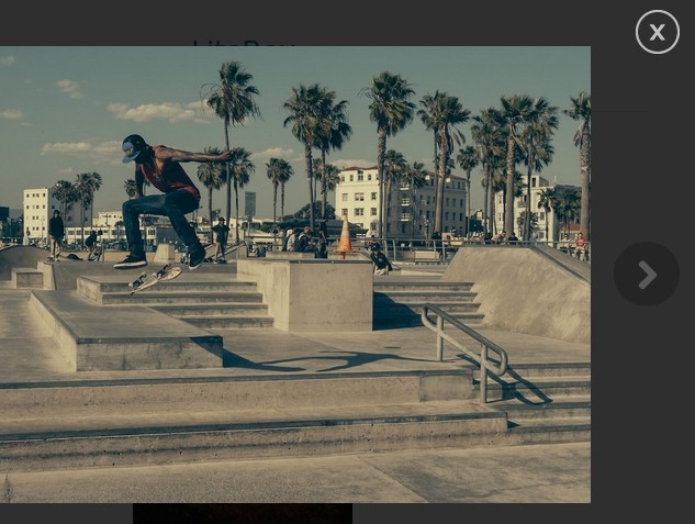
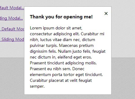
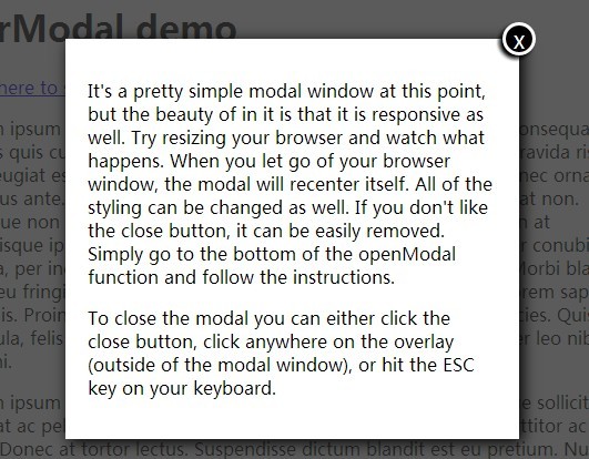
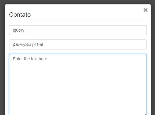
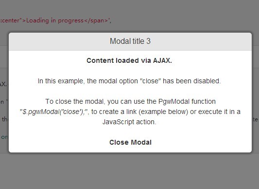
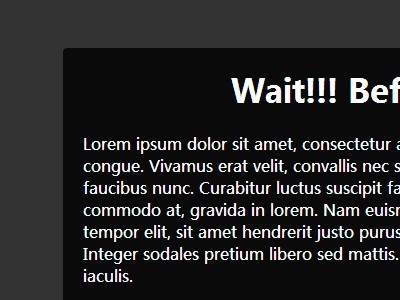
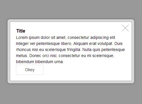
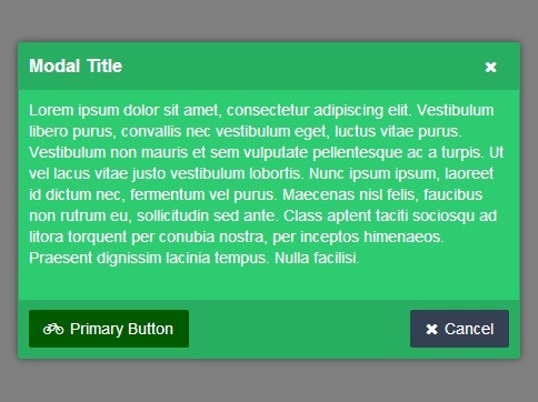
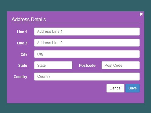
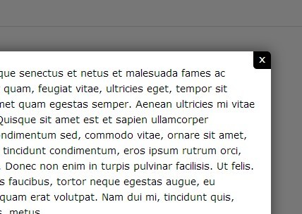
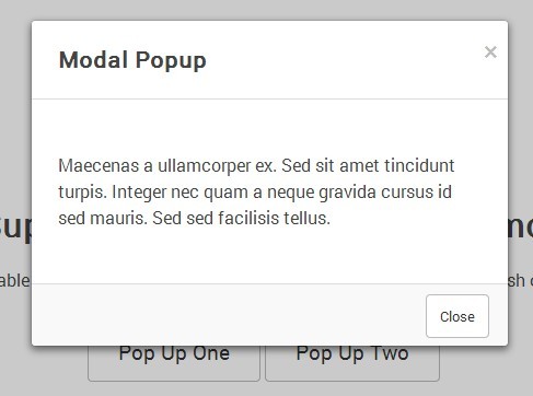
Modal Mode
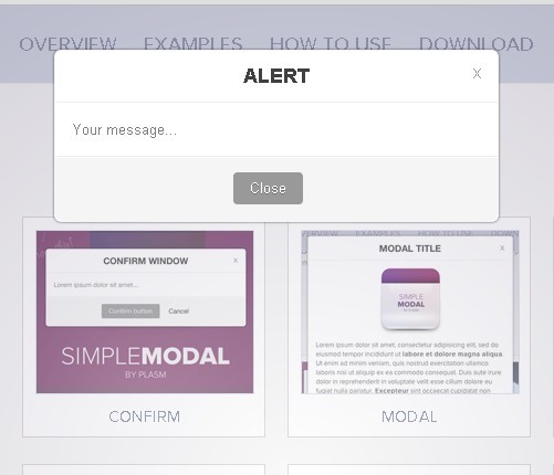
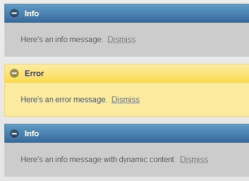
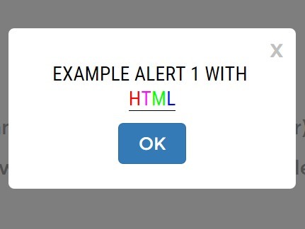
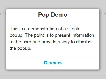
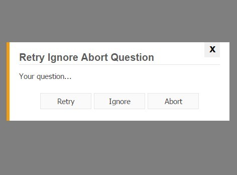
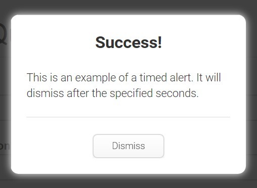
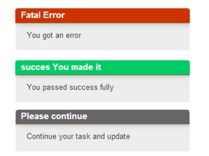
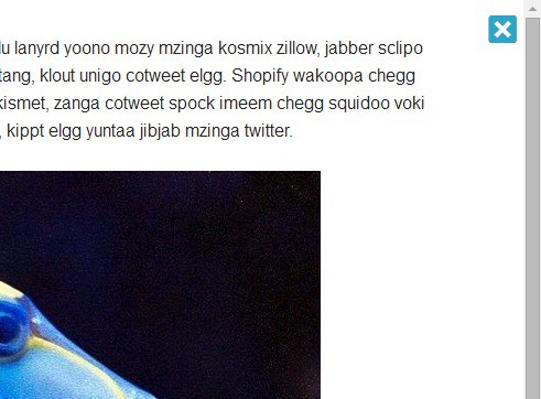
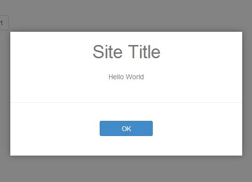
Alert Mode
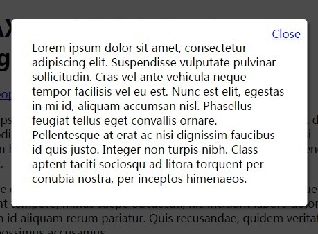
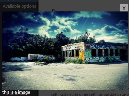
Mask Mode
Toast Mode
Install
download bDialog plugin zip file by last release, or Click me to download bDialog
or use NPM
npm i bdialog Usage
As you can see in the Demo page, you will need to include:
- jQuery library (1.6.0+), untest on jquery2.x & 3.x
- The JavaScript file b.dialog.js (or its minified version b.dialog.min.js)
- The css file b.dialog.bootstrap3.css for bootstrap3.x , b.dialog.css for bootstrap2.x
Including files
<!-- include for Bootstrap2.x --> <link rel="stylesheet" href="b.dialog.css" type="text/css"> <!-- include for Bootstrap3.x --> <link rel="stylesheet" href="b.dialog.bootstrap3.css" type="text/css"> <!-- Above the css file under your css framework choose one of them to include --> <!-- jquery-ui draggable liabrary if you need dialog drag function --> <script type="text/javascript" src="jquery-ui.min.js" >< /script> <script type="text/javascript" src="b.dialog.js" >< /script>Open a Modal dialog
bDialog.open({ title : 'User Info Modify', width : 500, height : 450, url : 'http://aa.com/load', params : { 'userName' : 'Bryant' }, callback:function(data){ if(data && data.results && data.results.length > 0 ){ bDialog.alert('已完成弹出窗口操作!<br>接收到弹出窗口传回的 userName 参数,值为:<b>' + data.results[0].userName + '</b>'); }else{ bDialog.alert('弹出窗口未回传参数',$.noop,{ messageType : 'error' }); } } });Quick Demo
//Modal : bDialog.open({ url : 'http://some url' }); bDialog.open({ dom : $('#some element').html() }); //Alert : bDialog.alert('your message'); bDialog.alert('your message',function(){ //your callback }); //Mask : bDialog.mask(); //Toast : bDialog.toast('your message'); bDialog.toast('your message',{ //toast dialog type messageType : 'warning', //show dialog in topleft position position : 'topLeft', //don't show close button dialogCloseButton : false, //auto close dialog time(second),default 3s closeTime : 0 });Options
-
backdrop
string | boolean
default : 'static'
the dialog backdrop layer set- 'static' : click the backdrop can not close the dialog
- false : do not show backdrop
- true : show backdrop, but click the backdrop will close dialog
-
title
string | boolean
default : '对话框'
set text to show in title bar,setfalseto close the title bar -
language
string
default : 'cn'
dialog using language
| Code | Language |
|---|---|
| cn | chinese |
| en | english |
| jp | japanse |
-
width
number
default : 700
dialog width, only work on modal dialog mode -
height
number
default : 400
dialog height, only work on modal dialog mode -
animation
boolean
default : true
whether show animation when dialog open -
dialogCloseButton
boolean
default : true
whether show the 'X' close button -
dialogMaxButton
boolean
default : true
whether show maximize button -
closeButton
boolean
default : false
whether to close dialog bottom bar, only work in Modal dialog mode -
scroll
boolean
default : true
whether to display the scroll bar -
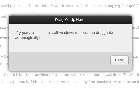
drag
boolean
default : true
whether to allow the window to be draggedthe drag function is depend on jquery-ui draggable liabrary,if not include it, drag function will auto close
-
url
string
default : false
the remote page url open in modal dialog -
params
object
default : undefined
pass the parameters to the new open modal dialog, in the new modal dialog you can get parameters like thisvar params = bDialog.getDialogParams();
example
params : { name : 'Michael', num : 23 }
-
dom
object
default : undefined
the html element or javascript object or jquery object to show in modal dialog -
fullWidth
boolean
default : false
whether to show full width modal dialog -
customClass
string
default : undefined
specify custom style class name -
show
boolean
default : false whether show dialog when dialog init finish -
onShow
function
default : undefined
before dialog show callback -
onShowed
function
default : undefined
when the dialog has been made visible to call this callback -
onHide
function
default : undefined
before dialog close callback -
onHidden
function
default : undefined
when dialog completely close callback -
callback
function
default : undefined
when dialog close callback, this callback different from others callback its can be return data to caller.
param
dataobjectreturn to caller data
example{ callback : function(data){ if(data && data.results && data.results.length > 0 ){ $('#input').val(data.results[0]); } } } //the param data is come from bDialog.close('i am return data'); -
messageType
string
default : 'info'
setup alert dialog, toast dialog type, the full type is- info(default)
- warning
- error
- success
- confirm(only work on alert dialog)
the different type will show different icon
-
position
string
default : 'bottomRight'
toast dialog display position, the full position is- topLeft
- topCenter
- topRight
- bottomLeft
- bottomCenter
- bottomRight(default)
-
closeTime
number
default : 3(second)
auto close toast dialog time, set 0 to disabled auto close dialog -
cancel
function
default : undefined
when alert dialog mode, and alert type is confirm, this callback is used to the cancel button callback
examplecancel : function(dialog){ bDialog.alert('The deal was canceled'); }
API
- open
open a modal dialog
param- params example
bDialog.open({ url : 'http://someurl' }); //so simple to open a remote page in modal dialog
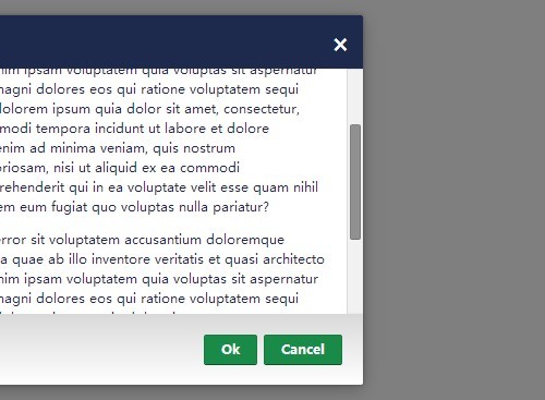
- close
close opened dialog (modal, alert, mask)
param- data
objectreturn to caller data - [dialog]
objectoptional to set, if you have a opened dialog object,you can directly to it. if no setup this param, plugin will close the last open dialog example
bDialog.close({name:'Michael',num:23});//close and return data(last open dialog) var dlg = bDialog.open({...}); $('#theBtn').click(function(){ bDialog.close({name:'Michael',num:23},dlg); });
- data
- getDialog
get last opened dialog (modal, alert, mask)var dlg = bDialog.getDialog();
- getDialogParams
get params data from open dialog paramsin the opened modal dialog, you can get params like thisbDialog.open({ params : { name : 'Michael', num : 23 } });
var params = bDialog.getDialogParams(); $('#name').val(params.name);
- alert
open a message alert dialog, the alert dialog can be info, warning, error, success, confirm types param- message
stringthe message show in alert dialog - callback
functionclose alert dialog callback - params
objectsetup alert dialog params
bDialog.alert('a am info message');//just show message bDialog.alert('a am info message',function(){ $('#name').val(''); });//show message and do something when alert dialog close bDialog.alert('a am info message',function(){ $('#name').val(''); },{ messageType : 'confirm',//open confirm alert dialog cancel : function(){ $('#name').val('my default name'); } });//show message, callback,and setup init params
- message
- mask
param- message
- params
bDialog.mask();//show a block every element layer and default prompt message bDialog.mark('please wait for a moment...');//show a mask and custom text
- toast
param- message
- params
//show a corner toast dialog, default position on bottomRight bDialog.toast('your message'); bDialog.toast('your message',{ //toast dialog type messageType : 'warning', //show dialog in topleft position position : 'topLeft', //don't show close button dialogCloseButton : false, //auto close dialog time(second),default 3s closeTime : 0 });

