Introduce
Tabs component of React,designed for mobile.Support gestures and lots of tabs.
Installation
$ npm install silk-tabs --saveHow To Use
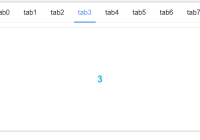
import React from 'react'; import ReactDOM from 'react-dom'; import Tabs from 'silk-tabs'; import 'silk-tabs/style/Tabs.css'; const numberOfTabs = 8; const tabs = [...new Array(numberOfTabs)].map((_, i) => `tab${i}`); const Panels = [...new Array(numberOfTabs)].map((_, i) => ( <div key={i}> <div className="myItem">{i}</div> </div> ) ); const tabPanelStyle = { container: { overflow: 'hidden', visibility: 'hidden', position: 'relative' }, wrapper: { overflow: 'hidden', position: 'relative' }, child: { float: 'left', width: '100%', position: 'relative', transitionProperty: 'transform', height: '250px' } } const onChange = index => { // Don't do costing things. // Meybe you should not use this api,use transitionEnd instead. console.log(`onChange:${index}`) } const transitionEnd = index => { // You may do some costing things here instead of in onChange callback for better performance! // fetch() // render() console.log(`transitionEnd:${index}`) } const TabsExample = () => ( <div> <Tabs defaultIndex={2} onChange={onChange} transitionEnd={transitionEnd} tabs={tabs} tabPanelStyle={tabPanelStyle} className="myTabs" > {Panels} </Tabs> </div> ) API
Tabs
Props
| Property | Description | Type | Default |
|---|---|---|---|
| className | className of container | String | |
| defaultIndex | default index position of tabs | Number | 0 |
| onChange | runs at tab change | Function | |
| transitionEnd | runs at the end slide transition | Function | |
| tabs | contents of tabs | Array[React.node] | |
| containerStyle | style of container | ||
| tabStyle | style of tabs,useful when tabs fixed top | ||
| tabPanelStyle | style of TabPanels |
tabPanelStyle defaults
style: { container: { overflow: 'hidden', visibility: 'hidden', position: 'relative' }, wrapper: { overflow: 'hidden', position: 'relative' }, child: { float: 'left', width: '100%', position: 'relative', transitionProperty: 'transform' } Tabs.css is styled by px,you can change to rem if needed,for example:
.silk-tabs-nav-scroller .silk-tabs-tab { display: inline-block; padding: 0 .3rem; font-size: 15px; height: .88rem; line-height: .88rem; }


