react-drag-drawer

Mobile draggable drawer that falls back to modals on desktop
Install
$ npm install react-drag-drawer --save Usage
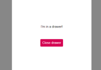
import Drawer from 'react-drag-drawer' .. toggle = () => { let { toggle } = this.state this.setState({ toggle: !toggle }) } render () { const { open } = this.state return ( <Drawer open={open} onRequestClose={this.toggle} > <div>Hey Im inside the drawer!</div> </Drawer> ) }API
| Param | Type | functionality | required |
|---|---|---|---|
| open | Boolean | null | true |
| children | Node | null | true |
| onRequestClose | Function | null | true |
| onDrag | Function | invoked on drag | false |
| onOpen | Function | invoked on drawer focus | false |
| notifyWillClose | Function | notify consumer if the drawer will close at touch release | false |
| allowClose | Boolean | block closing if allowClose={false}, default is true | false |
| modalElementClass | String | className to be applied to top element | false |
| containerElementClass | String | className to be applied to the drawer container element | false |
| parentElement | ref | block scrolls on element if you're not using body scrolling | false |
| direction | String | direction to translate drawer | false |
| dontApplyListeners | Boolean | skip applying internal event listeners to the dom | false |
| inViewportChange | Function | detect when drawer is at top of viewport | false |
| getModalRef | Function | get modal (draggable element) ref | false |
| getContainerRef | Function | get container (overlay) ref | false |
Example modal style
.modal { outline: none; background: white; font-size: 1.6rem; width: 76rem; max-width: 90%; display: flex; justify-content: space-between; flex-direction: column; z-index: 15; min-height: 47rem; will-change: transform; transform: translate3d(0, 0, 0); } @media (max-width: 768px) { .modal { width: 100%; max-width: 100%; margin-bottom: 0; border-top-left-radius: 8px; border-top-right-radius: 8px; } }License
MIT © Jack Hanford


