Bootstrap Mobile Nav
Is a lightweight vanilla JavaScript plugin that makes it easy to create mobile navigation with the Bootstrap 4 framework by just initializing the plugin. There's no need to write the markup as BMN does that for you.
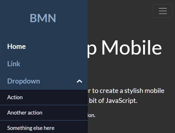
Demo
Installation
BMN is dependent on the Bootstrap 4 framework (only the CSS).
Include both the BMN JavaScript and CSS files in the HTML document. Then initialize it with the following code:
let bmn = new BMN(); bmn.init(); Options
There are several options available to customize the plugin. The following are the defaults.
var defaults = { toggler: ".navbar-toggler", // specify the toggle button slideFrom: "left", // left or right offCanvas: false, dropdown: { icon: "chevron" // chevron or plus }, footer: { show: false, content: null // add custom content in the footer } }; 


