React SimpleTabs
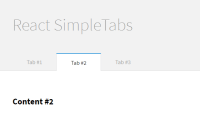
This is a simple <Tabs> component built with ReactJS.
See the Demo.
Install
Installing this component is very easy and it has just one dependency: React. So, you have a lot of options to do that:
- Using NPM
the quickest way
$ npm install --save react-simpletabs- Using Bower
$ bower install --save react-simpletabs- Or if you want to download the lastest release and put in your website, it will work too!
NOTICE: You need just one thing to make the component work. Put the base component style at the <header> tag. If you don't wanna use the .css extension, you can get the .styl or .scss extension at the folder ./lib.
Then you're done!
Usage
Using the component is simpler than installing. See an example with browserify to bundle your script:
/** @jsx React.DOM */ var Tabs = require('react-simpletabs'); var App = React.createClass({ render: function() { return ( <Tabs> <Tabs.Panel title='Tab #1'> <h2>Content #1 here</h2> </Tabs.Panel> <Tabs.Panel title='Tab #2'> <h2>Content #2 here</h2> </Tabs.Panel> <Tabs.Panel title='Tab #3'> <h2>Content #3 here</h2> </Tabs.Panel> </Tabs> ); } }); React.renderComponent(<App />, mountNode);If you decide to use just Javascript without any module loader, you can get the global variable window.ReactSimpleTabs (or just ReactSimpleTabs):
/** @jsx React.DOM */ var Tabs = ReactSimpleTabs; var App = React.createClass({ render: function() { ... } });<Tabs.Panel>
Well, the Tabs.Panel component is a namespaced component of the Tabs, this is easiest way and you avoid to declare a bunch of variables.
NOTE: It is required that you put the title property to the Tabs.Panel component. Without this, the component won't work, ok?
Behind the Scene
There are some things that you should know about the component. The first one is the structure created inside by the component if you wish to stylize it.
So, the semantic HTML structure will be something like this:
<div class='tabs'> <nav class='tabs-navigation'> <ul class='tabs-menu'> <li class='tabs-menu-item is-active'>Tab #1</li> <li class='tabs-menu-item'>Tab #2</li> </ul> </nav> <article class='tab-panel'> The content of active panel here </article> <div>This is a very simple structure to stylize however you want. So, if you are lost, don't panic, there is a real functional example that you can follow.
The other thing that I have to share with you is that the component has some properties that you can use. Example:
If you want to set a default tab active you can use the tabActive property:
... render: function() { return ( <Tabs tabActive={2}> ... </Tabs> ); } ...And if you want to do something before or after the changed tab, you can do use the onBeforeChange or onAfterChange property (or both together):
... handleMount: function(selectedIndex, $selectedPanel, $selectedTabMenu) { console.log('on mount, showing tab ' + selectedIndex); }, handleBefore: function(selectedIndex, $selectedPanel, $selectedTabMenu) { console.log('Something before tab ' + selectedIndex); }, handleAfter: function(selectedIndex, $selectedPanel, $selectedTabMenu) { console.log('Something after tab ' + selectedIndex); }, render: function() { return ( <Tabs tabActive={2} onBeforeChange={this.handleBefore} onAfterChange={this.handleAfter} onMount={this.handleMount}> ... </Tabs> ); } ...For more details, check out the API below.
Component API
<Tab> component:
| Property | Type | Default | Required | Description |
|---|---|---|---|---|
| className | Array|Object|String | n/a | no | Additional class names for wrapping div |
| tabActive | Number | 1 | no | The default tab active |
| onMount | Function | n/a | no | The function that will be executed when the component is mounted |
| onBeforeChange | Function | n/a | no | The function that will be executed before the state of the component change. Return false to cancel the change to the active tab. |
| onAfterChange | Function | n/a | no | The function that will be executed after the state of the component change |
<Tab.Panel> component:
| Property | Type | Default | Required | Description |
|---|---|---|---|---|
| title | String | n/a | yes | The title that will generate the tab menu items |
Contributing
Anyone can help make this project better - check out the Contributing guide!
License
See the License file.


