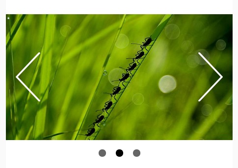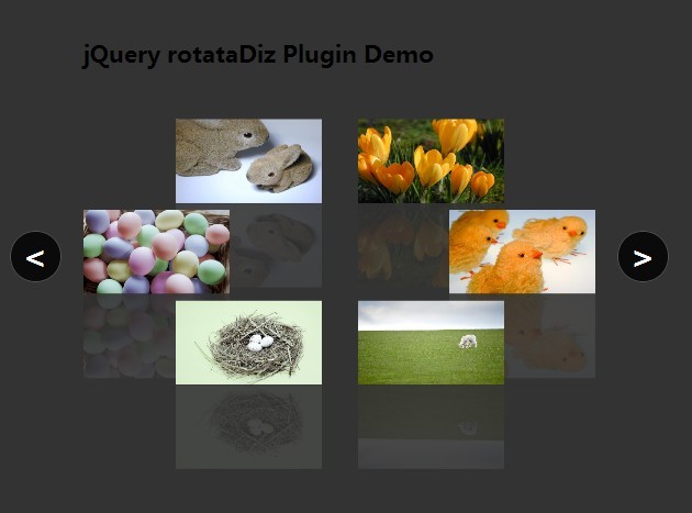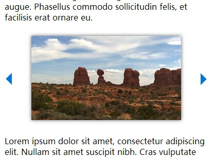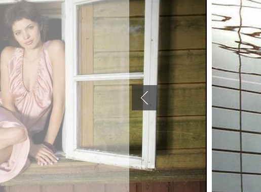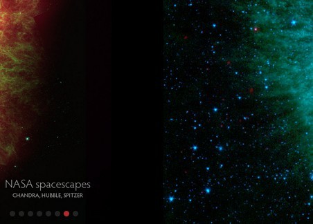
jQuery Cascade Slider
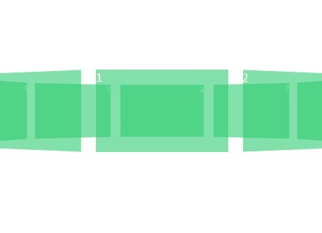
Cascade Slider is a super lightweight jQuery plugin used for generating an image carousel slider that acts like a 3D rotator with navigation and pagination. Works on modern browsers which have CSS3 transform and transition support.
How to use
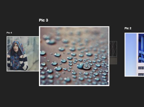
Build the html structure for the 3D image rotator and add your own images together with the navigation and pagination following the Html snippets like this:
<div class="cascade-slider_container" id="cascade-slider"> <div class="cascade-slider_slides"> <div class="cascade-slider_item"> <h3>Pic 1</h3> <img src="1.jpg" alt=""> </div> <div class="cascade-slider_item"> <h3>Pic 2</h3> <img src="2.jpg" alt=""> </div> <div class="cascade-slider_item"> <h3>Pic 3</h3> <img src="3.jpg" alt=""> </div> </div> <ol class="cascade-slider_nav"> <li class="cascade-slider_dot cur"></li> <li class="cascade-slider_dot"></li> <li class="cascade-slider_dot"></li> <li class="cascade-slider_dot"></li> <li class="cascade-slider_dot"></li> <li class="cascade-slider_dot"></li> </ol> <span class="cascade-slider_arrow cascade-slider_arrow-left" data-action="prev">Prev</span> <span class="cascade-slider_arrow cascade-slider_arrow-right" data-action="next">Next</span> </div> The core CSS styles for the 3D rotator.
.cascade-slider_container { position: relative; width: 1000px; height: 500px; margin: 0 auto; } .cascade-slider_item { position: absolute; top: 50%; left: 50%; transform: translateY(-50%) translateX(-50%) scale(0.3); transition: all 1s ease; opacity: 0; z-index: -1; } .cascade-slider_item.next { left: 50%; transform: translateY(-50%) translateX(-150%) scale(0.6); opacity: 1; z-index: 1; } .cascade-slider_item.prev { left: 50%; transform: translateY(-50%) translateX(50%) scale(0.6); opacity: 1; z-index: 1; } .cascade-slider_item.now { top: 50%; left: 50%; transform: translateY(-50%) translateX(-50%) scale(1); opacity: 1; z-index: 5; } Style the next / prev navigation and bottom pagination.
.cascade-slider_arrow { display: inline-block; position: absolute; top: 50%; cursor: pointer; z-index: 5; } .cascade-slider_arrow-left { left: 0; } .cascade-slider_arrow-right { right: 0; } .cascade-slider_nav { position: absolute; bottom: -120px; width: 100%; text-align: center; z-index: 5; } .cascade-slider_dot { display: inline-block; width: 1em; height: 1em; margin: 1em; background: #ddd; list-style: none; cursor: pointer; } .cascade-slider_dot:hover { background: #555; } .cascade-slider_dot.cur { background: #555; } Include jQuery library and the jQuery Cascade Slider's JavaScript file at the bottom of the webpage.
<script src="//code.jquery.com/jquery-2.1.4.min.js"></script> <script src="cascade-slider.js"></script> Active the 3D rotator.
$('#cascade-slider').cascadeSlider(); You can change the default CSS selectors by passing the following options during initialization.
$('#cascade-slider').cascadeSlider({ itemClass: 'cascade-slider_item', arrowClass: 'cascade-slider_arrow' });