react-native-mediapicker 


Media Picker for React Native
Props
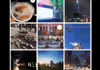
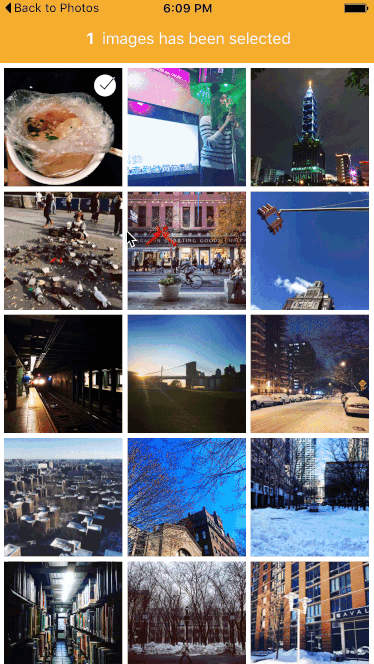
callback: required Callback function when images was selected.groupTypes: The group where the photos will be fetched, one of 'Album', 'All', 'Event', 'Faces', 'Library', 'PhotoStream' and 'SavedPhotos'. (Default: SavedPhotos)assetType: The asset type, one of 'Photos', 'Videos' or 'All'. (Default: Photos)maximum: Maximum number of selected images. (Default: 15)imagesPerRow: Number of images per row. (Default: 3)imageMargin: Margin size of one image. (Default: 5)selectedMarker: Custom selected image marker component. (Default: checkmark).backgroundColor: Set background color. (Default: white).selected: set preselected items (Default: none ).showLoading: show loading spinners before image will show? (Default: true ).
Installation
npm i -S react-native-mediapickeror
yarn add react-native-mediapickerLink Native Modules (IOS)
In XCode, you need to add a link to RCTCameraRoll. You will find more information in the react-native docs
Add Purpose String (IOS)
For IOS10 you need to add a “Privacy - Photo Library Usage Description”-key to Info.plist. For more information, see this blog
Usage Examples
import MediaPicker from "react-native-mediapicker"<MediaPicker callback={items => this.whenClicked(items)} groupTypes="SavedPhotos" assetType="Photos" maximum={1} imagesPerRow={3} imageMargin={5} showLoading={true} backgroundColor="black" selectedMarker={ <Image style={[styles.checkIcon, {width: 25, height: 25, right: this.props.imageMargin + 5},]} source={require('./checkmark.png')} /> } />


