Material-UI Rating


Installation
Stable channel
npm install material-ui-rating@nextUsage
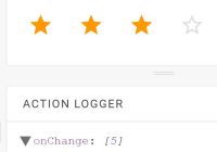
import Rating from 'material-ui-rating' <Rating value={3} max={5} onChange={(value) => console.log(`Rated with value ${value}`)} />Material Rating Properties
| Name | Type | Default | Description |
|---|---|---|---|
| classes* | object | Useful to extend the style applied to components. The accepted keys are listed below. | |
| component | elementType | div | The component used for the root node. Either a string to use a DOM element or a component. |
| disabled | bool | false | Disables the rating and gray it out if set to true. |
| iconFilled | node | This is the icon to be used as an icon in value range. | |
| iconFilledRenderer | func | Overrides filled icon renderer. | |
| iconHoveredRenderer | func | Overrides hovered icon renderer. | |
| iconHovered | node | This is the icon to be used as an hovered icon. | |
| iconNormal | node | This is the icon to be used as an normal icon. | |
| iconNormalRenderer | func | Overrides normal icon renderer. | |
| max | number | 5 | The max value of the rating bar. |
| onChange | func | Fired when a value is clicked. | |
| readOnly | bool | false | Don't allow input if set to true. |
| value | number | 0 | The value of the rating bar. |
* required property
CSS API
You can override all the class names injected by Material-UI-Rating thanks to the classes property. This property accepts the following keys:
root- Applied to the rootdivelementiconButton- Applied to the IconButton componenticon- Applied to the SvgIcon componentdisabled- Applied to the IconButton component when disabled prop istruereadOnly- Applied to the IconButton component when readOnly prop istrue
RTL support
Following Material-UI's conventions, this package respects theme.direction.rtl, so right-to-left support works out-of-the-box.
License
The files included in this repository are licensed under the MIT license.


