react-native-floating-action
Floating action button for React Native
Expo example
Open the following click on your phone: Expo link
or user your phone and scan the following QR:

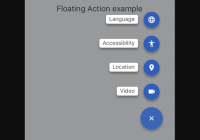
Example of how Expo looks
Installation
npm i react-native-floating-action --save or
yarn add react-native-floating-action Example
Take a look into example/ReactNativeFloatingAction-Expo
To execute the example using Expo run the following command:
yarn run run:exampleor open Expo link from your mobile
How to use it
First step: import the component:
import { FloatingAction } from "react-native-floating-action";Second step: define the buttons
const actions = [ { text: "Accessibility", icon: require("./images/ic_accessibility_white.png"), name: "bt_accessibility", position: 2 }, { text: "Language", icon: require("./images/ic_language_white.png"), name: "bt_language", position: 1 }, { text: "Location", icon: require("./images/ic_room_white.png"), name: "bt_room", position: 3 }, { text: "Video", icon: require("./images/ic_videocam_white.png"), name: "bt_videocam", position: 4 } ];Third step: use it
<View style={styles.container}> <Text style={styles.example}>Floating Action example</Text> <FloatingAction actions={actions} onPressItem={name => { console.log(`selected button: ${name}`); }} /> </View>Open and hide it programatically
There are some cases where you want to show or hide the component without pressing the main button:
<FloatingAction ref={(ref) => { this.floatingAction = ref; }} actions={[...]} ... />and then:
this.floatingAction.animateButton();Configuration
FloatingAction
| Property | Type | Default | Description |
|---|---|---|---|
| actions | array | [] | Actions to be show once user press the main button |
| color | string | #1253bc | Color of the main button |
| distanceToEdge | number | 30 | Distance from button to edge |
| visible | boolean | true | Hide or Show the component using an animation |
| overlayColor | string | rgba(68, 68, 68, 0.6) | Color of the background overlay |
| position | string | right | Position to render the main button and actions, options: (left, right, center) |
| overrideWithAction | string | false | Override the main action with the first action inside list actions, will not show other action |
| floatingIcon | node | ReactElement | |
| showBackground | boolean | true | Show or Hide background after open it |
| openOnMount | boolean | false | Open component after mounting it, useful on some weird cases like tutorials |
| actionsPaddingTopBottom | number | 8 | Change distance between actions |
| iconWidth | number | 15 | Icon width of the main button |
| iconHeight | number | 15 | Icon height of the main button |
| listenKeyboard | boolean | false | Change position when the keyboard will appear |
| dismissKeyboardOnPress | boolean | false | Dismiss keyboard when user press on the main button |
| shadow | object | { shadowOpacity: 0.35, shadowOffset: { width: 0, height: 5 }, shadowColor: "#000000", shadowRadius: 3 } | Change how we render the shadow of every button, this style will apply to the main button and to every action button |
| onPressItem | function | Function to be call as soon as the user select an option from actions. Will return the name of the action. | |
| onPressMain | function | Function to be call as soon as use click main button and will return true or false depeneding of the state. | |
| onPressBackdrop | function | Function to be call as soon as the backdrop is clicked. | |
| onClose | function | Function to be call after set state to false | |
| onOpen | function | Function to be call after set state to true | |
| onStateChange | function | Function to be call after every state change. Will return state object | |
| animated | boolean | true | Enable the animation |
Actions
| Property | Type | Default | Description |
|---|---|---|---|
| color | string | #1253bc | Color of the action button |
| icon | any | Icon to be rendered inside the action, will accept an URL or React.Image. If we want to send an URL we need to send it in this way: icon: { uri: 'https://imageurl.com' } if we want to send a React.Image we will use it in this way: icon: require('path/image') | |
| name | string | Name of the icon, this name is used as parameter for onPressItem action | |
| text | string | Text to show near to the button. (Only apply for position = ['left', 'right']) | |
| textBackground | string | #ffffff | Background color for Text container |
| textColor | string | #444444 | Text color for every action |
| textElevation | number | 5 | Elevation property (also modifies "shadowOffset" in iOS) |
| render | function | Custom render function for Action. If provided, other properties are not applicable. The provided function should return a React Node | |
| margin | number | 8 | Additional margin for action. This property is useful when we want to override the current margin for example using custom render |
| size | number | 40 | size of of the icon rendered inside the action |
TODO
- first implementation
- example
- add colors configurations
- add more positions like left, center and right
- support hide or show the component with an animation
- change plus icon to be customizable
- use components as icon
- hide background
- open on mounting
- migrate to TypeScript
- allow user defined animations
- use crazy animations


