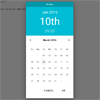
Material Datetime Picker
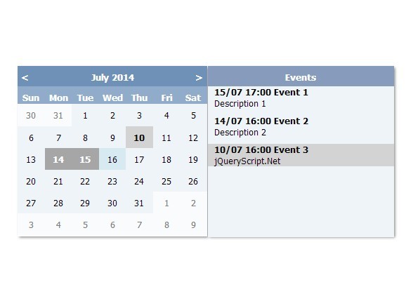
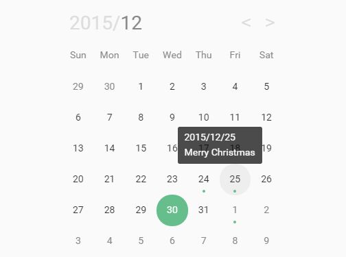
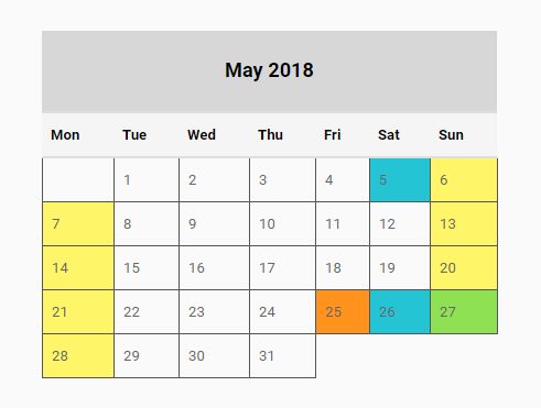
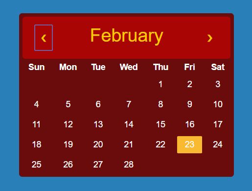
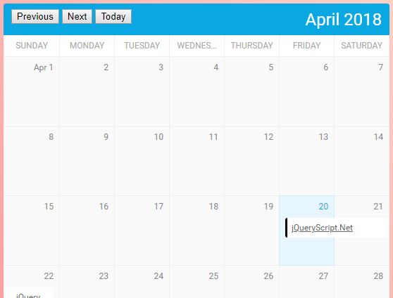
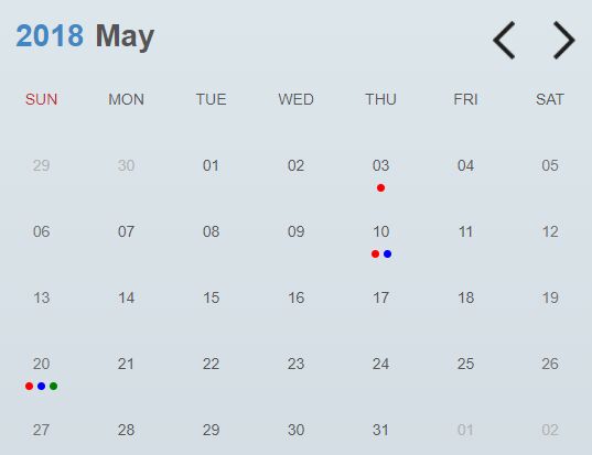
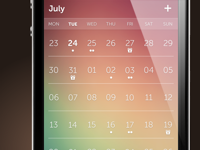
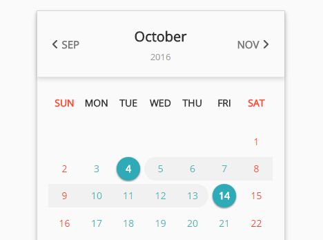
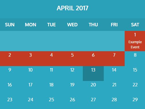
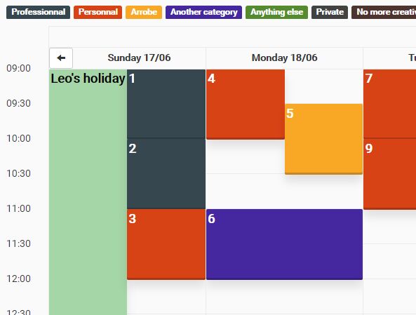
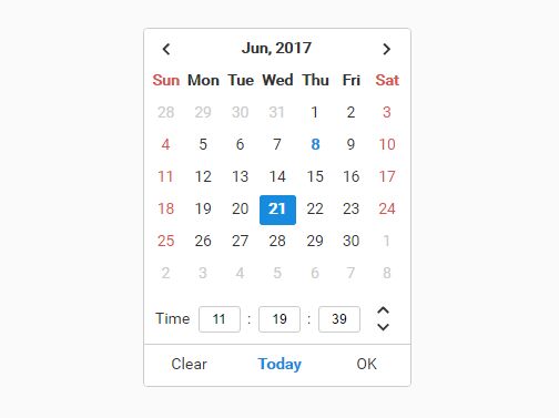
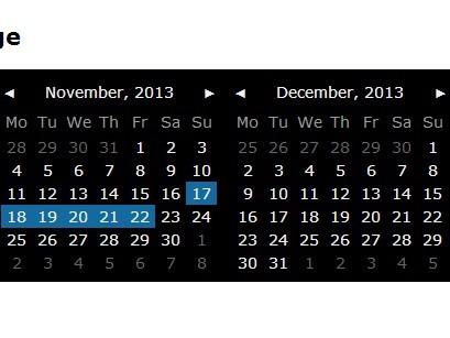
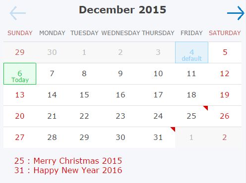
A Material Design date/time picker modal, built for the web. Works well with Materialize, or standalone.
https://ripjar.github.io/material-datetime-picker/
Installation
npm install material-datetime-picker Dependencies
The picker depends on Google's Material Design icons (packaged with Materialize), or included in the head of the document;
<link href="https://fonts.googleapis.com/icon?family=Material+Icons" rel="stylesheet">For best results also include Google's Material Font Roboto;
<link href='https://fonts.googleapis.com/css?family=Roboto' rel='stylesheet' type='text/css'>If you want to use this project as a standalone <script>, you can use dist/material-datetime-picker.js. You'll need to include moment.js and rome.js as well:
<script src="https://cdnjs.cloudflare.com/ajax/libs/rome/2.1.22/rome.js"></script> <script src="https://cdnjs.cloudflare.com/ajax/libs/moment.js/2.17.1/moment.js"></script> <script src="material-datetime-picker.js" charset="utf-8"></script>Usage
Manual (recommended)
The picker can be instantiated and interacted with manally;
import MaterialDateTimePicker from 'material-datetime-picker'; const picker = new MaterialDateTimePicker() .on('submit', (val) => console.log(`data: ${val}`)) .on('open', () => console.log('opened')) .on('close', () => console.log('closed')); document.querySelector('.c-datepicker-btn') .on('click', () => picker.open()); As form input
The picker is decoupled from any single form element for simplicity. However, it should be simple to link the picker to a form input or button. For instance, given the input element <input class="c-datepicker-input" />, the following could be written;
import MaterialDateTimePicker from 'material-datetime-picker'; const input = document.querySelector('.c-datepicker-input'); const picker = new MaterialDateTimePicker() .on('submit', (val) => { input.value = val.format("DD/MM/YYYY"); }); input.addEventListener('focus', () => picker.open()); Options
All options are optional, including the el.
{ // DOM Element to attach the datepicker. This element will receive // events when the data changes. If an input element, will be // populated with formatted date and time chosen. // `el` must be a DOM Element object. Selectpr strings or wrappers // like a jQuery selection are not supported. el: document.querySelector('.c-datepicker-btn'), // if `el` is set, the format used to display the datetime in the input, format: 'DD/MM/YY', // the default value of the picker default: moment(), // the container to append the picker. If you change this, you need to make // sure your element has a z-index > 0 so that it displays in front of the scrim. container: document.body, // cosmetic classes that can be overriden // mostly used for styling the calendar styles: { scrim: 'c-scrim', back: 'c-datepicker__back', container: 'c-datepicker__calendar', date: 'c-datepicker__date', dayBody: 'c-datepicker__days-body', dayBodyElem: 'c-datepicker__day-body', dayConcealed: 'c-datepicker__day--concealed', dayDisabled: 'c-datepicker__day--disabled', dayHead: 'c-datepicker__days-head', dayHeadElem: 'c-datepicker__day-head', dayRow: 'c-datepicker__days-row', dayTable: 'c-datepicker__days', month: 'c-datepicker__month', next: 'c-datepicker__next', positioned: 'c-datepicker--fixed', selectedDay: 'c-datepicker__day--selected', selectedTime: 'c-datepicker__time--selected', time: 'c-datepicker__time', timeList: 'c-datepicker__time-list', timeOption: 'c-datepicker__time-option', clockNum: 'c-datepicker__clock__num' }, // date range to allow (see rome validator factories) dateValidator: null }License
MIT
