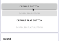
react-native-material-buttons


Material buttons with consistent behaviour on iOS and Android

Installation
npm install --save react-native-material-buttonsUsage
import React, { Component } from 'react'; import { TextButton, RaisedTextButton } from 'react-native-material-buttons'; class Example extends Component { render() { return ( <RaisedTextButton title='touch me' /> <TextButton title='do not touch me' disabled /> ); } }Common properties
| name | description | type | default |
|---|---|---|---|
| color | Button color | String | rgb(224, 224, 224) |
| shadeColor | Button shade color for focused state | String | rgb(0, 0, 0) |
| shadeOpacity | Button shade opacity for focused state | Number | 0.12 |
| shadeBorderRadius | Button shade border radius | Number | 2 |
| focusAnimationDuration | Button focus animation duration in ms | Number | 225 |
| disabled | Button availability | Boolean | false |
| disabledColor | Button color for disabled state | String | rgba(0, 0, 0, .12) |
| onPress | Touch up callback | Function | - |
Other Ripple properties will also work
TextButton properties
| name | description | type | default |
|---|---|---|---|
| title | Button title | String | - |
| titleColor | Button title color | String | rgb(0, 0, 0) |
| disabledTitleColor | Button title color for disabled state | String | rgb(153, 153, 153) |
| titleStyle | Button title style | Object | - |
RaisedTextButton properties
| name | description | type | default |
|---|---|---|---|
| title | Button title | String | - |
| titleColor | Button title color | String | rgb(66, 66, 66) |
| disabledTitleColor | Button title color for disabled state | String | rgba(0, 0, 0, .26) |
| titleStyle | Button title style | Object | - |
Example
git clone https://github.com/n4kz/react-native-material-buttons cd react-native-material-buttons/example npm install npm run ios # or npm run androidCopyright and License
BSD License
Copyright 2017 Alexander Nazarov. All rights reserved.


