react-matchmedia-connect


- Higher order components for the matchMedia API
- Receive props that indicate whether your media queries match
Installation
npm install react-matchmedia-connect --saveUsage
createMatchMediaConnect
createMatchMediaConnect lets you register a set of media queries. If one of the queries changes, you component will be updated.
import { createMatchMediaConnect } from 'react-matchmedia-connect'; // Define some media queries and give them a key const connect = createMatchMediaConnect({ isLandscape: '(orientation: landscape)', isMin400: '(min-width: 400px)', isTablet: '(min-width: 700px), handheld and (orientation: landscape)' });Then use this connect function throughout your app:
const Component = ({ isLandscape, isMin400 }) => ( <div> <div>{isLandscape ? 'landscape' : 'portrait'}</div> <div>{isMin400 ? 'at least 400' : 'less than 400'}</div> </div> ); // This component only needs `isLandscape` and `isMin400` const ConnectedComponent = connect(['isLandscape', 'isMin400'])(Component);const OtherComponent = ({ isTablet }) => ( isTablet ? <div>Tablet</div> : <div>No tablet</div> ); // This component only needs `isTablet` const OtherConnectedComponent = connect(['isTablet'])(Component); createResponsiveConnect
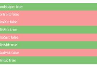
createResponsiveConnect expects a list of breakpoints and creates the respective media queries with createMatchMediaConnect. You'll get a isMin<Size> and isMax<Size> property for each breakpoint as well as a isPortrait and isLandscape property.
import { createResponsiveConnect } from 'react-matchmedia-connect'; const connect = createResponsiveConnect({ xs: 480, sm: 768, md: 992, lg: 1200 });const Component = ({ isMinMd, isMaxMd }) => ( <div> <div>{isMinMd ? 'greater than 992px' : 'less than 992px'}</div> <div>{isMaxMd ? 'less than 1200px' : 'greater than 1199px'}</div> <div>{isMinMd && isMaxMd ? 'between 992px and 1199px' : 'other'}</div> </div> ); // Only connect to `isMinMd` and `isMaxMd` const ConnectedComponent = connect(['isMinMd', 'isMaxMd'])(Component);API
createMatchMediaConnect(mediaQueries)
mediaQueries(Object): A set of media queries.returns(Function): connect function that connects your components to changes
const connect = createMatchMediaConnect({ isLandscape: '(orientation: landscape)', isMin400: '(min-width: 400px)' });connect(properties)
properties(Array): An array of properties that your component should receivereturns(Function): wrapWithConnect higher order function
const wrapWithConnect = connect(['isMin400']);wrapWithConnect(Component)
Component(Component): The component that you want to connectreturns(Component): Connected component
const Component = ({ isMin400 }) => ( <div>{isMin400 ? 'at least 400' : 'less than 400'}</div> ); // This component only needs `isLandscape` and `isMin400` const ConnectedComponent = wrapWithConnect(Component);createResponsiveConnect(breakpoints)
breakpoints(Object): A set of breakpointsreturns(Function): connect function that connects your components to changes
Default breakpoints:
const defaultBreakpoints = { xs: 480, sm: 768, md: 992, lg: 1200 };Examples
Run the simple example:
# Make sure that you've installed the dependencies npm install # Move to example directory cd react-matchmedia-connect/examples/simple npm install npm startTests
# Make sure that you've installed the dependencies npm install # Run tests npm testCode Coverage
# Run code coverage. Results can be found in `./coverage` npm run test:covLicense
MIT


