jquery.ui.window.framework.js
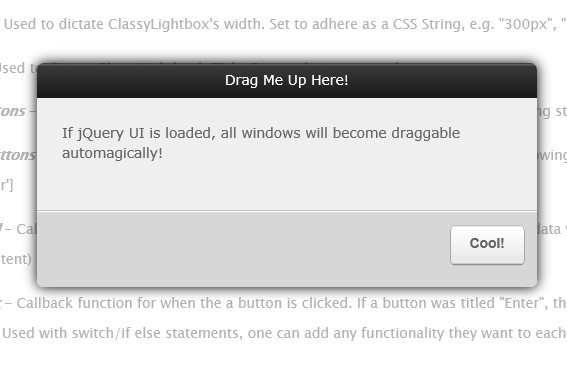
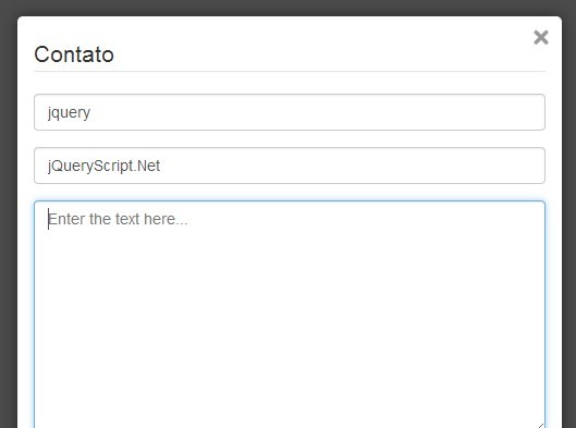
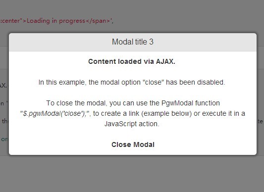
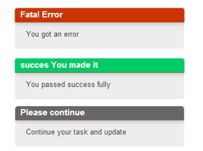
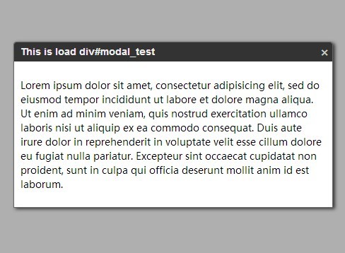
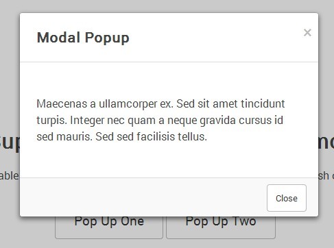
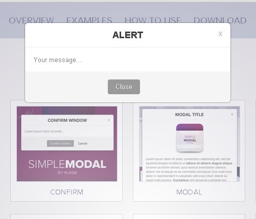
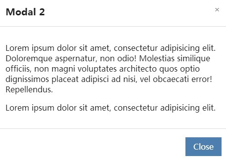
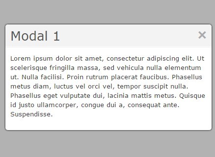
A simple framework that extends the jQuery UI dialog API to allow simple creation, modification, and deletion of dialogs that act as interactive windows as well as other functionality. Example here.
HTML Markup Per Window
To create any window in this framework, it must have a parent <div> container with an id. It can be initialized like so:
<div id="window_div_test"></div>Opening a Window
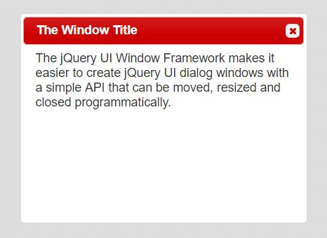
// with parameters openWindow( id, title, height, width, modal, autoOpen, resizeable ); // another example openWindow( 'window_div_test', 'The Window Title', 250, 500, true, true, true );| Parameter | Description |
|---|---|
| id | the window's div container |
| title | the window's title |
| height | the window's height |
| width | the window's width |
| modal | if true, window is always on top |
| autoOpen | if true, window opens on call |
| resizeable | if true, user can resize window |
Closing Windows
// with parameters hideWindow ( id ); // another example hideWindow ( 'window_div_test' );Showing Windows
// with parameters showWindow ( id ); // another example showWindow ( 'window_div_test' );Resizing Windows
// with parameters changeDialogSize ( dialog, h, w ); // another example changeDialogSize ( 'window_div_test', 500, 750 );Common Button Styling
Using any tag such as below will automatically turn it into a jQuery UI button.
<button>Add</button>If you desire more options, some classes are defined to give any button its associating icon.
Calling the following function will load the associated icon by class when the button is initialized:
loadButtonStyling();In the example below, a plus jQuery UI icon matching your theme is shown next to "Add".
<button class="addButton">Add</button>| Class | jQuery Icon |
|---|---|
| addButton | ui-icon-circle-plus |
| submitButton | ui-icon-circle-check |
| cancelButton | ui-icon-circle-close |
| deleteButton | ui-icon-trash |
| backButton | ui-icon-circle-triangle-w |
| switchButton | ui-icon-transferthick-e-w |
| resetButton | ui-icon-seek-first |
| reportButton | ui-icon-clipboard |
| playButton | ui-icon-play |
| scriptButton | ui-icon-script |
| gearButton | ui-icon-gear |
| wrenchButton | ui-icon-wrench |
Auto Load Functionality
This will implement automation of styling (see above), datepicker (see below), and auto input focus (see below) automatically on page load.
$( document ).ready(function() { loadWindow(); });Datepicker
The following class is needed on an <input> to initialize the datePicker on load.
<input type="text" class="datePicker" value="" />Input Auto Focus
Add the following data attribute to the <input> tag to automatically start the user's cursor inside.
<input type="text" data-input-focus="true" value="" />