react-native-picker


Cross platform picker for IOS and Android. It is based on PickerIOS for IOS while react-native-wheel for android.
Attention
Npm package will not be updated,because the account of npm is lost. The account belongs to my teammate and the team is gone. I feel very sorry for that! Sorry again! 

Guide
npm install
$ npm i https://github.com/SudoPlz/react-native-wheel.git --save $ npm i https://github.com/MonkeyKingPlus/react-native-picker.git --save Update Gradle Settings
// file: android/settings.gradle ... include ':react-native-wheel' project(':react-native-wheel').projectDir = new File(rootProject.projectDir, '../node_modules/react-native-wheel/android') Update app Gradle Build
// file: android/app/build.gradle ... dependencies { ... compile project(':react-native-wheel') } Register React Package
// file: android/src/main/java/com.xx/MainApplication.java ... import com.heng.wheel.WheelPackage; private final ReactNativeHost mReactNativeHost = new ReactNativeHost(this) { @Override protected boolean getUseDeveloperSupport() { return BuildConfig.DEBUG; } @Override protected List<ReactPackage> getPackages() { return Arrays.<ReactPackage>asList( new MainReactPackage(), new WheelPackage() // Added there ); } }; Usage
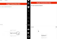
import React ,{Component}from 'react'; import { StyleSheet, Text, View, TouchableOpacity, Platform } from 'react-native'; import BaseComponent from './baseComponent'; import SinglePicker from 'mkp-react-native-picker'; import {viewStyles} from '../themes/default'; const options = [{ key: 1, value: "Option1" }, { key: 2, value: "Option2" }, { key: 3, value: "Option3" }] const another_options = [{ key: 1, value: "OptionA" }, { key: 2, value: "OptionB" }, { key: 3, value: "OptionC" }]; const optionsGroup = [options, another_options] export default class Picker extends BaseComponent { constructor(props) { super(props); this.state = { selected: '' } this.optionsGroupIndex = 0 } render() { return <View style={viewStyles.main}> <TouchableOpacity style={{height:30,flexDirection:'row',justifyContent:'center',alignItems:'center',backgroundColor:'red'}} onPress={()=>{ this.singlePicker.show(); }}> <Text style={{fontSize:18,color:'white',fontWeight:'bold'}}>Single Picker(Click Me!)</Text> </TouchableOpacity> <View style={{height:50,justifyContent:'center'}}><Text>You have selected {this.state.selected}</Text></View> <TouchableOpacity style={{height:30,flexDirection:'row',justifyContent:'center',alignItems:'center',backgroundColor:'red'}} onPress={()=>{ this.optionsGroupIndex = Math.abs(this.optionsGroupIndex - 1) this.singlePicker.setOption(optionsGroup[this.optionsGroupIndex]); }}> <Text>Switch Options</Text> </TouchableOpacity> <SinglePicker style={{justifyContent: 'flex-end', backgroundColor: 'white'}} lang="en-US" ref={ref=>this.singlePicker=ref} onConfirm={(option)=>{ //this.setState({selected:option.value}) }} onSelect={(option)=>{ this.setState({selected:option.value}) }} options={options} > </SinglePicker> </View> } }Documentation
Properties
| Key | Type | Required | Default | Description |
|---|---|---|---|---|
| options | array | yes | must be an array of key-value pairs,like { key: 1, value: 'option' } | |
| lang | string | no | 'zh-CN' | enums:'zh-CN','en-US','es-AR','ja-JP' indicate the language of the text in buttons |
| style | object | no | {backgroundColor: "white"} | modal container style |
| defaultSelectedValue | any | no | key of each option,if undefined, the first option will be selected | |
| onConfirm | function | no | option that be selected as the parameter | |
| onSelect | function | no | option that be selected as the parameter | |
| onCancel | function | no | ||
| headerStyle | object | no | ||
| headerButtonStyle | object | no | ||
| buttonCancelStyle | object | no | ||
| buttonAcceptStyle | object | no |
Methods
| Name | Description |
|---|---|
| show | show the Picker |
| hide | hide the Picker |
| setOption(options,defaultSelectedValue) | change options of the Picker |


