react-native-flat-button
Flat button component for react-native

Installation
npm i react-native-flat-button --save
API
| Prop | Type | Default | Description |
|---|---|---|---|
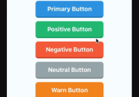
type | string(required) | - | Type of button. Use predefined types: 'primary', 'neutral', 'warn', 'positive', 'negative', 'info' or use 'custom' |
backgroundColor | string | '#34495e' | Sets button's background color. |
borderColor | string | '#2c3e50' | Sets button's border color. |
borderRadius | number | 8 | Sets button's border radius. |
shadowHeight | number | 4 | Sets button's border shadow. |
borderLeftWidth | number | 0.5 | Sets button's border left shadow. |
borderRightWidth | number | 0.5 | Sets button's border right shadow. |
activeOpacity | number | 0.9 | Sets button's onpressing transparency. (It should be between 0 to 1) |
containerStyle | View.propTypes.style | {justifyContent: 'center',alignItems: 'center'} | Sets button's style (Same as TouchableOpacity) |
contentStyle | Text.propTypes.style | {color: 'white',fontSize: 18,fontWeight: 'bold'} | Sets button's text style (Same as Text) |
Example
import React, { Component } from 'react' import { Alert, AppRegistry, StyleSheet, Text, View, } from 'react-native' import Button from 'react-native-flat-button' class Example extends Component { render() { return ( <View style={styles.container}> <Text style={{ fontSize: 20, fontWeight: 'bold' }}> Pre-Defined Buttons </Text> <Button type="primary" onPress={() => Alert.alert('Primary Button')} containerStyle={styles.buttonContainer} > Primary Button </Button> <Button type="positive" onPress={() => Alert.alert('Positive Button')} containerStyle={styles.buttonContainer} > Positive Button </Button> <Button type="negative" onPress={() => Alert.alert('Negative Button')} containerStyle={styles.buttonContainer} > Negative Button </Button> <Button type="neutral" onPress={() => Alert.alert('Neutral Button')} containerStyle={styles.buttonContainer} > Neutral Button </Button> <Button type="warn" onPress={() => Alert.alert('Warn Button')} containerStyle={styles.buttonContainer} > Warn Button </Button> <Button type="info" onPress={() => Alert.alert('Info Button')} containerStyle={styles.buttonContainer} > Info Button </Button> <Text style={{ fontSize: 20, fontWeight: 'bold' }}> Custom Buttons </Text> <Button type="custom" onPress={() => Alert.alert('Custom Button #1')} backgroundColor={"#1abc9c"} borderColor={"#16a085"} borderRadius={10} shadowHeight={5} containerStyle={styles.buttonContainer} contentStyle={styles.content} > Custom Button </Button> <Button type="custom" onPress={() => Alert.alert('Custom Button #2')} backgroundColor={"#9b59b6"} borderColor={"#8e44ad"} borderRadius={6} shadowHeight={8} activeOpacity={0.5} containerStyle={styles.buttonContainer} contentStyle={{ fontSize: 22, fontWeight: '900' }} > Custom Button </Button> </View> ) } } const styles = StyleSheet.create({ container: { flex: 1, justifyContent: 'center', alignItems: 'center', backgroundColor: '#F5FCFF', }, buttonContainer: { width: 200, height: 50, marginVertical: 5 }, content:{ fontSize: 22 } }) AppRegistry.registerComponent('Example', () => Example)


