star-rating.js
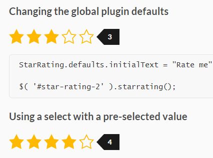
A zero-dependency library that transforms a select with numerical-range values (i.e. 1-5) into a dynamic star rating element.
For production, use the files from the dist/ folder.
Installation
Use one of the following methods to add the Star Rating library to your project:
- Download ZIP
yarn add star-rating.jsnpm install star-rating.jsbower install star-rating.js
Usage
<link href="css/star-rating.css" rel="stylesheet"> <select class="star-rating"> <option value="">Select a rating</option> <option value="5">Excellent</option> <option value="4">Very Good</option> <option value="3">Average</option> <option value="2">Poor</option> <option value="1">Terrible</option> </select> <script src="js/star-rating.min.js"></script> <script> var starRatingControls = new StarRating( '.star-rating' ); </script>To rebuild all star rating controls (e.g. after form fields have changed with ajax):
starRatingControls.rebuild();To fully remove all star rating controls, including all attached Event Listeners:
starRatingControls.destroy();Options
Here are the default options
{ classname: "gl-star-rating", clearable: true, initialText: "Select a Rating", maxStars: 10, showText: true, }classname:
Type: String
Determines the classname to use of the rendered star-rating HTMLElement. If you change this, make sure you also change the SCSS $star-rating[base-classname] map variable to match.
clearable:
Type: Boolean
Determines whether the star rating can be cleared by clicking on an already pre-selected star.
initialText:
Type: String
Determines the initial text when no value is selected. This has no effect if showText is set to false.
maxStars:
Type: Integer
Determines the maximum number of stars allowed in a star rating.
showText:
Type: Boolean
Determines whether or not the rating text is shown.
Build
Star Rating uses npm or yarn to manage package dependencies and gulp to build from src/.
yarn gulpThe compiled files will be saved in the dist/ folder.
Style Customization
Sass is used to build the stylesheet so you can @import the src/star-rating.scss file to compile it directly into your Sass project.
Following are the default sass values for Star Rating, they are contained in a map variable.
$star-rating-defaults: ( base-classname : 'gl-star-rating', base-display : block, base-height : 26px, font-size : 0.8em, font-weight : 600, parent : '', star-empty : url(../img/star-empty.svg), star-full : url(../img/star-full.svg), star-half : url(../img/star-half.svg), star-size : 24px, text-background: #1a1a1a, text-color : #fff, );To override any values with your own, simply create a new $star-rating map variable and include only the values you wish to change.
Important: Make sure you define $star-rating before you import the src/star-rating.scss file:
$star-rating: ( base-height: 32px, star-size : 30px, ); @import "../../node_modules/star-rating.js/src/star-rating"How to change CSS style priority
Sometimes an existing stylesheet rules will override the default CSS styles for Star Ratings. To solve this problem, you can specify a "parent" option in the $star-rating map variable. This option value should be a high priority/specificity property such as an id attribute or similar.
In the following example, all Star Rating css rules will begin with [id^=stars] which targets any id attributes that begin with "stars" (i.e. #stars-1):
$star-rating: ( parent: '[id^=stars]', );The CSS rule .gl-star-rating { ... } now becomes [id^=stars] .gl-star-rating { ... }.
Compatibility
- All modern browsers
If you need to use the Star Rating library in a unsupported browser (i.e. Internet Explorer), use the Polyfill service.
Contributing
All changes should be committed to the files in src/.
Changelog
v3.1.4 - [2019-01-28]
- Updated package URL
v3.1.3 - [2019-01-27]
- Fixed issue when used outside of a FORM
v3.1.2 - [2019-01-07]
- Fixed issue that allowed multiple star-rating transformations on the same SELECT element
v3.1.1 - [2018-07-27]
- Provided an un-minified CSS file in /dist
- Removed the change event trigger from the reset event
v3.1.0 - [2018-07-24]
- Changed the
star-filledSCSS map option tostar-full - Changed the
star-empty,star-full, andstar-halfSCSS map options tourl(...). This allows one to usenoneas the value ofbackground-image.
v3.0.0 - [2018-07-24]
- Dropped support for Internet Explorer (use polyfill.io, specifically: Element.prototype.closest, Element.prototype.dataset, Event)
- Removed the
onClickoption (listen for thechangeevent instead)
v2.3.1 - [2018-07-22]
- CSS improvements
v2.3.0 - [2018-07-20]
- Added a
$star-rating[parent]SCSS option
v2.2.2 - [2018-07-16]
- Fixed IE 11+ compatibility
v2.2.1 - [2018-07-13]
- Fixed touch events on Android devices
v2.2.0 - [2018-07-09]
- Added a
classnameoption - Added a
$star-rating[base-classname]SCSS option - Added touch events
- Fixed detection of an unset option value
- Optimised the minified output
- Removed unused code
v2.1.1 - [2018-05-25]
- Fixed jshint warnings
v2.1.0 - [2018-05-11]
- Added support for the keyboard
- Fixed accessibility support
- Fixed RTL support
v2.0.0 - [2018-05-02]
- Major rewrite of library
- Added support for loading as a module
- Added support for RTL
- Removed jQuery plugin
- Removed IE9 support
v1.3.3 - [2017-04-11]
- Fixed race conditions preventing correct element.outerWidth calculation
v1.3.1 - [2016-12-22]
- Fixed checking existence of parent form element before attaching an event to it
- Fixed mousemove event not correctly unattaching
v1.3.0 - [2016-10-10]
- Changed
clickFntoonClickwhich now passes the select HTMLElement as the argument
v1.2.2 - [2016-10-10]
- Fixed "reset" event when the
clearableoption is false
v1.2.1 - [2016-10-09]
- Fixed resetting the star-rating when a form "reset" event is triggered
v1.2.0 - [2016-10-09]
- Removed dependencies
- Fixed HTML5 “required” attribute validation
v1.1.0 - [2016-10-06]
- Added
showTextoption
v1.0.1 - [2016-10-06]
- Fixed using the wrong left offset
v1.0.0 - [2016-10-06]
- Initial release
