jQuery plugin - Bootstrap Modal
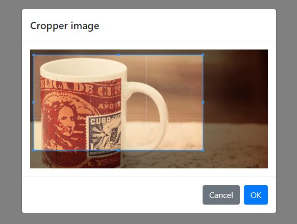
bsModal is jQuery plugin, generate bootstrap 4 modal, And crop&upload image modal.
Example
https://ycs77.github.io/jquery-plugin-bsModal/
Getting started
Must introduce jQuery 3, Bootstrap 4, Cropper.js.
Installation
$ npm install jquery-plugin-bsmodal or
$ yarn add jquery-plugin-bsmodal In browser:
<link href="/path/to/bootstrap.css" rel="stylesheet"><!-- Bootstrap is required --> <link href="/path/to/cropper.css" rel="stylesheet"> <script src="/path/to/jquery.js"></script><!-- jQuery is required --> <script src="/path/to/bootstrap.js"></script><!-- Bootstrap is required --> <script src="/path/to/cropper.js"></script><!-- Cropper.js is required --> <script src="/path/to/bsModal.js"></script>Usage
<button type="button" class="btn btn-primary" id="exampleBtn"> Launch demo modal </button> <!-- Cropper picture is displayed after success --> <div class="mt-3"> <img id="cropedImage"> </div>// Basic modal $('#basicBtn').bsModal({ id: 'bsModal', title: 'Title', body: 'Modal body text......', onOpen: function () { console.log('Open'); }, onClose: function () { console.log('Close'); }, onOk: function () { console.log('OK'); }, onCancel: function () { console.log('Cancel'); } }); // Crop image modal $('#cropImgBtn').bsModalCropper({ id: 'bsModalCropper', title: 'Crop image', src: 'example-picture.jpg', // Cropper.js options cropper: { aspectRatio: 16 / 9 }, // On cropper onCropper: function (dataURL) { $('#cropedImageBox').show(); $('#cropedImage').attr('src', dataURL); } });bsModal Options
Property
id
- Type:
String - Default:
exampleModal
Required. Define the modal id. Can't repeat.
title
- Type:
String - Default:
Modal title
Define the modal title.
titleLavel
- Type:
Number - Default:
5
Define the modal title lavel, default is tag <h5>.
body
- Type:
Any - Default:
''
Define the modal body.
label
- Type:
String|null - Default:
null
Define the modal title id.
lang
- Type:
String|null - Default:
null
Define the back lang, default is user browser language.
langs
- Type:
Object - Default:
{}
Define the texts languages.
modal
- Type:
String|null - Default:
null
Define the modal selector, if not exist, then create new modal.
fade
- Type:
Boolean - Default:
true
Open modal fade.
close
- Type:
Boolean - Default:
true
Show modal close button.
backdrop
- Type:
Boolean - Default:
true
Show modal backdrop.
confirm
- Type:
Boolean - Default:
false
Use modal confirm mode.
okBtn
- Type:
Object - Default:
{ text: '', color: 'primary' } The ok button options. If do not want to display ok button, set it to null.
- text: Define the modal ok button text.
- color: Define the modal ok button color, use bootstrap color.
cancelBtn
- Type:
Object - Default:
{ text: '', color: 'secondary' } The cancel button options. If do not want to display cancel button, set it to null.
- text: Define the modal cancel button text.
- color: Define the modal cancel button color, use bootstrap color.
confirmOkText
- Type:
String - Default:
''
Define the confirm mode modal ok button text.
confirmCancelText
- Type:
String - Default:
''
Define the confirm mode modal cancel button text.
Callback
onOpen
- Type:
Function - Default:
null
Is open modal callback.
onClose
- Type:
Function - Default:
null
Is close modal callback.
onOk
- Type:
Function - Default:
null
Is ok callback.
onCancel
- Type:
Function - Default:
null
Is cancel callback.
bsModalCropper Options
All bsModal options is can use.
id
- Type:
String - Default:
exampleModalCropper
Define the modal id.
confirm
- Type:
Boolean - Default:
true
Use modal confirm mode, default is true.
src
- Type:
String - Default:
null
Define the crop image src.
If there is no setting, it is the upload mode; if set, the image will be cropped.
imgId
- Type:
String - Default:
exampleImage
Define the crop image id.
cropper
- Type:
Object - Default:
{ viewMode: 1 } Define the Cropper.js options.
maxWidth
- Type:
Number|null - Default:
null
Define the crop image max width.
action
- Type:
String|null - Default:
null
Define the upload url, if action is null, then can't upload.
fileName
- Type:
String - Default:
file
Define the upload input name.
data
- Type:
Object - Default:
{}
Define the upload data.
uploadConfig
- Type:
Object
Options:
-
allowTypes
- Type:
Array - Default:
['image/jpeg', 'image/png']
Allow upload mimeType.
- Type:
-
maxSize
- Type:
Number - Default:
5242880(5MB)
Upload file max size (Byte).
- Type:
Define the upload config.
success
- Type:
Function - Default:
null
Is upload success callback.
error
- Type:
Function - Default:
null
Is upload error callback.
axios
- Type:
Function - Default:
null
If ajax function use axios, input axios instance.
axiosOriginalData
- Type:
Boolean - Default:
false
The axios successful return data is res or res.data.
onUpload
- Type:
Function - Default:
null
Is upload callback.
onUploadError
- Type:
Function - Default:
null
Is uploadError callback.
onCropper
- Type:
Function - Default:
null
Is cropper callback.


