droptabs
Jquery plugin for hiding Bootstrap tabs inside a dropdown, when viewport is too small.
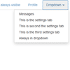
Usage:
Install
You can download the latest stable version with download links in Github Page.
Requirements
This plugin was tested with JQuery 1.10.1, but should work with older versions.
Droptabs works with Bootstrap default tab classes and structure, but selectors can be modified for using with other scenarios.
Demo
Demo available here.
Optional parameters
Droptabs supports optional parameters.
dropdownSelector
Jquery selector for the dropdown container.
Default: 'li.dropdown'
dropdownMenuSelector
Jquery selector for the dropdown container (menu) that holds the elements (tabs).
Default: 'ul.dropdown-menu'
dropdownTabsSelector
Jquery selector for the elements (tabs).
Default: 'ul.dropdown-menu'
dropdownTabsSelector
Jquery selector for the elements (tabs). This will only select elements under current container.
Default: 'li'
dropdownCaretSelector
Jquery selector for the caret used in the dropdown label. This will only select elements under current container.
Default: 'b.caret'
visibleTabsSelector
Jquery selector for the visible elements (tabs). This will only select elements under current container. **Will be changed soon, don't use it!
Default: '>li:not(.dropdown)'
autoArrangeTabs
Whether to auto arrange tabs that are always visible in front of all other tabs.
Default: 'true'
pullDropdownRight
Whether to make the dropdown float to the right of the current container. If false, will keep the dropdown inline to the right of the visible tabs.
Default: 'true'
development
This enables a fixed developer div that shows some live info. Only for use in development mode.
Default: 'false'
developmentId
If needed, the Id of the div that holds the developer info can be changed.
Default: 'dt-devInfo'
How to Use
<ul class="nav nav-tabs droptabs"> <li class="active always-visible"><a href="#home" data-toggle="tab">Home</a></li> <li><a href="#profile" data-toggle="tab">Profile</a></li> <li><a href="#messages" data-toggle="tab">Messages</a></li> <li><a href="#settings" data-toggle="tab">This is the settings tab</a></li> <li><a href="#settings1" data-toggle="tab">This is second the settings tab</a></li> <li><a href="#settings2" data-toggle="tab">This is the third settings tab</a></li> <li class="always-visible"><a href="#settings3" data-toggle="tab">This is always visible</a></li> <li class="dropdown"> <a href="#" id="myTabDrop1" class="dropdown-toggle" data-toggle="dropdown">Dropdown <b class="caret"></b></a> <ul class="dropdown-menu" role="menu" aria-labelledby="myTabDrop1"> <li class="always-dropdown"><a href="#settings4" data-toggle="tab">Always in dropdown</a></li> </ul> </li> </ul> <div class="row-fluid "> <div class="row-fluid"> <div class="tab-content span4"> <div class="tab-pane active" id="home">Home tab</div> <div class="tab-pane" id="profile">Profile tab</div> <div class="tab-pane" id="messages">Messages tab</div> <div class="tab-pane" id="settings">This is the settings tab</div> <div class="tab-pane" id="settings1">This is second the settings tab</div> <div class="tab-pane" id="settings2">This is the third settings tab</div> <div class="tab-pane" id="settings3">This is always visible</div> <div class="tab-pane" id="settings4">Always in dropdown</div> </div> </div> </div>For the HTML structure seen above, just call droptabs on the desired element, like this:
$(".droptabs").droptabs();With optional parameters:
$(".droptabs").droptabs({ development:true });


