
react-touch-screen-keyboard
Quick start
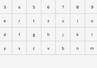
This library will render a draggable virtual keyboard on the bottom of the screen when the input is selected. The usage is very simple - instead of using the input tag, use the KeyboardedInput tag from the library. You can control the input's value via the callback function you give to its props.
Currently supported keyboards: us, de, ru, fr
Installing via npm
npm install react-touch-screen-keyboard Installing via npm (React v15)
npm install [email protected] Example
import React from 'react'; import KeyboardedInput from 'react-touch-screen-keyboard'; import 'react-touch-screen-keyboard/lib/Keyboard.css'; // if you just want css import 'react-touch-screen-keyboard/lib/Keyboard.scss'; // if you've got sass-loader class Input extends React.Component { render() { return ( <KeyboardedInput enabled required type={this.props.type} onChange={this.props.onChange} onBlur={this.props.onBlur} onFocus={this.props.onFocus} value={this.props.value} min={this.props.min} max={this.props.max} step={this.props.step} name={this.props.name} inputClassName={this.props.inputClassName} keyboardClassName={this.props.keyboardClassName} placeholder={this.props.placeholder} defaultKeyboard="de" secondaryKeyboard="us" // optional isFirstLetterUppercase={true} // optional, default is `false` uppercaseAfterSpace={true} // optional, default is `false` isDraggable={false} // optional, default is `true` readOnly={this.props.readOnly} // optional opacity={0.9} // optional /> ); } } export default Input; Use Custom Keyboard
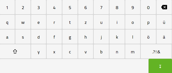
You can pass a Nx3 sized array into defaultKeyboard prop to render a customize layout.
You can place functional keys using the following placeholders:
| Placeholder | Key |
|---|---|
| *sh | Shift |
| *bs | Backspace |
import React from 'react'; import KeyboardedInput from 'react-touch-screen-keyboard'; import 'react-touch-screen-keyboard/lib/Keyboard.css'; class Input extends React.Component { render() { const CustomMapping = [ ['q', 'w', 'e', 'r', 't', 'y', 'u', 'i', 'o', 'p'], ['a', 's', 'd', 'f', 'g', 'h', 'j', 'k', 'l', '@'], ['z', 'x', 'c', 'v', 'b', 'n', 'm', '.com'] ]; return ( <KeyboardedInput enabled type={this.props.type} value={this.props.value} name={this.props.name} defaultKeyboard={CustomMapping} /> ); } } export default Input; Managing focus programmatically
The focus() function can be used to set the focus on the input field and show the keyboard. You can access the component via its ref.
For example, to focus the input field when clicking on a button, first set the ref:
<KeyboardedInput ref={ref => { this.myInput = ref; }} ...Then call the focus() function in the click handler of a button:
<Button onClick={() => { this.myInput.focus(); }}> Click Me </Button> See the examples for a more complete sample.
Running Local Example
# NPM $ npm run-script start # Yarn $ yarn start 


