Resonance
This library is experimental
This is a fork of react-move that animates by modifying the DOM directly. It is much faster in some cases and the entire library (including all dependencies) is just 5kb. You can install the beta version:
npm install resonance@beta Documentation & Demos
Sandboxes:
Feedback is welcome! Cheers.
The idea
The children of NodeGroup and Animate are used like a template and dynamic attributes are defined as a function of the state, data, key and index. Resonance reads in the children and generates a DOM representation. On each frame it updates the dynamic attributes. Seems to work pretty well.
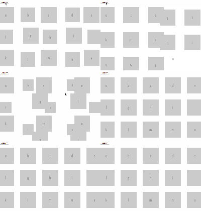
import { NodeGroup, animated } from 'resonance' <NodeGroup data={sorted} keyAccessor={(d) => d.letter} wrapper='g' start={() => ({ opacity: 1e-6, x: 1e-6, })} enter={(d) => ({ opacity: [0.7], x: [scale(d.letter)], timing: { duration: 750, ease: easeExpInOut }, })} update={(d, i) => ({ ... })} leave={() => ({ ... })} > <animated.g transform={s => `translate(${s.x},0)`} // transform is a function of state > <animated.rect height={(s, d) => dims[1] - y(d.frequency)} // height is a function of the data y={(s, d) => y(d.frequency)} fill="#fd8d3c" width={width} opacity={s => s.opacity} /> <animated.text x={scale.bandwidth() / 2} y={dims[1] + 15} dx="-.35em" fill="#dadada" > {(s, d) => d.letter} </animated.text> </animated.g> </NodeGroup>For styles just use a string template and regular CSS styles. Could use the style parser in React, but seems like this would alway be more performant.
import { NodeGroup, animated } from 'resonance' ... <animated.div style={(s, d, k) => (` // Use template strings for style position: absolute; transform: translate(${s.x}px, ${+k * 20}px); opacity: ${s.opacity}; color: ${s.color}; `)} > {(s, d, k) => `${k + 1} - ${Math.round(s.x)}`} </animated.div> ...Getting Started
Resonance exports two main components:
- NodeGroup - Use
NodeGroupif you have an array of items that enter, update and leave. - Animate - Use
Animateif you have a singe item that enters, updates and leaves.
< NodeGroup />
Component Props
| Name | Type | Default | Description |
|---|---|---|---|
| wrapper | string | 'div' | Tag for wrapping element: 'g', 'span', etc. No custom components. |
| wrapperClass | string | Class to be applied to wrapper. | |
| wrapperStyle | object | Style object for wrapper. | |
| data * | array | An array. The data prop is treated as immutable so the nodes will only update if prev.data !== next.data. | |
| keyAccessor * | function | Function that returns a string key given the data and its index. Used to track which nodes are entering, updating and leaving. | |
| interpolation | function | numeric | A function that returns an interpolator given the begin value, end value, attr and namespace. Defaults to numeric interpolation. See docs for more. |
| start * | function | A function that returns the starting state. The function is passed the data and index and must return an object. | |
| enter | function | () => {} | A function that returns an object or array of objects describing how the state should transform on enter. The function is passed the data and index. |
| update | function | () => {} | A function that returns an object or array of objects describing how the state should transform on update. The function is passed the data and index. |
| leave | function | () => {} | A function that returns an object or array of objects describing how the state should transform on leave. The function is passed the data and index. |
| children * | node | A React node. The node will be used as a template for each item in the array. No custom components. |
- required props
< Animate />
Component Props
| Name | Type | Default | Description |
|---|---|---|---|
| wrapper | string | 'div' | Tag for wrapping element: 'g', 'span', etc. No custom components. |
| wrapperClass | string | Class to be applied to wrapper. | |
| wrapperStyle | object | Style object for wrapper. | |
| show | bool | true | Boolean value that determines if the child should be rendered or not. |
| interpolation | function | numeric | A function that returns an interpolator given the begin value, end value, atrr and namespace. See docs for more. |
| start * | union: func object | An object or function that returns an obejct to be used as the starting state. | |
| enter | union: func array object | An object, array of objects, or function that returns an object or array of objects describing how the state should transform on enter. | |
| update | union: func array object | An object, array of objects, or function that returns an object or array of objects describing how the state should transform on update. Note: although not required, in most cases it make sense to specify an update prop to handle interrupted enter and leave transitions. | |
| leave | union: func array object | An object, array of objects, or function that returns an object or array of objects describing how the state should transform on leave. | |
| children | node | A React node. No custom components. |
- required props
Starting state
Before looking at the components it might be good to look at starting state. You are going to be asked to define starting states for each item in your NodeGroup and Animate components. This is a key concept and probably the most error prone for developers working with Resonance. The starting state for each item is always an object with string or number leaves. The leaf keys are referred to as "attrs" as in "attribute." There are also "namespaces" which are a purely organizational concept.
Two rules to live by for starting states:
- Don't use the strings "timing" or "events" as an attr or namespace.
- There should never be an array anywhere in your object.
Example starting state:
// GOOD { attr1: 100, attr2: 200, attr3: '#dadada' } // BAD { attr1: [100], // NO ARRAYS attr2: 200, attr3: '#dadada' }A more concrete example might be:
{ opacity: 0.1, x: 200, y: 100, color: '#dadada' }You can add "namespaces" to help organize your state:
{ attr1: 100, attr2: 200, attr3: '#ddaabb', namespace1: { attr1: 100, attr2: 200 } }Or something like:
{ namespace1: { attr1: 100, attr2: 200 }, namespace2: { attr1: 100, attr2: 200 } }You might use namespaces like so:
{ inner: { x: 100, y: 150, color: '#545454' }, outer: { x: 300, y: 350, color: '#3e3e3e' } }Starting state in NodeGroup
In NodeGroup you are working with an array of items and you pass a start prop (a function) that receives the data item and its index. The start prop will be called when that data item (identified by its key) enters. Note it could leave and come back and that prop will be called again. Immediately after the starting state is set your enter transition (optional) is called allowing you to transform that state.
<NodeGroup data={data} // an array (required) keyAccessor={item => item.name} // function to get the key of each object (required) start={(item, index) => ({ // returns the starting state of node (required) ... })} > ...children </NodeGroup>Starting state in Animate
In Animate you are animating a single item and pass a start prop that is an object or a function. The start prop will be called when the item enters. Note it could leave and come back by toggling the show prop. Immediately after the starting state is set your enter transition (optional) is called allowing you to transform that state.
<Animate start={{ // object or function ... }} > ...children </Animate>Transitioning state
You return an object or an array of config objects in your enter, update and leave props functions for both NodeGroup and Animate. Instead of simply returning the next state these objects describe how to transform the state. Each config object can specify its own duration, delay, easing and events independently.
There are two special keys you can use: timing and events. Both are optional. Timing and events are covered in more detail below.
If you aren't transitioning anything then it wouldn't make sense to be using NodeGroup. That said, it's convenient to be able to set a key to value when a node enters, updates or leaves without transitioning. To support this you can return four different types of values to specify how you want to transform the state.
-
string or number: Set the key to the value immediately with no transition. Ignores all timing values. -
array [value]: Transition from the key's current value to the specified value. Value is a string or number. -
array [value, value]: Transition from the first value to the second value. Each value is a string or number. -
function: Function will be used as a custom tween function.
Example config object:
{ attr1: [200], // Arrays are good in a config object. Array means transition from the current value to this value. attr2: 300, attr3: ['#dadada'] timing: { duration: 300, delay: 100 } }Using namespaces:
{ attr1: [100], attr3: '#ddaabb', namespace1: { attr1: [300], attr2: 200 }, timing: { duration: 300, delay: 100 } }To have different timing for some keys use an array of config objects:
[ { attr1: [200, 500], timing: { duration: 300, delay: 100 } }, { attr2: 300, // this item, not wrapped in an array, will be set immediately, so which object it's in doesn't matter attr3: ['#dadada'] timing: { duration: 600 } }, ]Example Transitions in NodeGroup
<NodeGroup data={this.state.data} keyAccessor={(d) => d.name} start={(data, index) => ({ opacity: 1e-6, x: 1e-6, fill: 'green', width: scale.bandwidth(), })} enter={(data, index) => ({ opacity: [0.5], // transition opacity on enter x: [scale(data.name)], // transition x on on enter timing: { duration: 1500 }, // timing for transitions })} update={(data) => ({ ... })} leave={() => ({ ... })} > ...children </NodeGroup>Using an array of config objects:
import { easeQuadInOut } from 'd3-ease'; ... <NodeGroup data={this.state.data} keyAccessor={(d) => d.name} start={(data, index) => ({ opacity: 1e-6, x: 1e-6, fill: 'green', width: scale.bandwidth(), })} enter={(data, index) => ([ // An array { opacity: [0.5], // transition opacity on enter timing: { duration: 1000 }, // timing for transition }, { x: [scale(data.name)], // transition x on on enter timing: { delay: 750, duration: 1500, ease: easeQuadInOut }, // timing for transition }, ])} update={(data) => ({ ... })} leave={() => ({ ... })} > ...children </NodeGroup>Timing
If there's no timing key in your object you'll get the timing defaults. You can specify just the things you want to override on your timing key.
Here's the timing defaults...
const defaultTiming = { delay: 0, duration: 250, ease: easeLinear };For the ease key, just provide the function. You can use any easing function, like those from d3-ease...
List of ease functions exported from d3-ease
Events
You can add events on your config objects. You can pass a function that will run when the transition starts, is interrupted (an update to the data occurs) or ends.
Using Events:
{ attr1: [100], attr3: '#ddaabb', namespace1: { attr1: [300], attr2: 200 }, timing: { duration: 300, delay: 100 }, events: { start: () => { ..do stuff - use an arrow function to keep the context of the outer component }, interrupt: () => { ..do stuff - use an arrow function to keep the context of the outer component }, end: () => { ..do stuff - use an arrow function to keep the context of the outer component }, } }Interpolation
You can wire your components in resonance to handle different types of interpolation using the interpolation prop in both NodeGroup and Animate. The code for interpolating strings or SVG paths can be bulky and, in many cases, it's not needed so by default components only handle numeric interpolation.
Your interpolation prop is a function that should avoid a lot of logic and computation. It will get called at high frequency when transitions fire in your components. You get the begin and end values and what the attribute name (string) is. You will also get the namespace string (less common) if you are using them in your state. See the sections on starting states and transitions for more on attrs and namespaces.
Cadillac Interpolation - Depends on d3-interpolate
To wire up a full service set of components that will interpolate colors, paths, numbers and SVG transforms you can use a setup like this:
npm install resonance d3-interpolate Then in your app:
import { NodeGroup, Animate } from 'resonance' import { interpolate, interpolateTransformSvg } from 'd3-interpolate' ... <NodeGroup data={this.state.data} keyAccessor={(d) => d.name} start={(data, index) => ({ ... })} enter={(data, index) => ([ // An array ... ])} update={(data) => ({ ... })} leave={() => ({ ... })} interpolation ={(begValue, endValue, attr, namespace) => { // pass as a prop to NodeGroup or Animate if (attr === 'transform') { return interpolateTransformSvg(begValue, endValue) } return interpolate(begValue, endValue) }} > ...children </NodeGroup>This setup mimics how `d3.js` works for selecting interpolators and will not force you to think too much about the values your are using. For example, if you use colors (in any format) they will be recognized and interpolated correctly. The `interpolate` function exported from d3-interpolate does a great job of guessing what you're trying to do and handles it for you but it also includes a lot of code (e.g. d3-color) that may not be needed for your project. #### Numeric Interpolation Only - Default - No dependencies To do numeric interpolation you don't need to do anything in your components. The default numeric interpolator looks like this: ```js // The default interpolator used in NodeGroup and Animate const numeric = (beg, end) => { const a = +beg const b = +end - a return function(t) { return a + b * t } } Contributing
Contributions are welcome! Before starting on a PR, open up an issue to discuss your idea.
Run the repo locally
- Fork this repo
npm installcd docsnpm installnpm start
Scripts
Run these from the root of the repo
npm run lintLints all files in src and docsnpm run testRuns the test suite locallynpm run test:coverageGet a coverage report in the consolenpm run test:coverage:htmlGet an HTML coverage report in coverage folder
