wSelect.js
A jQuery plugin for fully customizable and clean looking select boxes. These are div based select boxes that will allow us to do additional things like adding icons to our options.
Related Plugins
- wForm - See all the form plugins working together.
- wInput - Input plugin that handles backwards compatability for placeholders.
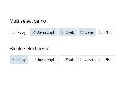
- wCheck - Radio and checkbox input plugin.
- wChar - On the fly character counter for inputs.
Settings
Available options with notes, the values here are the defaults.
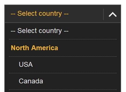
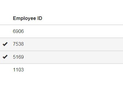
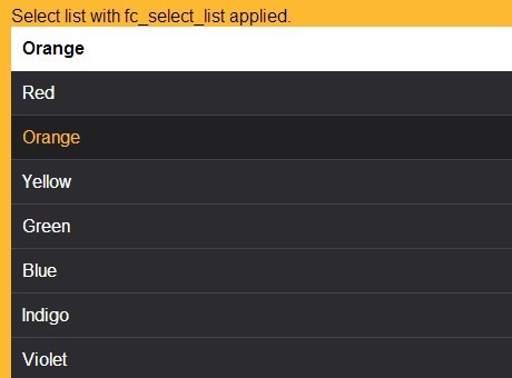
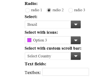
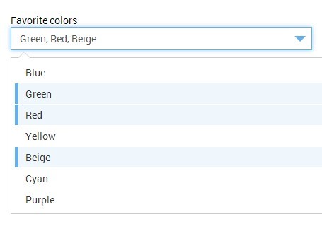
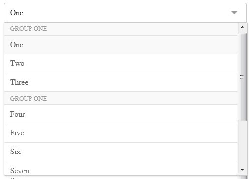
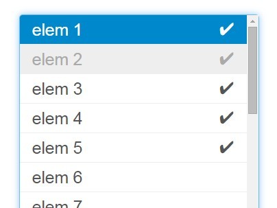
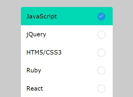
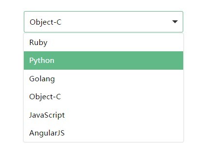
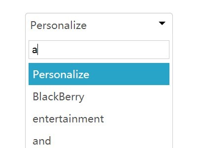
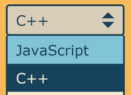
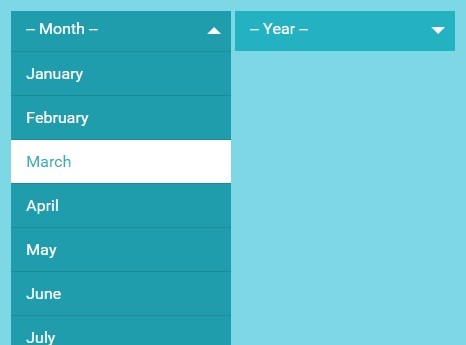
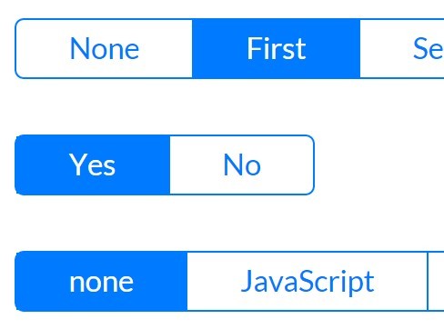
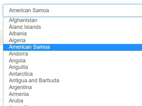
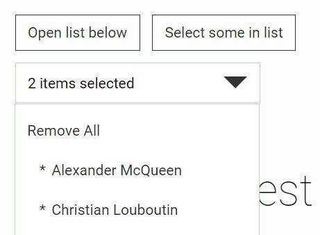
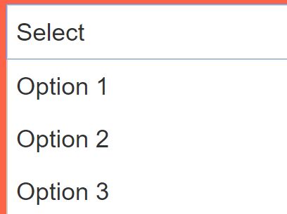
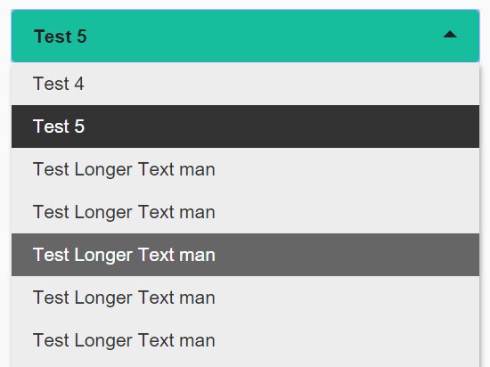
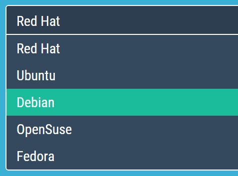
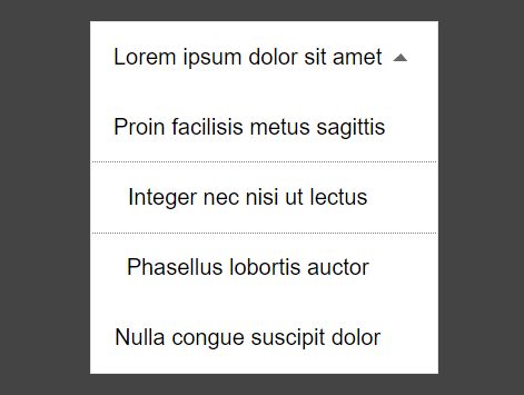
$.fn.wSelect.defaults = { theme: 'classic', // theme size: '4', // default number of options to display (overwrite with `size` attr on `select` element) labelPosition: 'left', // set position for label (left,top) highlight: true // highlight fields when selected };Examples
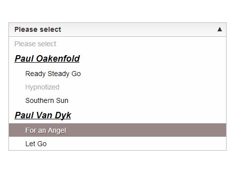
The plugin should work seamlessly with click or change events triggered from either end.
Include the following files:
<script type="text/javascript" src="./wSelect.js"></script> <link rel="Stylesheet" type="text/css" href="./wSelect.css" />options
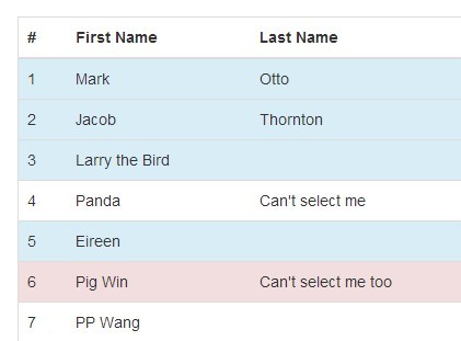
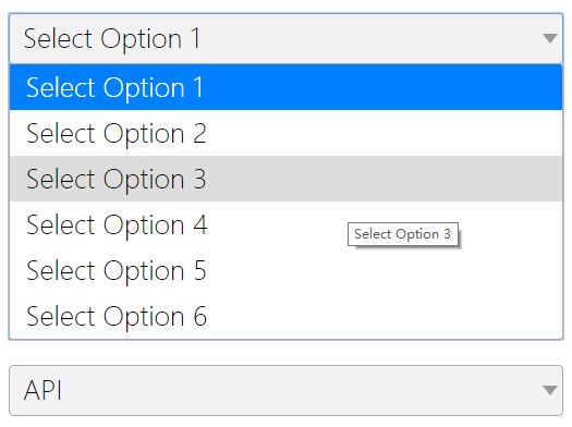
If you add, remove or modify any HTML content for any of the select options you will require a refresh.
NOTE: if you modify a select value a reset is NOT required, only for visible elements like changing the HTML content of an option or adding or removing options.
$('#select').append('<option value="four">four</option>').wSelect('reset');values
If a value is set manually using val() you will need to trigger a change event.
$('#select').val('two').change();Or if you don't want to trigger the select elements change event just run the plugin change method to update only the visuals.
$('#select').val('two').wSelect('change');icons
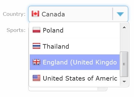
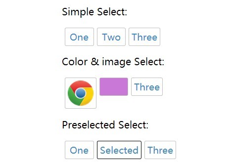
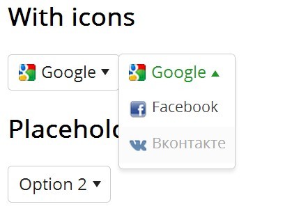
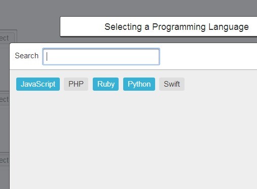
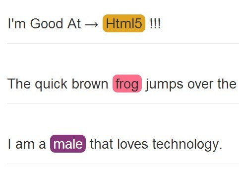
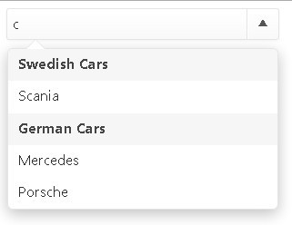
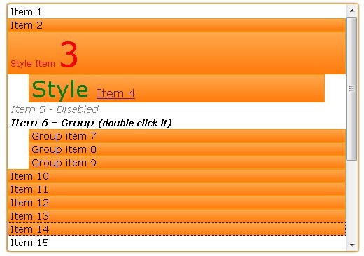
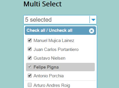
Icons can be added by setting an image path in the data-icon attribute for each option.
<option value="example" data-icon="/path/to/image.png">Example</option>To leave an indent with no image set the data-icon attribute to an empty string.
<option value="example" data-icon="">Example</option>Not setting the attribute at all will leave no indent and will appear normally.
<option value="example">Example</option>size
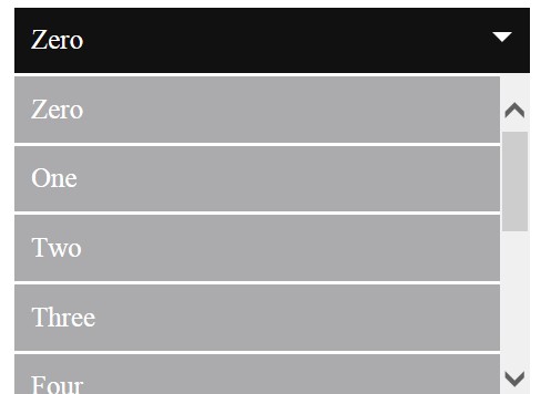
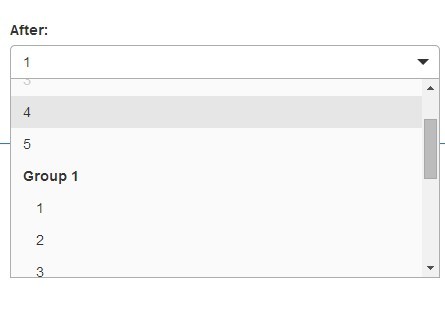
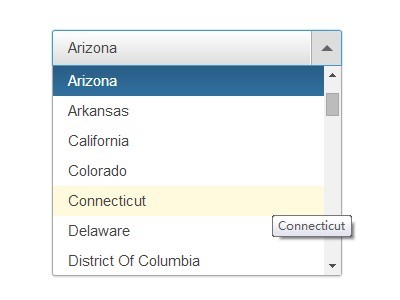
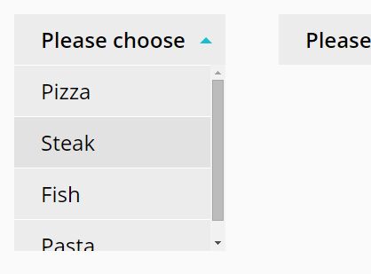
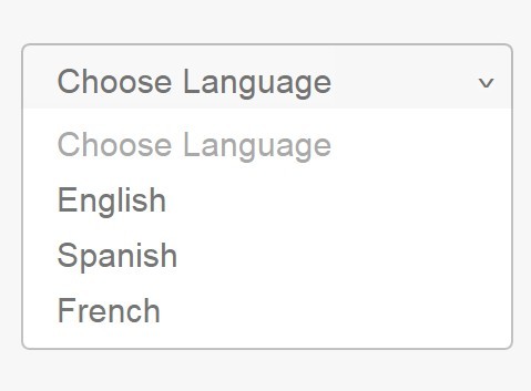
Setting the size can be done by using the global defaults or setting the attribute size on the element directly.
$.fn.wSelect.defaults = { ... size: '5', ... };If the size attribute on the element is set it will overwrite the global value set in the defaults.
<select size="3"> <option></option> ... </select>width
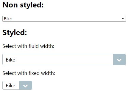
You can set the width of the select elements explicitly by setting the width property via CSS.
.wSelect { width: 200px; }If you want a dynamic width for the select only set the min-width and max-width properties and make sure to NOT include the width property.
.wSelect { min-width: 100px; max-width: 200px; }CSS labels
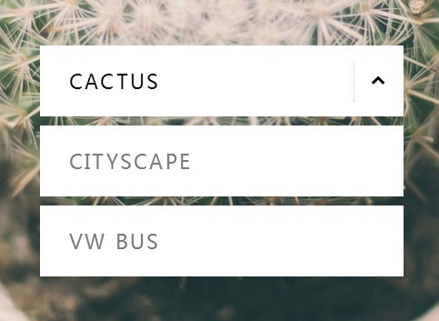
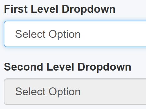
Global CSS labels are also available in this plugin and can be used by setting an adding the class name wLabel-left, wLabel-top or wLabel-left-top to an element.
<label class="wLabel-left">Label:</label>Resources
- More jQuery plugins by Websanova
- Websanova JavaScript Extensions Project
- jQuery Plugin Development Boilerplate
- The Ultimate Guide to Writing jQuery Plugins
License
MIT licensed
Copyright (C) 2011-2013 Websanova http://www.websanova.com

