React Super Treeview
Add/remove nodes, put your own animation, load data asynchronously, and even multi-select
🌟 See Demo w/ Example code
Gif feature demo
shift + click multi-select gmail-style
Full Features
- Expand/Collapse
- Checkbox
- Delete button
- Provide custom delete button
- Asynchronously load data
- Provide custom loading indicator
- Delete animation
- Unlimited nesting
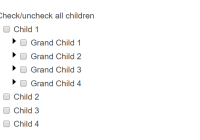
- Granular control over when to show expand, checkbox or delete options
- Multi-select/unselect checkbox (shift + Check) like Gmail
- Control the node adding/delete animation speed
How to install
npm install react-super-treeview --save
Basic Usage
Start using the component in just 2 steps.
Step 1: Import and use component in React:
import React from 'react'; import ReactDOM from 'react-dom'; import SuperTreeview from 'react-super-treeview'; class Example extends React.Component { constructor(){ super(); // SET YOUR DATA this.state = { data: [ { id: 1, name: 'Parent A' }, { id: 2, name: 'Parent B', isExpanded: true, isChecked: true, children: [ { id: 1, name: 'Child 1' }, { id: 2, name: 'Child 2' } ] } ] }; } render(){ return ( // RENDER THE COMPONENT <SuperTreeview data={ this.state.data } onUpdateCb={(updatedData) => { this.setState({data: updatedData}) }} /> ); } } ReactDOM.render(<Example/>, document.getElementById('app'););Step 2: Import styles to project
Import SuperTreeview styles with css or scss file.
The styles are in node_modules/react-super-treeview/dist/style.css or style.scss
Note: When you use the scss file, you can modify the style variables for quick styling.
Using webpack
If you are using webpack, put this in your project's styles.
~react-super-treeview/dist/style.css or scss
~react-super-treeview/dist/style.scss the tilda ~ tells webpack to pick-up the file from node_modules folder
Manually importing styles
You can also manually copy the css/scss file from node_modules/react-super-treeview/dist/style.(s)css and put it in your project files
All Props
Required Props *
| Props | Type | Default | Description |
|---|---|---|---|
data * | array | none | Data that will be displayed in the tree. |
onUpdateCb * | function | none | Function callback when data gets changed (deleted, expanded/collapsed, checked/unchecked). |
depth | number | 0 | Value that tracks the depth of the node tree. The root/highest depth is 0. Children nodes are depth+1 upto infinity. |
deleteElement | element | <div>(X)</div> | Element that displays as the delete button. |
getStyleClassCb | function | (node, depth) => { return ' '; } | Return the class name string you want to add on the node. |
isCheckable | function | (node, depth) => { return true; } | Return true/false to show/hide checkbox on node. |
isDeletable | function | (node, depth) => { return true; } | Return true/false to show/hide delete button on node. |
isExpandable | function | (node, depth) => { return true; } | Return true/false to show/hide expand/collapse button (►) on node. |
keywordChildren | string | 'children' | Set the key where the component should look for the children elements. |
keywordChildrenLoading | string | 'isChildrenLoading' | Set the key that indicates if the children nodes are loading or now. If true then the loadingElement is shown. NOTE: Make sure that the node is expanded (isExpanded: true) for the loadingElement. |
keywordKey | string | 'id' | This is the value that is set as the key attribute on the node (<div key={keywordKey}> node name </div>). It defaults to the id key. This must be a unique key, if not provided or is not unique, will break the animation feature. |
keywordLabel | string | 'name' | The node text is printed from the name key. If you want some other key value to be printed, provide the key here. |
loadingElement | element | <div>loading...</div> | Element that shows when data is being loading. Provide your custom loading element with this prop. |
noChildrenAvailableMessage | string | 'no data found' | Message that shows when the expanded node has no children. |
onCheckToggleCb | function | (arrayOfNodes, depth) => {} | Function callback when checkbox gets toggled. The callback provides an array of nodes (arrayOfNodes) that got checked/unchecked. Since <SuperTreeview /> has a multi-select feature, hence its an array here. All nodes will have the same isChecked state, either true or false. The callback also provides the depth of the node that got checked/unchecked. |
onDeleteCb | function | (node, updatedData, depth) => { return true; } | Function callback when node delete button gets clicked. The callback provides the node being deleted, its depth, and the updated data (updatedData) with the deleted node removed. Return true if you want to proceed with the deletion, and false if you do not want to delete the node. Returning true will trigger the onUpdateCb() prop, discussed below. |
onExpandToggleCb | function | (node, depth) => {} | Function callback when node Expands/Collapses. The callback function provides the node that got toggled, and its depth. |
transitionEnterTimeout | number | 1200 | Time in milliseconds for node appear animation. |
transitionExitTimeout | number | 1200 | Time in milliseconds for node remove |
Data Format
[ { id: 1, name: 'Any String', isExpanded: true, isChecked: true, isChildrenLoading: false children: [ id: 2, name: 'Any String', isExpanded: true, isChecked: true, isChildrenLoading: true children: [] ] } ]; Test
npm test Shoutout
Shoutout to Andrew Onyshchuk for suggesting a clean API exposing strategy.
Thank you TJ Hubert and Prashanth Naika for your contribution to the animation feature and the bug fixes.
TODO:
- Bug:
keywordKeyprop is not being applied - Feature: Make user friendly prop names for
keywordKey,keywordChildrenetc - Performance: Remove the need for lodash
- Feature: Stretch goal: Add ability to add custom decorator/element per node
- Feature: Add css class on nodes based on its state i.e
<div class="expanded">Text</div> - Feature: Provide .scss file with configurable variables
- Workflow: Provide auto-launch browser feature when examples are run with
npm run examples
License
SuperTreeview is MIT licensed.


