ExtendedBootstrapModal
Overview
Extended Bootstrap Modal is a simple Javascript plugin enables you to generate a complex bootstrap modal without any HTML code.
Requirements
- Jquery 1.10 or higher.
Installation
<!-- Import Jquery --> <script src="https://code.jquery.com/jquery-1.12.4.min.js" integrity="sha256-ZosEbRLbNQzLpnKIkEdrPv7lOy9C27hHQ+Xp8a4MxAQ=" crossorigin="anonymous"></script> <!-- Import Bootstrap --> <script src="https://maxcdn.bootstrapcdn.com/bootstrap/3.3.7/js/bootstrap.min.js" integrity="sha384-Tc5IQib027qvyjSMfHjOMaLkfuWVxZxUPnCJA7l2mCWNIpG9mGCD8wGNIcPD7Txa" crossorigin="anonymous"></script> <link href="https://maxcdn.bootstrapcdn.com/bootstrap/3.3.7/css/bootstrap.min.css" rel="stylesheet" integrity="sha384-BVYiiSIFeK1dGmJRAkycuHAHRg32OmUcww7on3RYdg4Va+PmSTsz/K68vbdEjh4u" crossorigin="anonymous"> <!-- Import Extended bootstrap modal plugin --> <script src="plugin/extendedBootstrapModal.js"></script> How to use it
Simple modal
You can simply use the plugin without any parameters, it will generate a simple and classic bootstrap modal with the given text, and a close button.
This is an elegant way to replace the old Javascript Alert, and this is as simple as it.
Sample
ExtendedBoostrapModal('Simple modal without any parameters'); 
Modal state
You can specify a modal state to change the header color :
- success
- warning
- danger
- info
- primary

Complex modal
The plugin become a powerfull tools when you want to generate complex modal with many HTML components.
- No HTML code
- Many modals on the same page without duplicate code
- Possibility to to add a form with inputs, radio button, checkbox and dropdown list
- Add Bootstrap row with many columns
- Easily customizable
Autoload modal with text
ExtendedBoostrapModal({ autoload: true, id: 'my-modal', title: 'Sample modal' }); Modal with simple form
You can add an HTML form by using addForm parameter with id, name, and a list of HTML tags. If you use it, you have to manually define a collection of buttons (at least one for closing).
You can define a callback on each button by using callback parameter, and add parameters with arguments.
ExtendedBoostrapModal({ autoload: true, id: 'my-modal', title: 'Sample modal', addForm: { id: 'form_id', name: 'form_name', inputs: { label: 'textInput', list: [ { id: 'input_id', name: 'input_name', type: 'text', value: '', placeholder: 'my text input' } ] }, buttons: [ { value: 'Cancel', type: 'button' }, { name: 'btn_add', value: 'Validate', type : 'button', class: 'btn-success', callback: 'my_callback_fct', arguments : ['arg1', 'arg2'] } ] } }); function my_callback_fct(arg1, arg2) { } 
Modal with complex form
You can add the following components :
- Input text (with or without pattern)
- Radio button
- Checkbox
- Select
Each component works the same way : you just have to add a node with a name and a tags list.
Input text
inputs: { label: 'input1', list: [ { id: 'input_id1', name: 'input_name1', type: 'text', value: '', placeholder: 'my first text input' }, { id: 'input_id2', name: 'input_name2', type: 'text', value: '', placeholder: 'my second text input with pattern', pattern: '.{5,}' // Pattern example, contain 5 or more characters } ] } Radio button
/!\ You have to use the same name for each radio if you want to linked them
radios : { label : 'radios', list: [ { name: 'radio_name', value: 'choice_1', content: 'Choice 1', checked: true }, { name: 'radio_name', value: 'choice_2', content: 'Choice 2' } ] } Checkbox
checkboxs : { label : 'checkboxs', list: [ { name: 'check1', content: 'Choice 1' }, { name: 'check2', content: 'Choice 2' } ] } Select
selects: { label : 'selects', list : [ { name:"myList", options : [ { name: 'opt1', value: 'Option 1' }, { name: 'opt2', value: 'Option 2', selected: true }, ], } ] } Complete sample
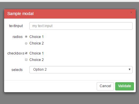
Here is a complete sample you can use to build your proper modal.
ExtendedBoostrapModal({ autoload: true, id: 'my-modal', title: 'Sample modal', addForm: { id: 'form_id', name: 'form_name', inputs: { label: 'textInput', list: [ { id: 'input_id', name: 'input_name', type: 'text', value: '', placeholder: 'my text input' } ] }, buttons: [ { value: 'Cancel', type: 'button' }, { name: 'btn_add', value: 'Validate', type : 'button', class: 'btn-success', callback: 'my_callback_fct', arguments : ['arg1', 'arg2'] } ], radios : { label : 'radios', list: [ { name: 'radio_name', value: 'choice_1', content: 'Choice 1' }, { name: 'radio_name', value: 'choice_2', content: 'Choice 2' } ] }, checkboxs : { label : 'checkboxs', list: [ { name: 'check1', content: 'Choice 1' }, { name: 'check2', content: 'Choice 2' } ] }, selects: { label : 'selects', list : [ { name:"myList", options : [ { name: 'opt1', value: 'Option 1' }, { name: 'opt2', value: 'Option 2', selected: true }, ], } ] } } }); 


