
The best Country Picker for React Native.


Installation
$ yarn add react-native-country-picker-modalBasic Usage
import DeviceInfo from 'react-native-device-info' import React, { AppRegistry, Component, StyleSheet, Text, View, StatusBarIOS, PixelRatio } from 'react-native' import CountryPicker, { getAllCountries } from 'react-native-country-picker-modal' const NORTH_AMERICA = ['CA', 'MX', 'US'] class Example extends Component { constructor(props) { StatusBarIOS.setHidden(true) super(props) let userLocaleCountryCode = DeviceInfo.getDeviceCountry() const userCountryData = getAllCountries() .filter(country => NORTH_AMERICA.includes(country.cca2)) .filter(country => country.cca2 === userLocaleCountryCode) .pop() let callingCode = null let cca2 = userLocaleCountryCode if (!cca2 || !userCountryData) { cca2 = 'US' callingCode = '1' } else { callingCode = userCountryData.callingCode } this.state = { cca2, callingCode } } render() { return ( <View style={styles.container}> <Text style={styles.welcome}>Welcome to Country Picker !</Text> <CountryPicker countryList={NORTH_AMERICA} onChange={value => { this.setState({ cca2: value.cca2, callingCode: value.callingCode }) }} cca2={this.state.cca2} translation="eng" /> <Text style={styles.instructions}>press on the flag</Text> {this.state.country && ( <Text style={styles.data}> {JSON.stringify(this.state.country, null, 2)} </Text> )} </View> ) } } const styles = StyleSheet.create({ container: { flex: 1, justifyContent: 'center', alignItems: 'center' }, welcome: { fontSize: 20, textAlign: 'center', margin: 10 }, instructions: { fontSize: 12, textAlign: 'center', color: '#888', marginBottom: 5 }, data: { padding: 15, marginTop: 10, backgroundColor: '#ddd', borderColor: '#888', borderWidth: 1 / PixelRatio.get(), color: '#777' } }) AppRegistry.registerComponent('example', () => Example)Dark theme example
A simple example to display a CountryPicker component with a dark theme. You need to download a light colored image for the close button, for example this one.
import CountryPicker from 'react-native-country-picker-modal' // change the import path according to your project structure import closeImgLight from "/asset/iconWhite.png"; const DARK_COLOR = "#18171C"; const PLACEHOLDER_COLOR = "rgba(255,255,255,0.2)"; const LIGHT_COLOR = "#FFF"; export default (props) => ( <CountryPicker filterPlaceholderTextColor={PLACEHOLDER_COLOR} closeButtonImage={closeImgLight} styles={darkTheme} {...props} /> ); const darkTheme = StyleSheet.create({ modalContainer: { backgroundColor: DARK_COLOR }, contentContainer: { backgroundColor: DARK_COLOR }, header: { backgroundColor: DARK_COLOR }, itemCountryName: { borderBottomWidth: 0 }, countryName: { color: LIGHT_COLOR }, letterText: { color: LIGHT_COLOR }, input: { color: LIGHT_COLOR, borderBottomWidth: 1, borderColor: LIGHT_COLOR } });Props
| Key | Type | Default | Description |
|---|---|---|---|
| cca2 | string | *required | code ISO 3166-1 alpha-2 (ie. FR, US, etc.) |
| translation | string | 'eng' | The language display for the name of the country (deu, fra, hrv, ita, jpn, nld, por, rus, spa, svk, fin, zho, cym) |
| onChange | function | *required | The handler when a country is selected |
| onClose | function | *required | The handler when the close button is clicked |
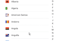
| countryList | array | See cca2.json | List of custom CCA2 countries to render in the list. Use getAllCountries to filter what you need if you want to pass in a custom list |
| excludeCountries | array | [] | List of custom CCA2 countries you don't want to render |
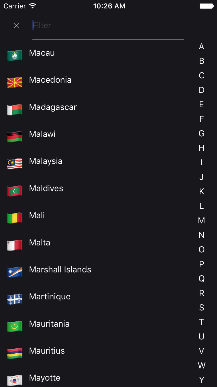
| closeable | bool | false | If true, the CountryPicker will have a close button |
| filterable | bool | false | If true, the CountryPicker will have search bar |
| filterPlaceholder | string | 'Filter' | The search bar placeholder |
| filterPlaceholderTextColor | string | undefined | The search bar placeholder text color |
| autoFocusFilter | bool | true | Whether or not the search bar should be autofocused |
| styles | object | {} | Override any style specified in the component (see source code) |
| disabled | bool | false | Whether or not the Country Picker onPress is disabled |
| transparent | bool | false | If true, the CountryPicker will render the modal over a transparent background |
| animationType | string | 'none' | The handler that controls how the modal animates |
| closeButtonImage | React.element | default close button Image | Custom close button Image |
| flagType | string | 'emoji' on iOS, 'flat' on Android | If set, overwrites the default OS based flag type. |
| hideAlphabetFilter | bool | false | If set to true, prevents the alphabet filter rendering |
| showCountryNameWithFlag | bool | false | If set, then country name will appear next to flag in the view |
| showCallingCode | bool | false | If set to true, Country Picker List will show calling code after country name United States (+1) |
| renderFilter | Function | undefined | If 'filterable={true}' and renderFilter function is provided, render custom filter component.* |
*
renderFilter = ({value, onChange, onClose}) => ( <CustomFilterComponent value={value} onChange={onChange} onClose={onClose} /> )Dependencies
- world-countries : https://www.npmjs.com/package/world-countries
FAQ
Is it supported and tested both on android and iOS?
YES
Is the data that is populated inside the list saved offline once I install your package?
YES : It used the world-countries package and image is stored into json and base64.
Tiers lib using this lib
See also
Contribution
- @xcapentier The main author.
Questions
Feel free to contact me or create an issue
made with ♥
Licence
Hire an expert!
Looking for a ReactNative freelance expert with more than 12 years experience? Contact me from my website!


