hummingbird-popover
A tiny and fast jQuery plugin for multi-layer right click context-menus.
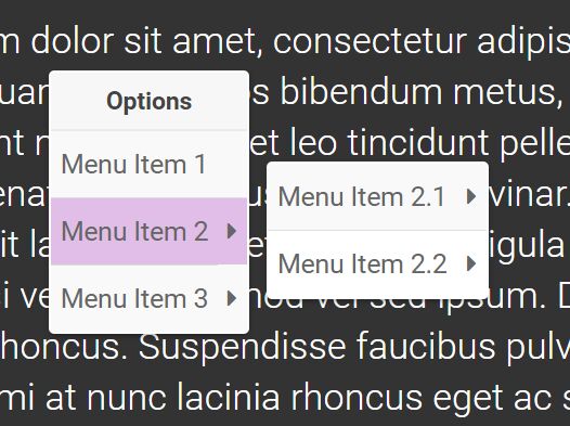
Visit demo page
Features
- Opens popover menues on right mouse click.
- Based on simple HTML lists.
- Can be attached to any HTML element.
- Supports multiple layer menues.
- Supports multiple popovers on one page.
- Dynamical change of popover content.
- Add custom data via data-id
Dependencies
- bootstrap v3.3.7
- jQuery v3.1.1
- font-awesome v4.7.0
The hummingbird-popover is tested with these versions, newer versions work most probably as well.
Example

Getting started
Usage
Add the following resources for the hummingbird-popover to function correctly:
<!-- Required Stylesheets --> <link href="/path/to/bootstrap.css" rel="stylesheet"> <link href="/path/to/font-awesome.css" rel="stylesheet"> <link href="/path/to/hummingbird-popover.css" rel="stylesheet"> <!-- Required Javascript --> <script src="/path/to/jquery.js"></script> <script src="/path/to/bootstrap.js"></script> <script src="/path/to/hummingbird-popover.js"></script> Create an HTML element as bindpoint for the popover, e.g. an <h1>. The id and data-id can be chosen arbitrarily. However, it is important that the data-id of the bindpoint and the id of the popover "structure", i.e. the list containing the popover content, are equal.
<h1 id="theText" data-id="changeText">Click this text with the right mousebutton. A popover will appear to change text, color or font.</h1> Create a simple structure for the popover content. The class must be hummingbird-popover-converter and the id must be equal to the data-id of the bindpoint (see above). The hyphens indicate the level and the belonging of the popover items. This means that items of one popover can have a popover by themselves. In the example the base popover contains Change text, Change color and Change font. The Change color has again a popover containing Red colors and Blue colors, etc. Add additional custom data via the data-id of individual <li>'s.
<div class="hummingbird-popover-converter" id="changeText"> <li>Change text</li> <li>Change color</li> <li>-Red colors</li> <li data-id="dark">--DarkRed</li> <li>--Red</li> <li>--OrangeRed</li> <li>-Blue colors</li> <li data-id="dark">--MidnightBlue</li> <li>--Blue</li> <li>--LightSkyBlue</li> <li>Change font</li> <li>-bold</li> <li>-normal</li> <li>-lighter</li> </div> Initialize hummingbird-popover and bind it to the HTML element (#theText). Then create the popover content by calling the setContent() method.
$("#theText").hummingbirdPopover(); $("#theText").hummingbirdPopover("setContent"); Congratulations, you are done, your HTML element has now right mouse click popover functionality.
Styling items
Under the hood, the items are based on <tr> tags. To style the items it is possible top add css styles like
<li data-trStyle="border-bottom:3px solid;">Change color</li> which adds a bold line below the item. Other stylings are possible.
Multiple popovers on one page
Multiple popovers on one page can be implemented straight forward. Just create a new bindpoint and new popover content. Make sure to use the same names for the bindpoint's data-id and the content's id. Then initialize the hummingbird-popover on the new bindpoint.
Methods
Methods are used to interact with the popover programmatically. The following methods are available:
- destroy()
Destroys all popovers.
$("#theText").hummingbirdPopover("destroy"); - setContent()
Creates the content of the popover. This method can be used to dynamically change the popover's content. Thus, call this method after changing the content of the popover content structure (that one with class=hummingbird-popover-converter). It is also possible to change the content on a right mouse click event, hence just before the popover is created. Therefor, the right mouse click event must be catched with the jQuery mousedown method before the popover catches it, which means that the mousedown method must appear before the hummingbird-popover.js in your source code.
$("#theText").hummingbirdPopover("setContent"); - hide()
Call this method to hide the following popover on the next right mouse click. After that, popovers are again normally triggered by the right mouse click event. Similar to the setContent method, this method can be used directly after a right mouse click to prevent the popover directly on this click, i.e. the popover is not shown on this click.
$("#theText").hummingbirdPopover("hide"); Events
An event is fired if a popover option has been selected (left mouse click) so that your application can respond:
- hummingbirdPopover_action
The event can be catched as shown below. The selected popover option can be retrieved from the data.text parameter and the optional custom data (via the data-id) can be retrieved from the data.dataID parameter. The whole "path" of the selected option is returned as the array data.parentsText. Click on "OrangeRed" as an example.
$("#theText").on("hummingbirdPopover_action", function(e,data) { //do something ... if (data.text.includes("Red") || data.text.includes("Blue")) { $("#theText").css({"color":data.text}); } if (data.text == "bold" || data.text == "normal" || data.text == "lighter") { $("#theText").css({"font-weight":data.text}); } if (data.dataID == "dark") { alert("A dark color has been chosen!") } if (data.text == "OrangeRed") { alert("Parent items are " + JSON.stringify(data.parentsText)) } }); 


