AnimatedDialog.js
jQuery plugin, animates the showing of a model dialog. Check out the demo to see how.
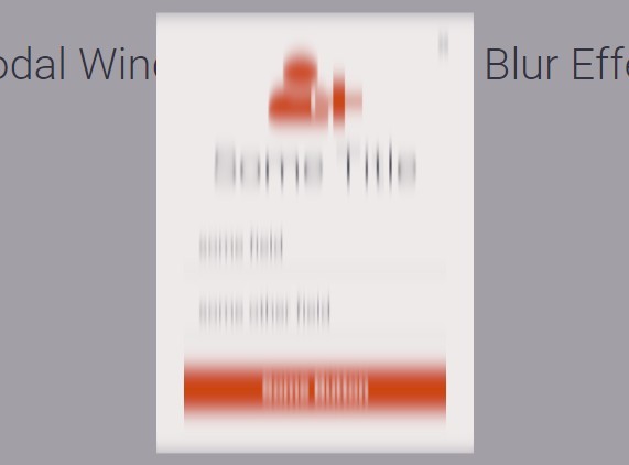
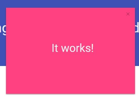
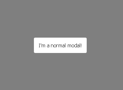
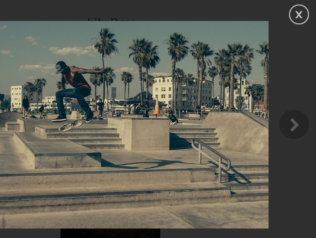
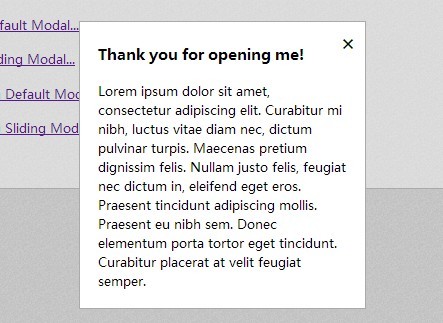
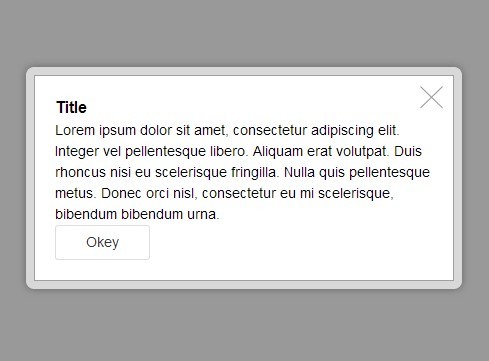
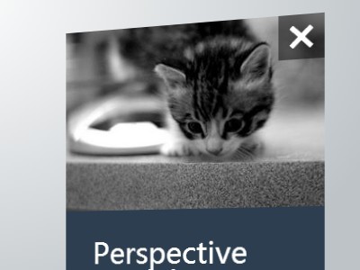
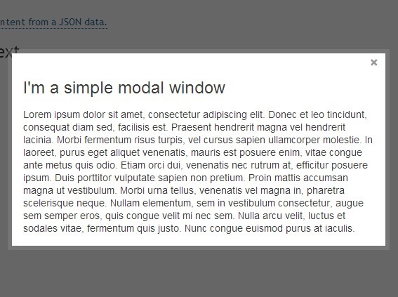
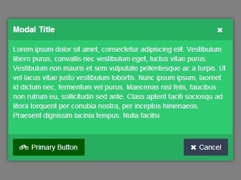
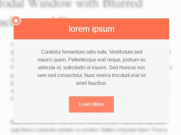
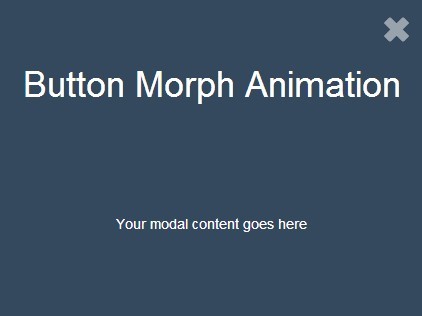
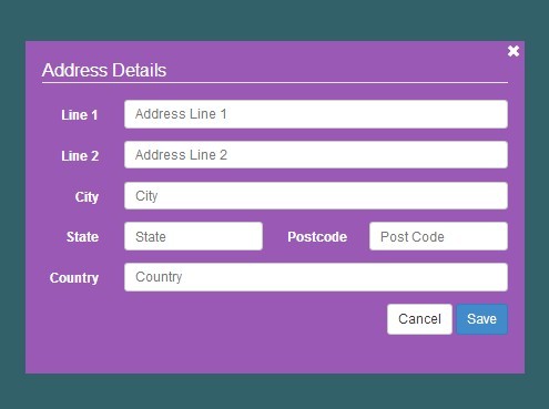
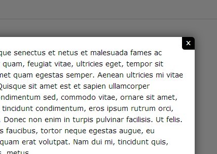
##Demo
Installation
Download the latest release of AnimatedDialog.js
Once you have downloaded the the JS and CSS files stick em in your HTML. AnimatedDialog.js requires jQuery
<head> <link rel="stylesheet" href="jquery.animated.dialog.min.css" /> </head> <body> <script type="text/javascript" src="jquery.js"></script> <script type="text/javascript" src="jquery.animated.dialog.min.js"></script> </body>Browser Support
AnimatedDialog.js is designed to work in CSS3 compliant browsers. For other browsers the dialog will still show, just not in a nice cool way. The same applies to mobile devices due to the limitation of not running multiple transitions concurrently.
Basic Usage
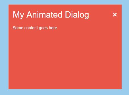
Use a jQuery selector to find the containing element and call the .animatedDialog() plugin to initialise. If using the default content selector your content must be a sibling of the button with the class 'animated-dialog-content'.
<button id="my-animated-dialog"></button> <div class="animated-dialog-content"> <div class="animated-dialog-header"> <div class="animated-dialog-title">My Animated Dialog</div> <div class="animated-dialog-close">×</div> </div> <div> My content goes here </div> </div> <script type="text/javascript"> $("#my-animated-dialog").animatedDialog(); </script>Options
Have a play around with the options, in the code example below the values for each options are the default.
$("#showdialog").animatedDialog({ // Selector to finding the content to put in the dialog "content": "~ .animated-dialog-content", // Selector to find the clickable item, in the content, that will close the dialog "closeable": ".animated-dialog-close", // The minimum width of the dialog element in px, resizes if window is smaller than defined "width": 800, // The minimum height of the dialog element in px, resizes if window is smaller than defined "height": 600, // The background colour for the dialog // Can be an <object> with start and end colours. Useful if you have a different coloured button to the background // of your dialog // e.g. // "background": { // "start": "#1565C0", // "end": "#fff" // } "background": "#fff", // The animation tween, can be either a <string> or <function> // <string> value options are "centerExpand", "topExpand", "bottomExpand" // <function> return <array> of <object>s, each element is a stage in the tween. // Possible values to tween are top, left, width, height and backgroundColor // Passed parameters to the function are // <object> - container element of the dialog // <object> - the start tween parameters // <object> - the end tween parameters, this object should be included as the last element in the array // // e.g. // "tween": function(container, start, end) { // return [{ // "left" : (container.width / 2) - (start.width / 2), // "top" : (container.height / 2) - (start.height / 2) // }, end]; // } "tween": "centerExpand" });
