#CSS-Gallery CSS-Gallery demonstrates the true power of CSS and LESS. This is a fully interactive photo gallery, built entirely in CSS and LESS, with no Javascript anywhere.
This example is a bit over-the-top, and I do not recommend building actual interactive applications with no Javascript anywhere. However, this serves as a showcase of the many techniques to move logic into CSS, which can frequently be much simpler than trying to maintain every possible state by hand in Javascript code.
#Features
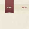
- Use the hamburger menu to filter photos by category
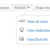
- Use the view icons on the upper right to switch between thumbnail and list views
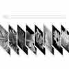
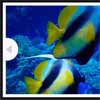
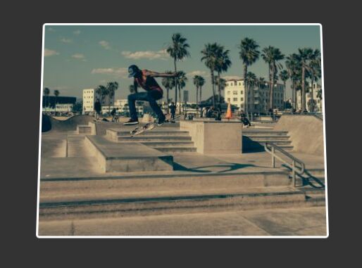
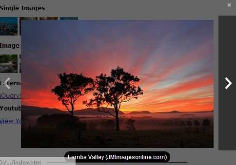
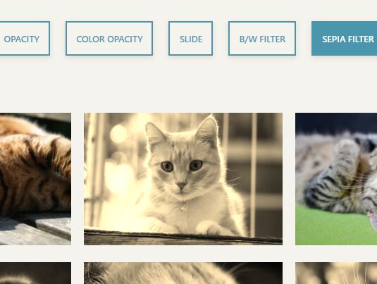
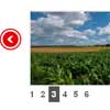
- Click a photo to open a scaled lightbox showing a larger view
- Click the arrows on the sides of the lightbox to switch photos directly.
#Implementation All of the source can be found in the LESS files in the styles directory. Here are some of the more interesting techniques that I used.
Data Binding with LESS
All of the data and logic behind the photo gallery lives only in a LESS file. The HTML source just contains empty placeholders; all content and behavior is inserted through LESS mixins powered by the data in that file (using :after selectors and background-images).
The data file defines a mixin that calls its callback for each image in the gallery. Each component in the gallery calls this mixin to add content to its elements, selecting elements via numeric identifiers.
Scaling the lightbox
The lightbox (shown by clicking any photo) is scaled to fit within the browser viewport, shrinking both horizontally and vertically depending on the aspect ratios of the browser and the current photo. Other than background-size (which cannot affect the box itself), CSS has no direct way to scale an element to fit. Instead, I set the element's max-width to constrain it horizontally. To constrain it vertically, I set the width to a calc() formula that divides the height of the viewport (calculated using the vh unit) by the aspect ratio of the photo being displayed.
For more details, and the algebra used to derive the calc() formula for the width from the desired height, see the source.
Maintaining state
The gallery maintains three different pieces of local state:
- Current page / filter
- Whether the hamburger is open
- Current view
- Lightbox content
The current page is stored in the URL fragment, and styled using :target selectors for elements with matching IDs (these IDs, and corresponding links, are the only pieces of actual content that appears in the HTML).
The hamburger state is linked to the focus state of an invisible <input> element; the hamburger is displayed when the element is focused. Clicking anywhere after opening the hamburger will shift focus elsewhere, hiding the hamburger menu and resulting in expected behavior.
The final two pieces of state are stored in hidden radio buttons, using :checked selectors to style each state appropriately.
The lightbox is powered by a separate radio button for each photo, using auto-generated CSS selectors to show the appropriate photo and title for the clicked image. The lightbox is opened by clicking <label> tags for each photo. Similarly, the navigation within the lightbox is powered by a complete set of <label> tags for each image, using more auto-generated CSS to show only the labels pointing to the previous and next image, and to position each link on the appropriate side of the lightbox.
LESS :extend syntax is used to reduce the size of the generated CSS, combining the selectors for every valid state instead of endlessly repeating the same couple of properties.
Animations
Almost all state changes are animated. CSS cannot animate the display property, so elements are hidden by setting height, width, or opacity to 0, and including those properties in transition.


