Bootstrap Rating
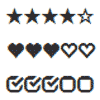
Bootstrap Rating is a jQuery plugin that creates a rating control that uses Bootstrap glyphicons for rating symbols.
See bootstrap rating in action.
Dependencies
Bootstrap Rating depends on jQuery and can use Bootstrap for the rating symbols. Actually, the glyphs in font format that Bootstrap provides.
<link href="dist/css/bootstrap.css" rel="stylesheet"> <script type="text/javascript" src="dist/js/jquery-1.10.2.js"></script> Usage
Bootstrap Rating uses a hidden input to keep the rating value. This value corresponds to the 0-based index of the selected rating.
Any rating input, those with class rating, are implicitly initialized.
<input type="hidden" class="rating"/> Also it can be explicitly initialized just calling .rating() on the desired input:
$('input').rating(); Behind the rating control
Bootstrap Rating uses an input to keep the rating value. But the relationship between the behind the scenes input control and the rating control goes a little further. This input is the associated control. They are tied together.
You can disable the rating control simply disabling its associated input control:
<input type="hidden" class="rating" disabled="disabled"/> Make it read only:
<input type="hidden" class="rating" data-readonly/> Set its initial value:
<input type="hidden" class="rating" value="2"/> Or attach events:
$('input').on('change', function () { alert('Rating: ' + $(this).val()); }); Customizing the rating symbols
The default rating symbols can be replaced with another ones. Just add the desired glyphicon for the filled and empty states:
<input type="hidden" class="rating" data-filled="glyphicon glyphicon-heart" data-empty="glyphicon glyphicon-heart-empty"/> Check the available glyphs.
Again, you can explicitly initialize the plugin passing the glyphicons as parameters:
$('input').rating({ filled: 'glyphicon glyphicon-heart', empty: 'glyphicon glyphicon-heart-empty' }); If you want to change the default glyphicons for all the rating controls, you only need to override the plugin default values:
$.fn.rating.defaults.filled = 'glyphicon glyphicon-heart'; $.fn.rating.defaults.empty = 'glyphicon glyphicon-heart-empty'; This needs only be called once, but remember to make these assignments before the rating controls are created.
If you even want more control over the symbols appearance, you can customize the selected symbol filled state with the filled-selected attribute. This attribute takes precedence over the default filled state allowing you, for example, to fill only the selected one:
<input type="hidden" class="rating" data-filled="glyphicon glyphicon-heart-empty" data-filled-selected="glyphicon glyphicon-heart" data-empty="glyphicon glyphicon-heart-empty"/> Or programmatically:
$('input').rating({ filled: 'glyphicon glyphicon-heart-empty', filledSelected: 'glyphicon glyphicon-heart', empty: 'glyphicon glyphicon-heart-empty' }); Using Non-Bootsrap icons
Though the original idea was to use glyphicons provided by Bootstrap, any symbol can be used. It means that the rating control is not tightly tied to Bootstrap and you can use it without Bootstrap.
Font Awesome icons
You can use the Font Awesome by Dave Gandy - http://fontawesome.io. Check Font Awesome for a list of available icons.
-
Include in the
<head>the reference to the Font Awesome CSS.<link rel="stylesheet" href="path/to/font-awesome.min.css"> -
Start using the classes provided by Font Awesome.
<input type="hidden" class="rating" data-filled="fa fa-bell fa-3x" data-empty="fa fa-bell-o fa-3x"/>
Custom CSS icons
You can even create your own not font based icons, using raw CSS:
-
Define a symbol class for empty and filled states.
.symbol { display: inline-block; border-radius: 50%; border: 5px double white; width: 30px; height: 30px; } .symbol-empty { background-color: #ccc; } .symbol-filled { background-color: black; } -
Start using those custom classes.
<input type="hidden" class="rating" data-filled="symbol symbol-filled" data-empty="symbol symbol-empty"/>
Setting rate range
The default range is (0..5], or in plain text, starting at 0 (not included) and stopping at 5 (included). In this case the range of whole symbols would include [1, 2, 3, 4, 5].
It can be overriden by means of two data attributes, data-start for the start rate value and data-stop for the stop/end one. If you want to define a range (5..10]:
<input type="hidden" class="rating" data-start="5" data-stop="10"/> Also you can explicitly initialize the plugin passing the start and stop values as parameters:
$('input').rating({ start: 5, stop: 10 }); If what you need is to change the default start and stop values for all the rating controls, just override the plugin defaults:
$.fn.rating.defaults.start = 5; $.fn.rating.defaults.stop = 10; Fractional range
You can configure the rating to get partial or fractional rates. The data-fractions indicates the number of equal parts that make up a whole symbol.
For example, a data-fractions of two will create a rating with half symbols:
<input type="hidden" class="rating" data-fractions="2"/> The possible values in this case would be all the whole and half rates between (0..5], i.e, [0.5, 1, 1.5, 2, 2.5, 3, 3.5, 4, 4.5, 5].
Stepping different
The rating range spans all the integers from start to stop, incremented or decremented by a step. The default step is 1.
Use data-step attribute to change the stepping:
<input type="hidden" class="rating" data-stop="10" data-step="2"/> Or the explicit initialization:
$('input').rating({ stop: 10, step: 2 }); The range of whole symbols defined in this case would include [2, 4, 6, 8, 10].
Also, as usual, you can change the default step globally:
$.fn.rating.defaults.step = 2 My Python background wouldn't forgive me not supporting negative stepping:
<input type="hidden" class="rating" data-stop="-10" data-step="-2"/> Giving [-2, -4, -6, -8, -10] as the range of whole symbols.
Getting more control over the symbols
Every time a rating symbol is created the extendSymbol callback is called. This callback gives you the full control over the symbol elements. As with any regular element, you can bind event handlers, add attributes, add classes, or anything you need to customize it. The callback's context is the rating symbol DOM element and receives the rate as parameter.
For example, you could bind the bootstrap tooltip on all the rating symbols to show the rate on hover:
$('input').rating({ extendSymbol: function (rate) { $(this).tooltip({ container: 'body', placement: 'bottom', title: 'Rate ' + rate }); } }); Symbol events
Rating symbols can fire two events rating.rateenter and rate.rateleave. These events are triggered when the pointer enters and leaves a rate.
For example, you can use these events to dynamically update the bootstrap tooltip, even for fractional ratings.
<input type="hidden" class="rating-tooltip-manual" data-filled="fa fa-star fa-3x" data-empty="fa fa-star-o fa-3x" data-fractions="3"/> $('.rating-tooltip-manual').rating({ extendSymbol: function () { var title; $(this).tooltip({ container: 'body', placement: 'bottom', trigger: 'manual', title: function () { return title; } }); $(this).on('rating.rateenter', function (e, rate) { title = rate; $(this).tooltip('show'); }) .on('rating.rateleave', function () { $(this).tooltip('hide'); }); } }); Methods
rate
You can programmatically set, get, or reset the current rating value via javascript using the rate method.
To set the rate value:
$('input').rating('rate', 2.5); To get the rate value:
var rate = $('input').rating('rate'); To reset the rate value:
$('input').rating('rate', ''); 