countrypicker
based on the popular bootstrap-select

countrypicker is a jQuery plugin that utilizes Bootstrap's dropdown.js and bootstrap-select to provide country data and styling to standard select elements.
Dependencies
Requires jQuery v1.8.0+, Bootstrap’s dropdown.js component, and Bootstrap's CSS. If you're not already using Bootstrap in your project, a precompiled version of the minimum requirements can be downloaded here.
Usage
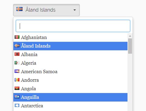
Create your <select> with the .selectpicker and .countrypicker class. The data-api from bootstrap-select will automatically apply a basic theme to these elements. Then the data-api from countrypicker will populate the select with countries.
<select class="selectpicker countrypicker"></select> Copyright and license
Copyright (C) 2017-2018 country-picker
Licensed under the MIT license.
Bootstrap 4 beta-2
Bootstrap-select is still incompatible (ver. 1.12.4) with Bootstrap 4 beta-2. Include an additional CSS file, or put the following between <style></style> tags on the page you're displaying the country-picker on:
/* Make bootstrap-select work with bootstrap 4 see: https://github.com/silviomoreto/bootstrap-select/issues/1135 */ .dropdown-toggle.btn-default { color: #292b2c; background-color: #fff; border-color: #ccc; } .bootstrap-select.show > .dropdown-menu > .dropdown-menu { display: block; } .bootstrap-select > .dropdown-menu > .dropdown-menu li.hidden { display: none; } .bootstrap-select > .dropdown-menu > .dropdown-menu li a { display: block; width: 100%; padding: 3px 1.5rem; clear: both; font-weight: 400; color: #292b2c; text-align: inherit; white-space: nowrap; background: 0 0; border: 0; text-decoration: none; } .bootstrap-select > .dropdown-menu > .dropdown-menu li a:hover { background-color: #f4f4f4; } .bootstrap-select > .dropdown-toggle { width: 100%; } .dropdown-menu > li.active > a { color: #fff !important; background-color: #337ab7 !important; } .bootstrap-select .check-mark { line-height: 14px; } .bootstrap-select .check-mark::after { font-family: "FontAwesome"; content: "\f00c"; } .bootstrap-select button { overflow: hidden; text-overflow: ellipsis; } /* Make filled out selects be the same size as empty selects */ .bootstrap-select.btn-group .dropdown-toggle .filter-option { display: inline !important; } Examples
Data Default
Set default country
data-default="United States" Live Search
Searchable with bootstrap-select.js
data-live-search="true" With Flag
Searchable, data default with flags
data-flag="true" 


