Bootstrap Combobox
We had need of a combobox at work and after looking around at the available options I was not happy with any of them. The project had all it's styling based on Twitter's Bootstrap, so building on that made sense.
How to install it
You can install this plugin one of two ways.
1. Manual download
Previously, this was the only way to install the plugin. You will need two files included in your HTML in order for this to work:
- js/bootstrap-combobox.js
- css/bootstrap-combobox.css
2. Npm install
npm install @danielfarrell/bootstrap-combobox 3. Bower install
This plugin is now in bower! If you've already installed bower on your machine, simply use the command:
bower install bootstrap-combobox This will install the plugin to your bower_components folder. For more information please see http://bower.io/
How to use it
The dependencies are the Bootstrap stylesheet(CSS or LESS). Include it and then the stylesheet(CSS or LESS) and javascript.
Then just activate the plugin on a normal select box(suggest having a blank option first):
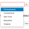
<select class="combobox"> <option></option> <option value="PA">Pennsylvania</option> <option value="CT">Connecticut</option> <option value="NY">New York</option> <option value="MD">Maryland</option> <option value="VA">Virginia</option> </select> <script type="text/javascript"> $(document).ready(function(){ $('.combobox').combobox(); }); </script> Options
When activating the plugin, you may include an object containing options for the combobox
$('.combobox').combobox({bsVersion: '2'}); menu: Custom markup for the dropdown menu list element.
item: Custom markup for the dropdown menu list items.
matcher: Custom function with one item argument that compares the item to the input. Defaults to matching on the query being a substring of the item, case insenstive
sorter: Custom function that sorts a list items for display in the dropdown
highlighter: Custom function for highlighting an item. Defaults to bolding the query within a matched item
template: Custom function that returns markup for the combobox.
bsVersion: Version of bootstrap being used. This is used by the default template function to generate markup correctly. Defaults to '3'. Set to '2' for compatibility with Bootstrap 2
appendId: The desired id of the transformed combobox. This will become the id attr and can be mapped to a label using the for attribute. Useful for accessibility.
renderLimit: The maximum number of suggestions to render on the screen at one time. Useful for dealing with source elements with items.
clearIfNoMatch: When true, the combobox will clear its contents when unfocusing if a matching option is not selected. Defaults to true.
iconCaret: Custom icon font class for the caret button of the combobox. This is only effective when using {bsVersion: '4'}. (e.g. 'fas fa-caret-down' when using Font Awesome)
iconRemove: Custom icon font class for the remove button of the combobox. This is only effective when using {bsVersion: '4'}. (e.g. 'fas fa-times' when using Font Awesome)
Dependencies
Uses the latest 1.X version of jQuery and the latest version of Bootstrap.
Live Example
Bootstrap 2.0 Version
http://dl.dropbox.com/u/21368/bootstrap-combobox/index.html
Bootstrap 3.0 Version
http://bootstrap-combobox-test.herokuapp.com/
License
Licensed under the Apache License, Version 2.0


