Toast - A Bootstrap 4.2+ jQuery plugin
About
As of Bootstrap 4.2, toasts have been introduced and the aim of this plugin is to make them easier to use.
Usage
You can pass to the $.toast function an object with the settings for your toast which are as follows:
| Parameter | Description | Default | Values |
|---|---|---|---|
| title | Shows in the top left corner of the toast header | 'Notice!' | |
| subtitle | Shows in the top right corner of the toast header | N/A | |
| content | Shows in the toast body | N/A | |
| type | Determines the style of the toast based on Bootstrap styles | 'info' | 'info', 'success', 'warning', 'error' |
| delay | Determines how long the Toast shoud be shown for. The default, -1, will show the toast until the user clicks close. | -1 | omit or set to -1 to disable auto close, or timeout value in milliseconds |
| img | Shows an image before the title | N/A | { src: '', class: '', title: '', alt: '' } |
| pause_on_hover | true/false respectively to pause on hover | false | true/false |
| container | Set the container inside which the toasts will be displayed | $("body") | A JQuery selector |
Note: If content is omitted, the toast will not have a .toast-body and can be used as a small snack which will be shown below in the examples. By default toasts will be positioned in the top right corner and will in the future (hopefully) have other position options.
$.toast({ title: 'Toast', subtitle: '11 mins ago', content: 'Hello, world! This is a toast message.', type: 'info', delay: 5000 });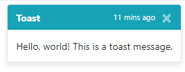
The respective markdown for the above would be:
<div class="toast" role="alert" aria-live="assertive" aria-atomic="true" data-delay="5000"> <div class="toast-header bg-info text-white"> <strong class="mr-auto">Toast</strong> <small class="text-white">11 mins ago</small> <button type="button" class="ml-2 mb-1 close" data-dismiss="toast" aria-label="Close"> <span aria-hidden="true" class="text-white">×</span> </button> </div> <div class="toast-body">Hello, world! This is a toast message.</div> </div> To show a "snack" (a small version of the toast), simply omit the content property:
$.toast({ title: 'A small bitesize snack, not a toast!', type: 'info', delay: 5000 });
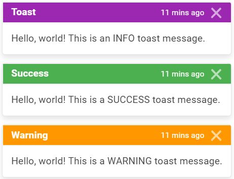
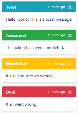
Now, onto the different types:
An 'info' toast
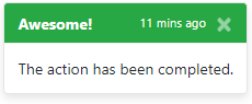
A 'success' toast
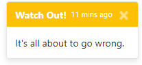
A 'warning' toast
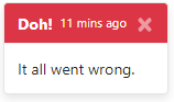
An 'error' toast
The toasts are stackable:
Caveats
The toast will remain in the DOM when hidden, I am working on a way to incorperate removing them from the DOM or reusing existing ones if left in, however, for the time being, you can use the following to remove the toast once it is hidden from the DOM:- As of 2019-03-16, the toasts will be removed automatically from the DOM.
$('body').on('hidden.bs.toast', '.toast', function () { $(this).remove(); });Roadmap
Allow img in toast as is shown in the Bootstrap 4 documentation- 2019-03-16- Allow the option to prevent stacking
Autoremove toast from DOM once hidden- 2019-03-16- Custom styling (rounded toasts, blocky toasts, custom background colours)
- Positioning of the actual toast
Contributing
Feel free to contribute in any of the ways outlined:
- Request features
- Submit bug reports
- Submit pull requests
- Help by answering issues
- Tell us if you are using the plugin in your project (it helps!)
Just a few guidelines (for now):
- Follow the existing conventions (if unsure, make an issue)
- Ensure dist and js/css dirs are kept uptodate with each other
- Minify using https://closure-compiler.appspot.com/home (no custom options)


