Modal-Picker
A JQuery plugin that creates a Bootstrap modal picker.
- Modal-Picker v1.2.8 requirements:
- -jQuery +
- -Bootstrap v3.3.7
Creates a Bootstrap modal with a list of items to select from, then copy selected value to HTML input control. Commonly use to replace drop-down options where data list can dynamically change. Traditionally, when values in a drop-down options are updated. When user review a record where the value no longer exist in the list, an error is throw because the drop-down control cannot pre-select that value. This makes drop-down values very strict. With Modal-Picker plugin, can solve this problem.
How It Works
During the Picker plugin creation, the <div> wrapper is appended to <body> tag at the bottom of page. This allow quick loading through-out the entire web application. When using ajax parameter, the ajax is only called once to create the picker modal. If user clicked again, plugin checks to see if the modal Id already exist. If TRUE, simply display the modal. Selected text and value are copied to the <input> element. Text will display in the field while also adding the data-name="text" and data-id="value" to that element. When using a <div> element, buttons are created to allow user to select more than one item from the list.
General Setup
Add a script link to the plugin.
<script src="~/Scripts/mi-picker.js"></script>
Add a text box and a button. Button will trigger the modal picker. Text box is used to copy the selected value/text from the picker.
<div class="form-group-sm form-inline"> <input type="text" id="textbox1" class="form-control" disabled="disabled" /> <button type="button" id="button1" class="btn btn-xs btn-primary">...</button> </div>
Add the <script> tag.
<script> $(document).ready(function () { $('#button1').click(function () { $('#textbox1').Picker(); }); }); </script> Plugin Options
Modal-Picker accepts a few options to better customize the picker modal.
| id | (optional) MyModal | overrides the default parent Id of the modal div. |
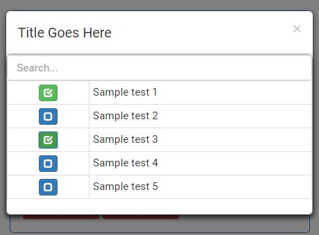
| title | (optional) Title Goes Here | overrides the default modal title. |
| group | (optional) NULL | returns specific group when using server calls, see ajax. Also, append group name to css class for additional jquery functionally. |
| buttonTemplate | (optional) NULL | If not set, will use Bootstrap 'gyphicon-unchecked' for the button image. NOTE: text is place inside of a button tag. buttonTemplate: 'pickMe' Or do a FontAwesome icon like this: buttonTemplate:'<i class="fa fa-circle"></i>' |
| data | (optional) NULL | provide a custom set of data to fill the picker values. This data model is based from Microsoft MVC SelectListItem class. Javascript Object = [{Text: "Sample test 1", Value: "1", Group: {Name: "Group-1"} }] |
| ajax | (optional) false | when true, will make a ajax call to server with return Json result to fill the picker values. |
| url | (optional) NULL | required when ajax set to true. URL of server controller to fetch Json data model. |
| multiSelect | (optional) false | Turns picker into a multi-select mode to prevent opening and closing a modal window. Great when using DIV elements! |
| isSubModal | (optional) false | When using the picker from another modal window, set this to true to allow parent modal to scroll (when needed). |
| callback | (optional) function() | provide additional jquery functionally once the selection has been made. |
| showBlank | (optional) false | place a blank item at top of list to allow uses to clear a selected item. |
Change History
- v1.1.0 - 2/23/2017: added feature to search list
- v1.2.0 - 3/02/2017: ability to add a list of buttons to a DIV tag
- v1.2.1 - 3/07/2017: add multiSelect option. When using DIVs, you can build a list of buttons and pre-select the item without opening and closing the model.
- v1.2.2 - 3/21/2017: Add isSubModal option. When using picker as a parent modal, upon close removes the class="modal-open" from the tag to allow scrolling on the main page.
- v1.2.3 - 3/22/2017: Truncate text longer than 30 characters
- v1.2.4 - 4/11/2017: BUG FIXES, - Relocate AJAX after the intital check for existing modal picker. AJAX calls were made on every call instead of the 1st call only. - Relocate the callback function within the button click event to fired once a selection was made. - When Searching, not able to merge simple ({Value: '', Text: ''}) model to filtered array.
- v1.2.5 - 5/15/2017: Added feature, Bootstrap's tooltip to display additional information for each item. - NOTE: Since MS SelectListItem class doesn't inculde the "Title" property, must use a anyomus type class object ({Value: '', Text: '', Title: ''}) to build model. Renamed the 'callback' option to 'onSelected' to provide better understanding and usability.
- v1.2.6 - 6/12/2017: Added feature to include a blank option at the top of the list. Useful for allowing users to blank/clear the selected picked item.
- v1.2.7 - 8/23/2017: Set default focus to search box upon opening modal window
- v1.2.8 - 8/30/2017: Option to display "disabled" items via CSS style while allowing the user to select it.


