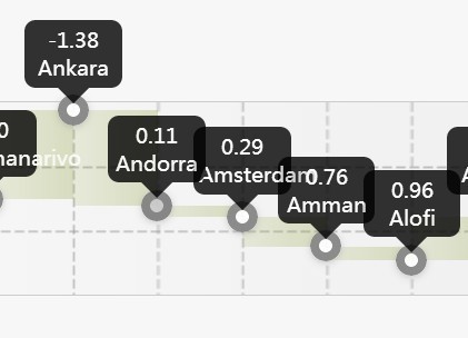
jQuery Tooltipify
jQuery Tooltipify creates a slide in stylable tooltip to replace the default browser tooltip.
Please visit www.vicreative.nl for full documentation and demo.
Install
npm
npm install jquery-tooltipify Import the module:
import "jquery-tooltipify"; scss
import "jquery-tooltipify/src/tooltipify.scss"; css
import "jquery-tooltipify/lib/tooltipify.css"; Options
animationDuration
Sets the duration of the animation in miliseconds.
datatype: Integer
default: 100.
$("[title]").tooltipify({ animationOffset : 200 });animationOffset
Sets the offset used in the animation propery to animate for showing.
datatype: Integer
default: 50.
$("[title]").tooltipify({ animationDuration : 500 });animationProperty
Sets the propery to animate for showing. When left empty, no animation will take place.
datatype: String
default: "left".
possible values: All properties supported by the animate method of jQuery are allowed.
$("[title]").tooltipify({ animationProperty : "top" });content
Sets the content of the tooltip. This can be either text or html.
Note: When content is set, the title attribute will be ignored.
Note: When text is set, no html encoding will take place.
datatype: String
default: ""
$("span.tooltip").tooltipify({ content : "<div>my content</div>"});cssClass
Sets the class of the tooltipify container.
datatype: String
default: ""
$("span.tooltip").tooltipify({ cssClass : "tooltip-purple"});displayAware
Sets wheter the tooltip should be display aware. When set to true, the tooltip will be displayed on an other position (probably the opposite direction) when there is not enough space to display the tooltip.
datatype: Boolean
default: true
$("[title]").tooltipify({ displayAware : true });hideEvent
Sets the event that hides the tooltip.
datatype: String
default: "mouseout"
possible values: Any possible jQuery event or custom event.
$("[title]").tooltipify({ hideEvent : "blur" });offsetLeft
Sets an offset to the left.
datatype: Integer
default: 0
$("[title]").tooltipify({ offsetLeft : 10 });offsetTop
Sets an offset to the top.
datatype: Integer
default: 0
$("[title]").tooltipify({ offsetTop : 10 });opacity
Sets the final opacity of the tooltip. This will be faded in from 0.
datatype: Double
default: 0.8
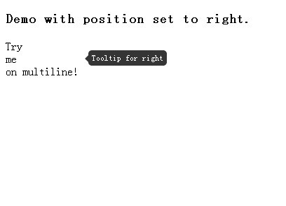
$("[title]").tooltipify({ opacity : 1 });position
Sets the position of the tooltip.
datatype: String
default: "top"
possible values: "top", "left", "right", "bottom"
$("[title]").tooltipify({ position : "right" });showEvent
Sets the event that triggers the tooltip.
datatype: String
default: "mouseover"
possible values: Any possible jQuery event or custom event.
$("[title]").tooltipify({ showEvent : "click" });width
Sets a width to the tooltip.
datatype: Integer
default: null. The tooltip has the same height as its content.
$("[title]").tooltipify({ width : 200 });Events
hide
Hides the tooltip.
$("[title]").tooltipify("hide");show
Shows the tooltip.
$("[title]").tooltipify("show");destroy
Destroys the tooltipify element and unbinds all events.
$("[title]").tooltipify("destroy");Requirements
- jQuery 1.8.3+ (could also work on previous versions, but is not tested)


