react-native-micro-animated-button

Installation
yarn add react-native-vector-icons react-native-micro-animated-button
react-native-vector-icons may require native linking, see package repository for more details (not needed if using Expo).
Definition
type props = { activeOpacity?: number, backgroundColor?: string, // default = white bounce?: boolean, // default = false disabled?: boolean, // default = false disabledBackgroundColor?: string, // default = gray disabledForegroundColor?: string, // default = white errorBackgroundColor?: string, // default = red errorForegroundColor?: string, // default = white errorIcon?: string, errorLabel?: string, expandOnFinish?: boolean, // default = false foregroundColor?: string, // default = blue icon?: string, // default = icons names from iconSet iconSet? any, // default = FontAwesome iconSize?: number, // default = 17 iconStyle?: Object, initialState?: 'success' | 'error' | 'loading', label?: string, labelStyle?: Object, // default = defaultLabelStyle material?: boolean, // use MaterialIcons instead of FontAwesome maxWidth?: number, // default = 240 minWidth?: number, // default = 40 noBorder?: boolean, // default = false noFill?: boolean, // default = false noRadius?: boolean, // default = false onError?: Function, onLoad?: Function, onPress?: Function, onReset?: Function, onSecondaryPress?: Function, onSuccess?: Function, renderErrorIcon?: any, // default = <FontAwesome /> renderIndicator?: any, // default = <ActivityIndicator /> renderLabel?: any, // default = <Text /> renderSuccessIcon?: any, // default = <FontAwesome /> scaleFactor?: number, // default = 1.1 scaleOnSuccess?: boolean, // default = false shakeOnError?: boolean, // default = false static?: boolean, // default = false style?: Object, // default = defaultStyle successBackgroundColor?: string, // default = green successForegroundColor?: string, // default = white successIcon?: string, successLabel?: string, width?: number, // overwrites maxWidth and minWidth, use for fixed length }; const defaultStyle = { alignItems: 'center', borderRadius: 20, borderWidth: 1, height: 40, justifyContent: 'center', marginVertical: 10 }; const defaultLabelStyle = { backgroundColor: 'transparent', padding: 10 }; // methods button.success(); // Animate button to success state button.error(); // Animate button to error state button.load(); // Animate button to loading state button.reset(); // Animate button to initial/default state // usage import Btn from 'react-native-micro-animated-button'; <Btn label="Submit" onPress={() => this.btn.success()} ref={ref => (this.btn = ref)} successIcon="check" />Examples
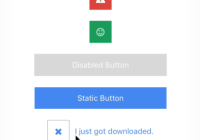
Available here.


