Angular Drag and Drop
Customizable drag and drop behaviour for Angular.
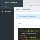
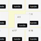
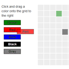
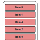
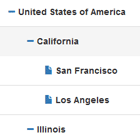
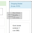
Demo
Getting Started
Bower
bower install angular-drag-and-drop-directives Or download the files from github, then:
In your HTML:
- Add
angular-drag-and-drop.js - Add
angular-drag-and-drop.css - Add required markup
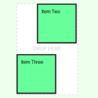
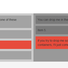
```html <drag-and-drop> <drag-item> <p>Anything in here</p> <p>will be draggable</p> </drag-item> <drop-spot> <p>Drop Here</p> </drop-spot> </drag-and-drop> ``` In your Angular module:
- Add
"laneolson.ui.dragdrop"as a dependency to the module. - In your controller, add functions for handling various events in the drag and drop.
Customizing
Directive Attributes
You can pass various functions and options to the directive by assigning the following attributes:
drag-and-drop - element or attribute
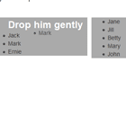
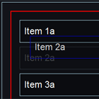
on-drag-start: function - fired when an item starts being draggedon-drag-end: function - fired when an item is releasedon-drag-enter: function - fired when an item is dragged over a drop spoton-drag-leave: function - fired when an item is dragged outside of a drop spoton-item-placed: function - fired when an item is dropped inside of a drop spoton-item-removed: function - fired when and item is removed from its drop spotenable-swap: boolean - an item will be swapped out when dropping a drag item on to a drop spot that has reached its maximum number of itemsfixed-positions: boolean - when set to true, items return to their start positions when dropped outside of a drop spot
drag-item - element or attribute
drag-id: an identifier that is used for this drag item. When set, thedrag-itemelement will have a class that matches thedrag-id.drag-data: object - use to associate any additional data you may want for the draggable item.drop-to: string - used to position the element within the drop spot (e.g. "top", or "bottom left")x: int - the pixel x offset of the drag item from it's original positiony: int - the pixel y offset of the drag item from it's original positionclone: boolean - a clone item is dragged instead of the original itemlock-vertical: boolean - locks the item so it may only be moved left and right
drop-spot - element or attribute
drop-id: string - an identifier that is used for this drop item. When set, thedrop-spotelement will have a class that matches thedrag-id.max-items: int - Used to specify the maximum number of items allowed in this drop spot
Classes
The following classes are added to elements to allow styling based on the current state of the drag and drop.
dragging: Added to thedrag-and-dropwrapper when an item is being dragged.drop-hovering: Added to androp-spotelement when an item has been dragged over top of the drop spot.drop-full: Added to androp-spotwhen it has reached its maximum number of items (assigned throughmax-items)drag-active: added to adrag-itemelement when it is being dragged{{DRAG_ID}}: added to andrag-itemelement if thedrag-idattribute is set{{DROP_ID}}: added to androp-spotelement if thedrop-idattribute is set. Andrag-itemelement will be given the classin-{{DROP_ID}}when it is placed within that drop spot.
Todo
- proper z-indexing when lifting and placing drag items


