Angular Dropzone Wrapper
This is an Angular wrapper library for the Dropzone. To use this library you should get familiar with the Dropzone documentation as well since this documentation only explains details specific to this wrapper.
This documentation is for the latest 6.x.x version which requires Angular 5 or newer. For Angular 4 you need to use the latest 4.x.x version. Documentation for the 4.x.x can be found from here.
Quick links
Example application | StackBlitz example | Dropzone documentation
Building the library
npm install npm startRunning the example
cd example npm install npm startLibrary development
npm link cd example npm link ngx-dropzone-wrapperInstalling and usage
npm install ngx-dropzone-wrapper --saveLoad the module for your app (with global configuration):
Providing the global configuration is optional and when used you should only provide the configuration in your root module.
import { DropzoneModule } from 'ngx-dropzone-wrapper'; import { DROPZONE_CONFIG } from 'ngx-dropzone-wrapper'; import { DropzoneConfigInterface } from 'ngx-dropzone-wrapper'; const DEFAULT_DROPZONE_CONFIG: DropzoneConfigInterface = { // Change this to your upload POST address: url: 'https://httpbin.org/post', maxFilesize: 50, acceptedFiles: 'image/*' }; @NgModule({ ... imports: [ ... DropzoneModule ], providers: [ { provide: DROPZONE_CONFIG, useValue: DEFAULT_DROPZONE_CONFIG } ] })Use it in your HTML template (with custom configuration):
This library provides two ways to create a Dropzone element, component for simple use cases and directive for more custom use cases.
COMPONENT USAGE
Simply replace the element that would ordinarily be passed to Dropzone with the dropzone component.
NOTE: Component provides couple additional features from directive such as the placeholder image. If you don't need them or want to create custom component then you might want to use the directive instead.
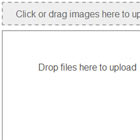
<dropzone [config]="config" [message]="'Click or drag images here to upload'" (error)="onUploadError($event)" (success)="onUploadSuccess($event)"></dropzone>[config] // Custom config to override the global defaults. [disabled] // Disables / detaches Dropzone from the element. [message] // Message to show for the user on the upload area. [placeholder] // Placeholder image to be shown as the upload area. [useDropzoneClass] // Use 'dropzone' class (use provided default styles). (error) // Event handler for the Dropzone upload error event. (success) // Event handler for the Dropzone upload success event. (canceled) // Event handler for the Dropzone upload canceled event. (<dropzoneEvent>) // All Dropzone events / callbacks work as bindings. // Event names are in camel case (not lower case). // Example: maxfilesreached -> maxFilesReachedDIRECTIVE USAGE
When using only the directive you need to provide your own theming or import the default theme:
@import '~dropzone/dist/min/dropzone.min.css';Dropzone directive can be used in form or div element with optional custom configuration:
<div class="dropzone" [dropzone]="config" (error)="onUploadError($event)" (success)="onUploadSuccess($event)"></div>[dropzone] // Can be used to provide optional custom config. [disabled] // Disables / detaches Dropzone from the element. (error) // Event handler for the Dropzone upload error event. (success) // Event handler for the Dropzone upload success event. (canceled) // Event handler for the Dropzone upload canceled event. (<dropzoneEvent>) // All Dropzone events / callbacks work as bindings. // Event names are in camel case (not lower case). // Example: maxfilesreached -> maxFilesReachedAvailable configuration options (custom / global configuration):
This library supports all Dropzone configuration options and few extra options for easier usage.
LIBRARY OPTIONS
autoReset // Time for resetting component after upload (Default: null). errorReset // Time for resetting component after an error (Default: null). cancelReset // Time for resetting component after canceling (Default: null).DROPZONE OPTIONS
url // Upload url where to send the upload request (Default: ''). method // HTTP method to use communicating with the server (Default: 'post'). headers // Object of additional headers to send to the server (Default: null). paramName // Name of the file parameter that gets transferred (Default: 'file'). maxFilesize // Maximum file size for the upload files in megabytes (Default: null). acceptedFiles // Comma separated list of mime types or file extensions (Default: null).For more detailed documentation with all the supported Dropzone events / options see the Dropzone documentation.
Available control / helper functions (provided by the directive):
dropzone() // Returns reference to the Dropzone instance for full API access. reset(cancel?) // Removes all processed files (optionally cancels uploads as well).Above functions can be accessed through the directive reference (available as directiveRef in the component).
