react-popover

React Versions Support
react-popover >= 0.5.0 supports React 16 while react-popover < 0.5.0 works with React 15.x.x and likely lower. There is no plan to support older versions of this library with back-ported patches and PRs for that purpose are not welcome since it increases maintenance for the authors.
Installation
yarn add react-popoverExamples
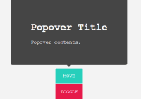
Look at the stories in our storybook.
API
export default Popover(props, target)
props :: {…}
body :: Node | Array Node
The popover content.
isOpen :: Boolean
Determines Whether or not the popover is rendered.
preferPlace :: Enum String | Null
Sets a preference of where to position the Popover. Only useful to specify placement in case of multiple available fits. Defaults to null. Valid values are:
above | right | below | left-
Prefer an explicit side.
row | column-
Prefer an orientation.
start | end-
Prefer an order.
null-
No preference, automatic resolution. This is the default.
place :: String | Null
Like preferPlace except that the given place is a requirement. The resolver becomes scoped or disabled. It is scoped if the place is an orientation or order but disabled if it is a side. For example place: "row" scopes the resolver to above or below placement but place: "above" removes any need for the resolver.
onOuterAction :: (Event) → Void
A callback function executed every time the user does an action (mousedown or touchstart) outside the DOM tree of both Popover and Target. A canonical use-case is to automatically close the Popover on any external user action.
refreshIntervalMs :: Number | Falsey
The polling speed (AKA time between each poll) in milliseconds for checking if a layout refresh is required. This polling is required because it is the only robust way to track the position of a target in the DOM. Defaults to 200. Set to a falsey value to disable.
enterExitTransitionDurationMs :: Number | Falsey
The amount of time in milliseconds that it takes to complete the enter and exit animation. Defaults to '500'.
tipSize :: Number
Defines the size of the tip pointer. Use .01 to disable tip. Defaults to '7'.
Standard
-
Properties like
classNameandstyle.
target :: ReactElement
-
The React Element that this popover will orient itself around.
targetrendering treeis unaffected.Popoverwill become itsowner.
appendTarget :: DOMElement
-
The DOM element which the portal will mount into. In effect the popover will become an appended child of this DOM element. Defaults to 'document.body'.


