react-native-tooltip
A react-native component from displaying tooltip. Uses UIMenuController.
Add it to your project
- Run
npm install react-native-tooltip --save - Open your project in XCode, right click on
Librariesand clickAdd Files to "Your Project Name"(Screenshot) then (Screenshot). - Add
libRNToolTipMenu.atoBuild Phases -> Link Binary With Libraries(Screenshot). - Whenever you want to use it within React code:
var ToolTip = require('react-native-tooltip');
Usage
Props
actions: Array of actions[{text: 'Copy', onPress: () => Clipboard.set(this.someValue) }]longPress: Boolean indicating if the tooltip should be showing on longPress, false by default.arrowDirection: String indicating the direction of the tooltip arrow. Possible values are:up,down,left,right, anddefault. Default isdefault, which means to point up or down at the object of focus based on its location on the screen.
Props from TouchableHighlight.propTypes
activeOpacityonHideUnderlayonShowUnderlaystyleunderlayColor
You can see the list on the react native website
Example
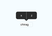
import React from 'react'; import { AppRegistry, StyleSheet, PixelRatio, View, Text, } from 'react-native'; import ToolTip from 'react-native-tooltip'; export default class MyToolTip extends React.Component { state = { input: 'chirag' }; handleCopyPress = () => { AlertIOS.alert(`Copy has been pressed!`); }; handleOtherPress = () => { AlertIOS.alert(`Other has been pressed!`); }; handleHide = () => { console.log('Tooltip did hide'); }; handleShow = () => { console.log('tooltip did show'); }; render() { return ( <View style={{flex: 1, justifyContent: 'center'}}> <ToolTip ref='tooltip' actions={[ {text: 'Copy', onPress: this.handleCopyPress }, {text: 'Other', onPress: this.handleOtherPress } ]} onHide={this.handleHide} onShow={this.handleShow} underlayColor={'blue'} style={styles.selectedName} > <Text style={styles.welcome}> Press Here. </Text> </ToolTip> </View> ); } } const styles = StyleSheet.create({ container: { flex: 1, justifyContent: 'center', alignItems: 'center', backgroundColor: '#F5FCFF', }, textinputContainer: { marginTop: 20, justifyContent: 'center', alignItems: 'center', }, textinput: { width: 60, marginVertical: 2, marginHorizontal: 2, borderWidth: 1 / PixelRatio.get(), borderRadius: 5, borderColor: '#c7c7cc', padding: 2, fontSize: 14, backgroundColor: 'white', }, }); AppRegistry.registerComponent('tooltip', () => tooltip);Note
It is also possible to open the menu programmatically, by calling this.refs.theToolTip.showMenu(); ( theToolTip being the reference of the component). To hide menu this.refs.theToolTip.hideMenu(); (Though tooltip hides by itself, while using with drawer on specific gesture tooltip does not hide by default.)
Here is how it looks:

Special thanks
Special thanks to jrichardlai for refactoring the api and make it awesome.


