react-pinch-zoom-pan
A react component that lets you add pinch-zoom and pan sub components. On touch you can pinch-zoom and pan the zoomed image. On desktop you can 'pinch' by holding down your ALT-key and do a mousedown from center of inner content onto the edges.
Install
npm install react-pinch-zoom-pan
Usage
Take a look at demo/App.js for usage, you can also run it in your local enviroment by
npm install & npm start
and open localhost:3001
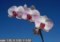
import React, {Component} from 'react' import {PinchView} from 'react-pinch-zoom-pan' class App extends Component { render () { return ( <PinchView debug backgroundColor='#ddd' maxScale={4} containerRatio={((400 / 600) * 100)}> <img src={'http://lorempixel.com/600/400/nature/'} style={{ margin: 'auto', width: '100%', height: 'auto' }} /> </PinchView> ) } } Usage underlaying zoom widget (ReactPinchZoomPan)
Take a look at demo/App.js for usage, you can also run it in your local enviroment by
npm install & npm start
and open localhost:3001
import React, {Component} from 'react' import s from 'react-prefixr' import {ReactPinchZoomPan} from 'react-pinch-zoom-pan' export default class App extends Component { /* Use the css padding-top to make the container as high as inner content */ getContainerStyle(ratio) { return { paddingTop: ratio.toFixed(2) + '%', overflow: 'hidden', position: 'relative' } } /* Position inner content absolute */ getInnerStyle() { return { position: 'absolute', top: 0, left: 0, right: 0, bottom: 0 } } render() { const {height,width} = this.props const ratio = (height / width) * 100 return ( <ReactPinchZoomPan maxScale={2} render={obj => { return ( <div style={this.getContainerStyle(ratio)}> <div style={this.getInnerStyle()}> <img src={`http://lorempixel.com/${width}/${height}/nature/`} style={s({ width: '100%', height: 'auto', transform: `scale(${obj.scale}) translateY(${obj.y}px) translateX(${obj.x}px)`, transition: '.3s ease' })} /> </div> </div> ) }} /> ) } } Usage event listeners
The component exposes 2 event listeners: onPinchStart and onPinchStop. These are called resp. when the user starts pinching and stops pinching.
<PinchView debug backgroundColor='#ddd' maxScale={3} containerRatio={100} onPinchStart={() => console.log('pinch started')} onPinchStop={() => console.log('pinch stopped')}> <img src={'http://lorempixel.com/400/600/nature/'} style={{ margin: 'auto', width: 'auto', height: '100%' }} /> </PinchView> Usage initial scale
The component exposes a prop to set the initialScale. This can be used to display the content with zoomed in by default
<PinchView debug backgroundColor='#ddd' initalScale={2} maxScale={4} containerRatio={100}> <img src={'http://lorempixel.com/400/600/nature/'} style={{ margin: 'auto', width: 'auto', height: '100%' }} /> </PinchView> Discussion
- My experience with rxjs is limited, see
src/ReactPinchZoomPan.jsif you have any suggestions and submit a pull request.
Thanks to Hugo Bessaa and rx-react-pinch for inital idea, but it had no support for panning and desktop.


