ngPopover
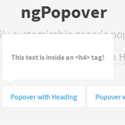
An elegant, easily customizable generic popover in Angular that transcludes custom HTML
Description
- An angular directive for generic popovers.
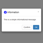
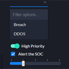
- Popovers can contain simple text to complex html templates.
- Popovers can have callback functions for opening and closing.
- Popovers can have custom directions.
- The script also provides a factory to close all or specific directives manually.
- Works well with/without Bootstrap/Foundation.
Dependecies
- Angular.js
Installation
- Copy ngPopover.js and ngPopover.css from the repository and use it the way you like.
Usage
- Make sure you include the '''ngPopover''' module in you angular app:
angular.module('myApp', ['ngPopover']); - once you've added the module in your app. Use the code below to get the popover up and running:
<ng-popover trigger="popover-trigger" // ID of the (trigger) element that'll open/close the popover direction="left" // The direction in which the popover hould appear can be equal to top, bottom, left & right. bottom is the default value popover-class="custom-popover" // CSS Class of your popover. Ideally you should define the styles of your HTML under this class on-open="openCallback()" // Function to be called when the popover is shown on-close="closeCallback()"> // Function to be called when the popover is hidden <!--- Your custom HTML goes here ---> </ng-popover> - The trigger element for above popover would look like this:
<span id="popover-trigger" // Notice the same ID is provided in the trigger attribute of the popover class="ng-popover-trigger"> // Add this class to your trigger elements Open Popover </span> -
Ideally all your popovers should be present at the bottom of the body
-
To manually close a popover use
ngPopoverFactory -
Inject
ngPopoverFactoryin you controller :
angular.module("myApp").controller("myController", function(ngPopoverFactory){ });- Once you've injected the factory you can manually close the dropdown by calling the closePopover function of the factory:
ngPopoverFactory.closePopover(triggerId) - You can also close all the popovers at the same time by calling closeAll function of thr factory:
ngPopoverFactory.closeAll(); ###Customization You can easily customize the look and feel of the popover by changing the following variables in the ngPopover.scss file as per your requirement:
$background-color: #FFF; // Background color of the popovers $border-color: #EAEAEA; // Border color of the popovers###Demo visit http://fauzankhan.github.io/angular-popover/ to see the popover in action
